Timininous
Branding Design
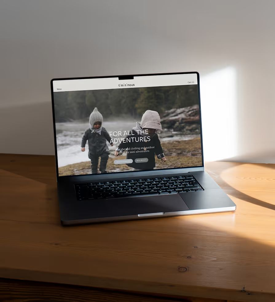
Timininous is a Quebec-based brand producing environmentally conscious merino wool clothing
for babies and children. The garments are designed for outdoor use and distributed through retail partners as well as temporary pop-up stores.
The existing identity lacked distinction and flexibility. The objective was to develop a clearer brand identity that feels warm and approachable while maintaining a polished character to support a wide range of applications.
scroll this way →
The challenge was to redesign the logo so that it became more legible and recognizable without
losing the brand’s playful character. I wanted to avoid visual clichés commonly associated with
children’s brands and instead create something more subtle, refined and adaptable.
Subheader
The exploration focused on simplifying the letterforms while introducing a small visual gesture
that could carry personality across the system. The process involved testing different typographic structures, spacing relationships, and ways of incorporating a recurring graphic element that could extend beyond the logo itself.
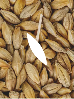
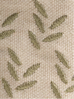
This approach was loosely inspired by the idea of hide-and-seek, where small elements reveal
themselves through careful observation, guiding the development of subtle graphic motifs throughout the identity.

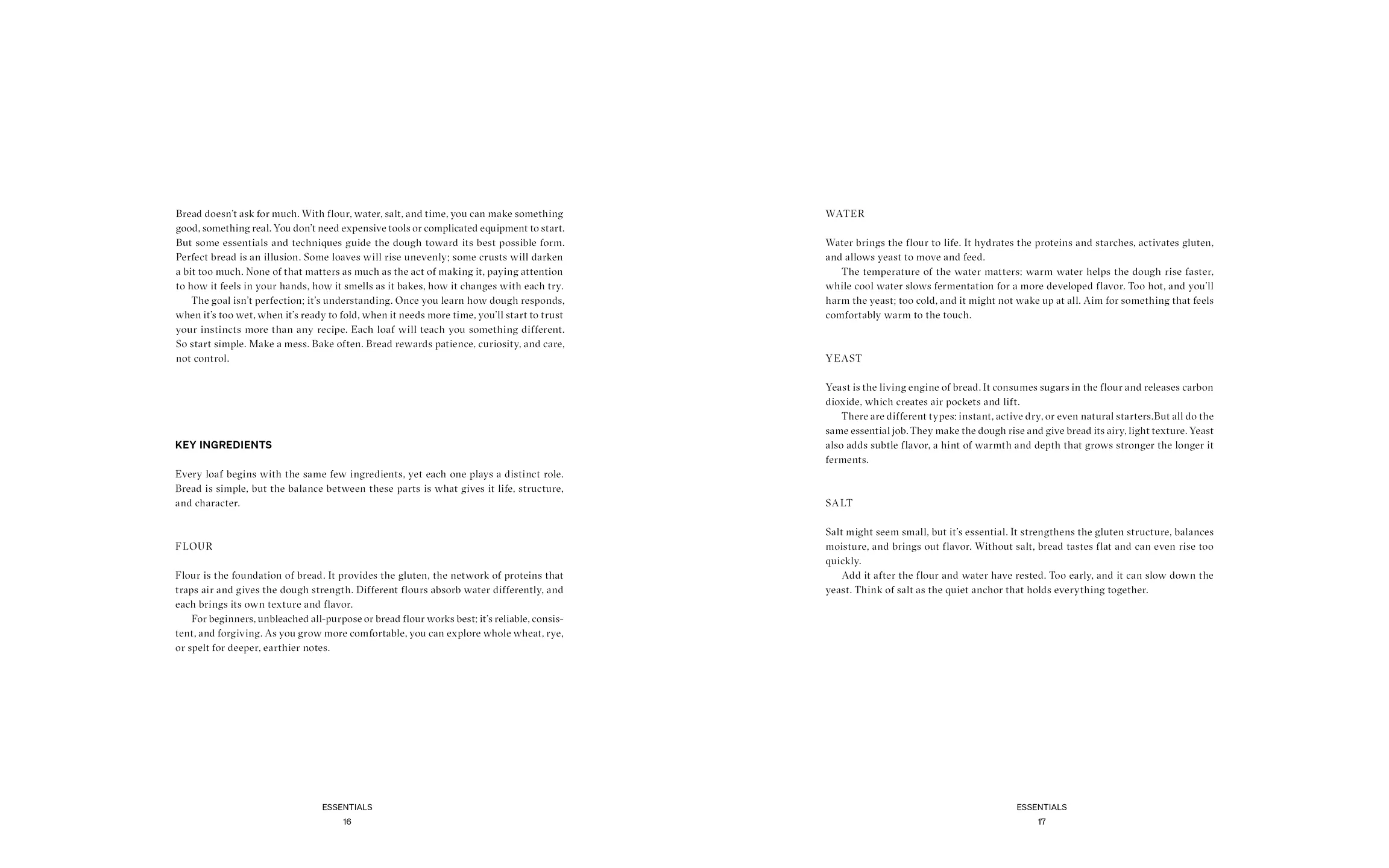
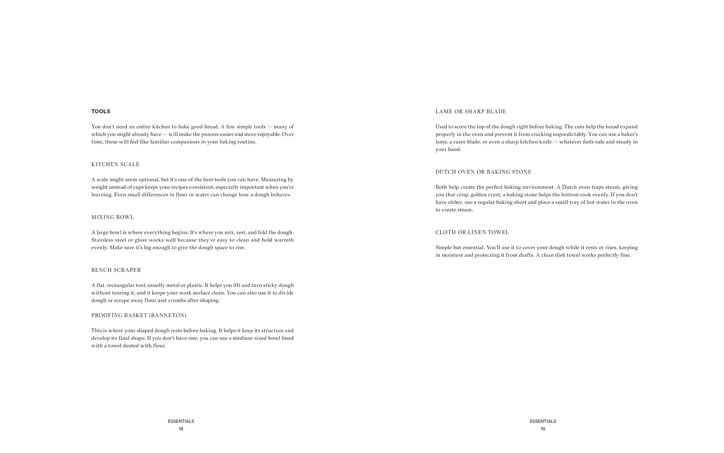
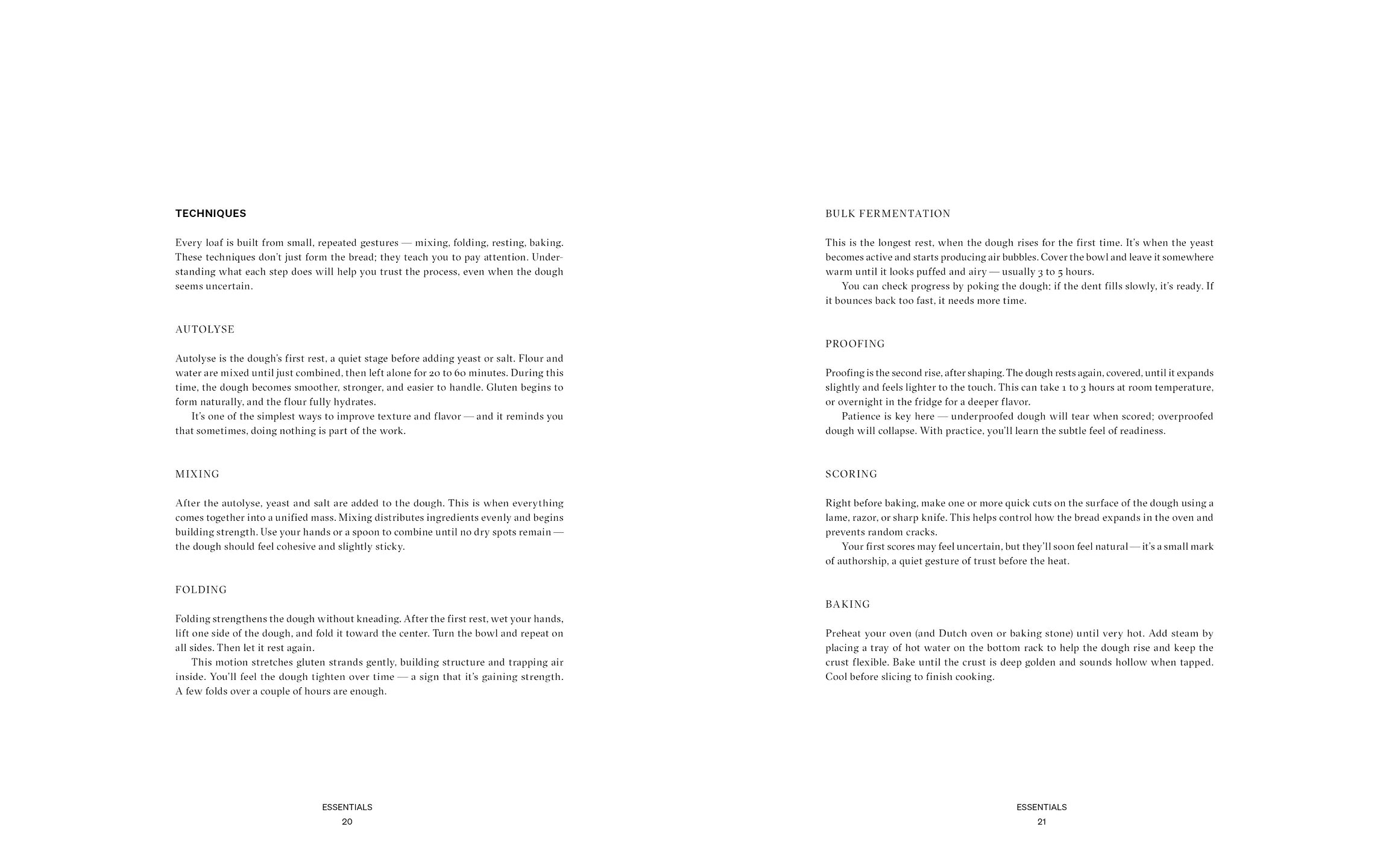
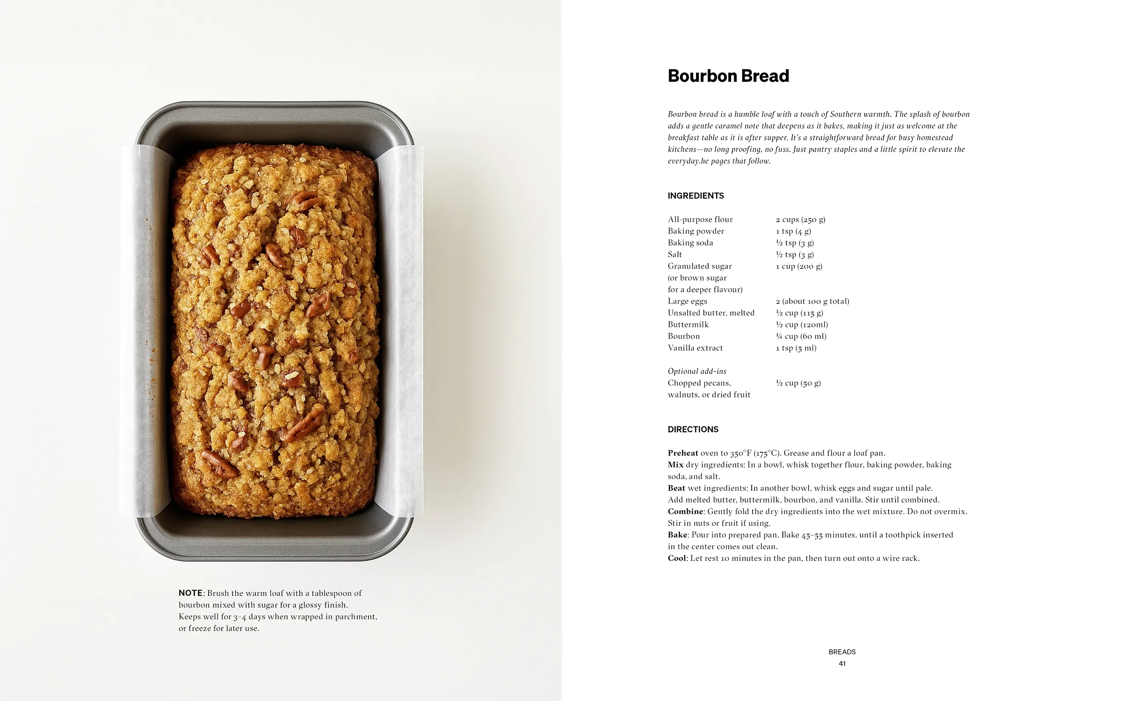
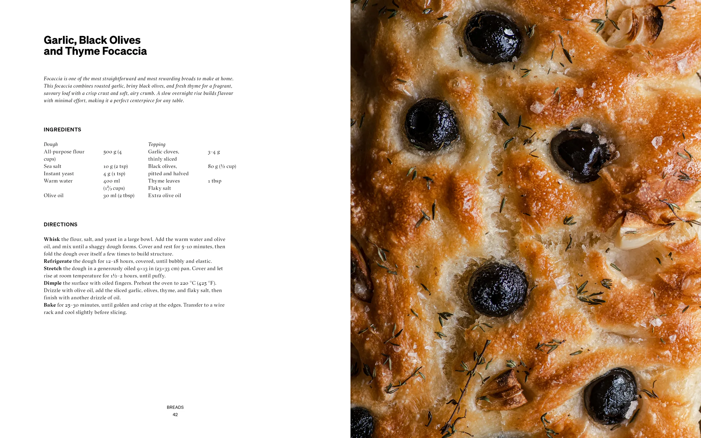
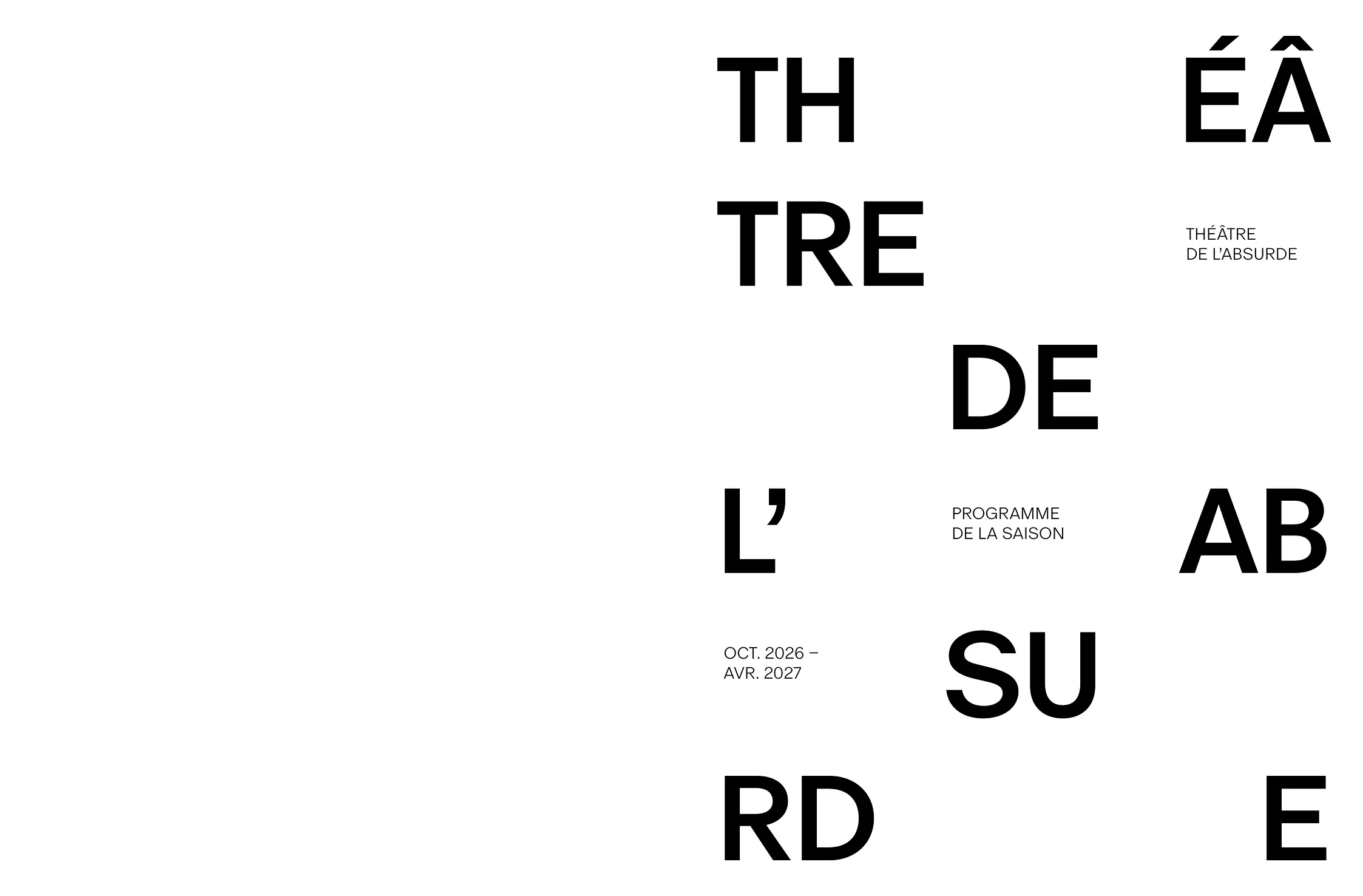
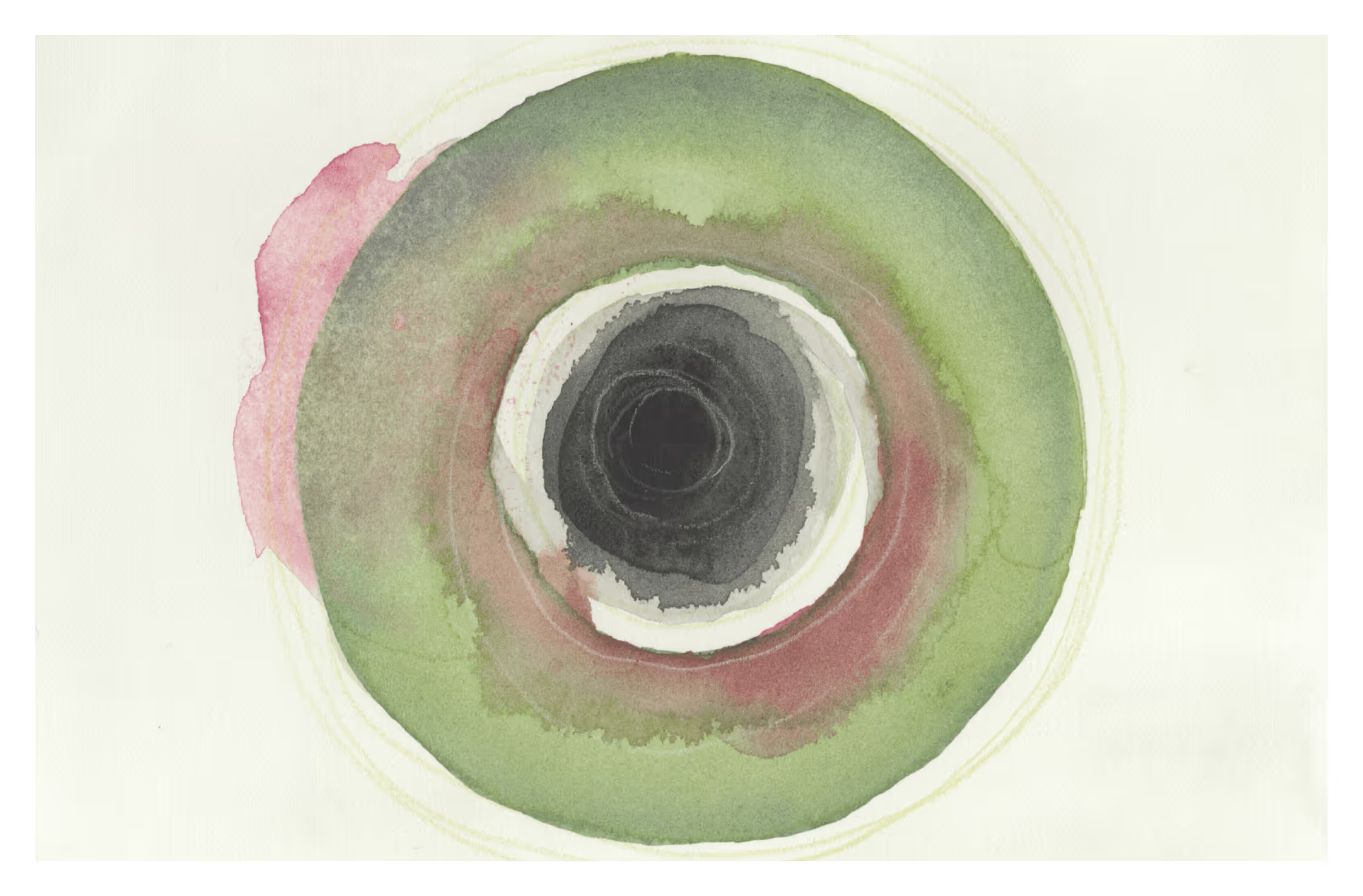

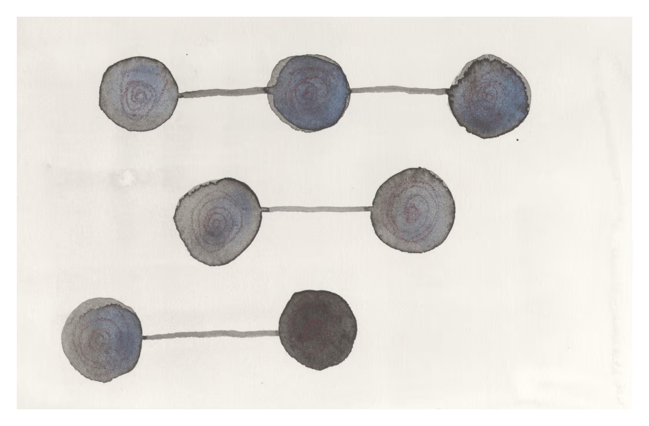
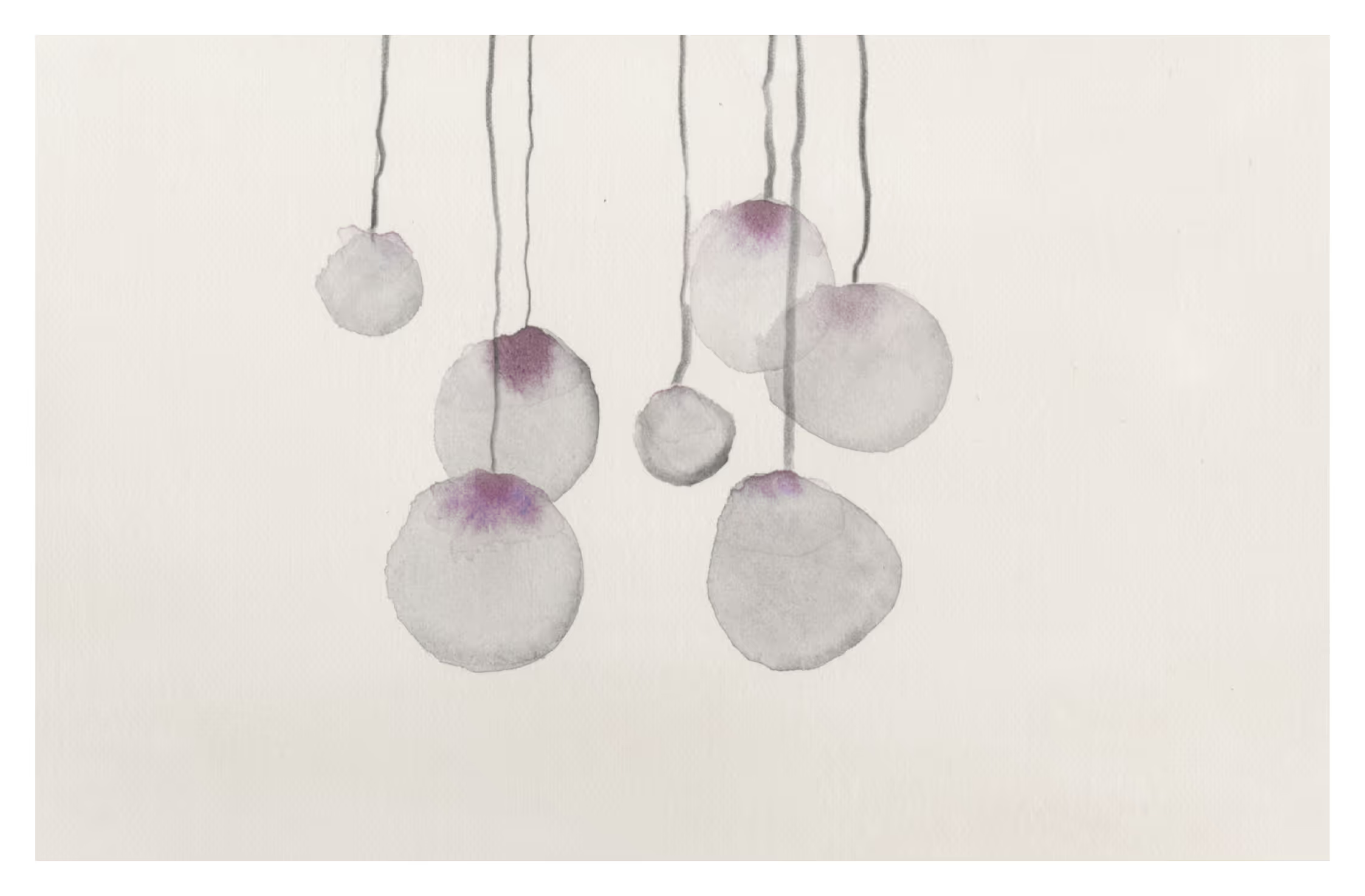
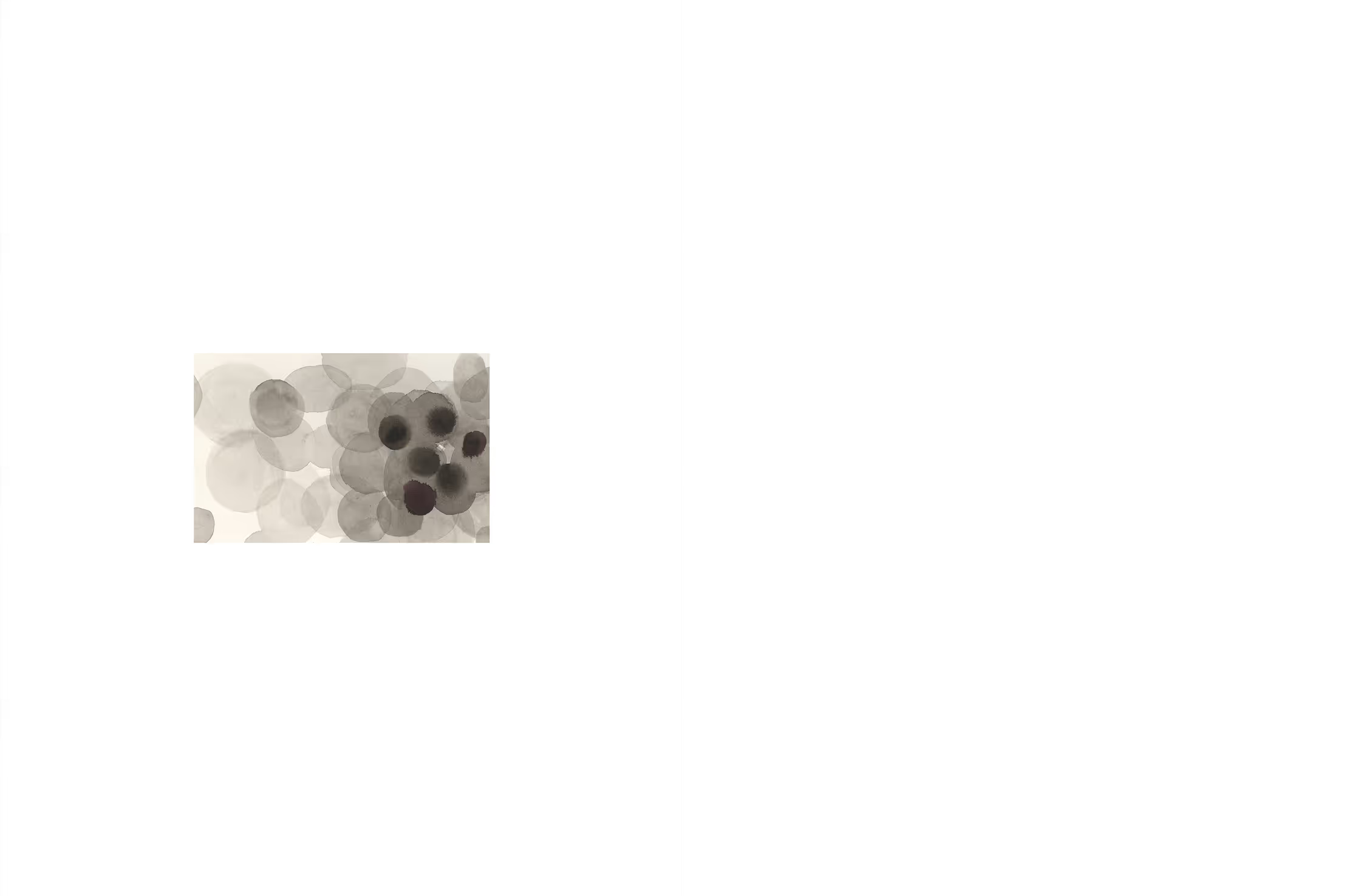
“Be part of the adventure!”
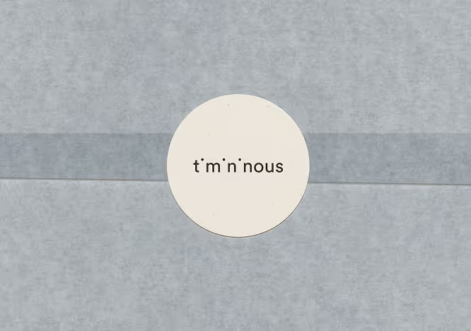
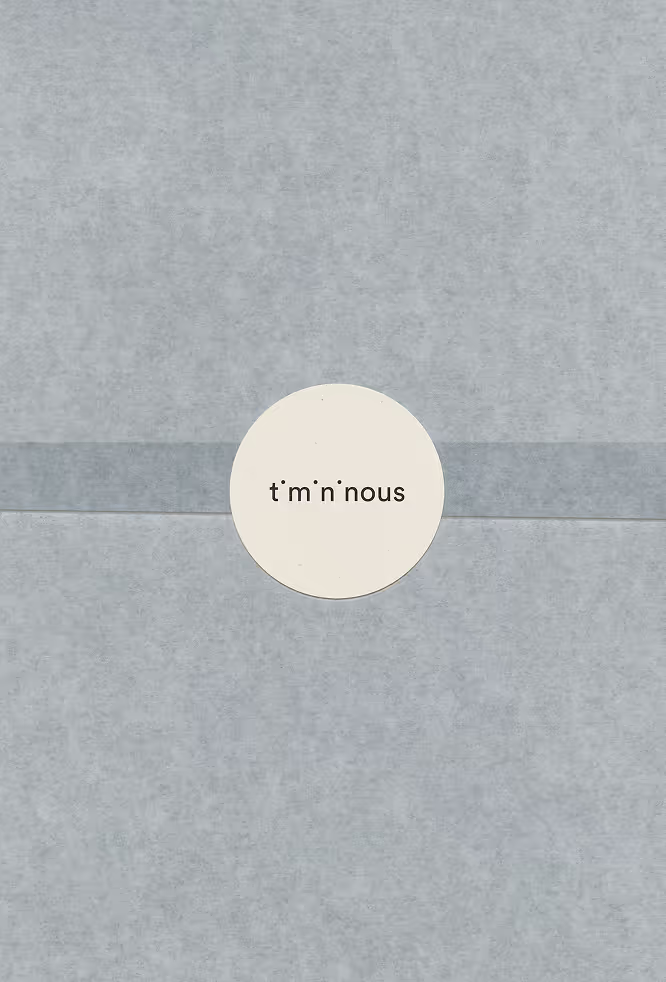
The final identity centers on a refined wordmark constructed with balanced proportions and generous spacing, reinforcing a calm and approachable tone. Subtle typographic interventions introduce personality without disrupting the clarity of the letterforms.
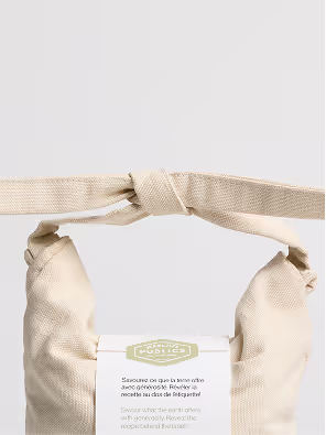
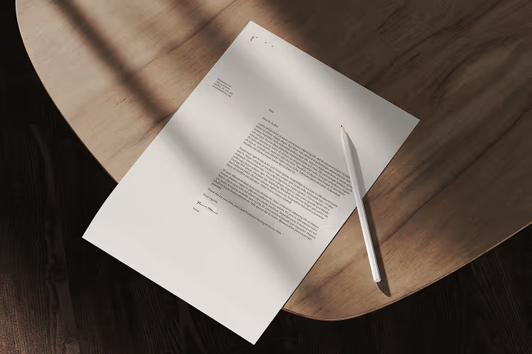
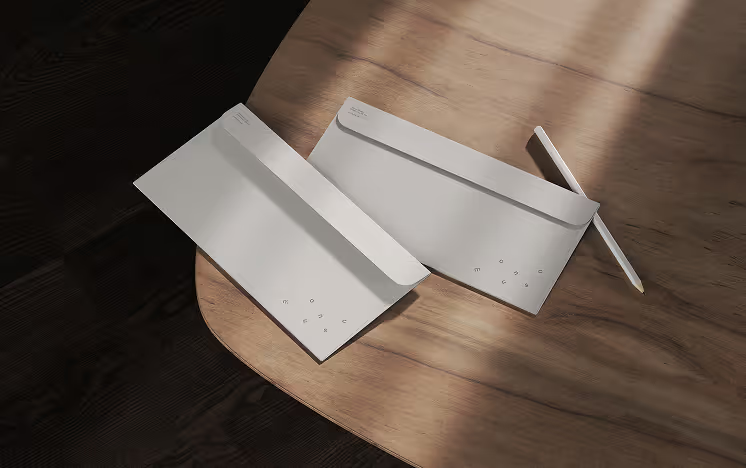
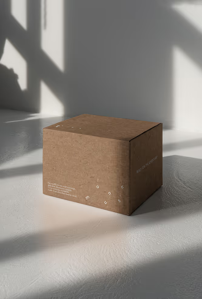
Rather than relying on a separate graphic symbol, the identity system extends from the wordmark itself. Individual letterforms extracted from “Timininous” are repurposed across packaging, labels, and communication materials, creating playful moments of recognition inspired by the idea of hide-and-seek. These fragmented typographic elements allow the system to feel flexible and interactive while maintaining visual cohesion across applications.
Subheader
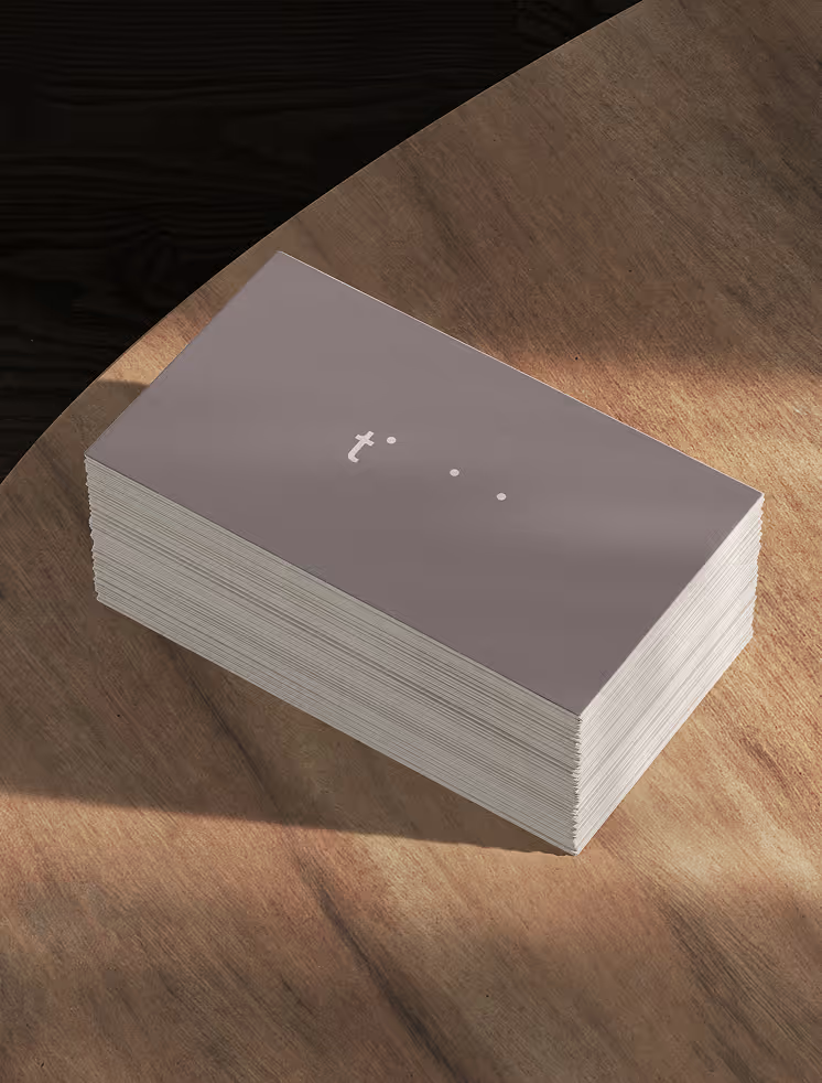
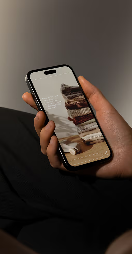
At smaller scales, the identity can also be reduced to a minimal “t” configuration while remaining recognizable. A restrained neutral palette anchors the system, allowing the tactile qualities of the clothing and materials to remain central. Lowercase sans-serif typography reinforces the softness of the brand while subtle typographic play introduces a quiet sense of mischief
Lorem ipsum dolor sit amet, consectetur adipiscing elit. Suspendisse varius enim in eros elementum tristique. Duis cursus, mi quis viverra ornare, eros dolor interdum nulla, ut commodo diam libero vitae erat. Aenean faucibus nibh et justo cursus id rutrum lorem imperdiet. Nunc ut sem vitae risus tristique posuere.
Lorem ipsum dolor sit amet, consectetur adipiscing elit. Suspendisse varius enim in eros elementum tristique. Duis cursus, mi quis viverra ornare, eros dolor interdum nulla, ut commodo diam libero vitae erat. Aenean faucibus nibh et justo cursus id rutrum lorem imperdiet. Nunc ut sem vitae risus tristique posuere.
Lorem ipsum dolor sit amet, consectetur adipiscing elit. Suspendisse varius enim in eros elementum tristique. Duis cursus, mi quis viverra ornare, eros dolor interdum nulla, ut commodo diam libero vitae erat. Aenean faucibus nibh et justo cursus id rutrum lorem imperdiet. Nunc ut sem vitae risus tristique posuere.