Grain Bags

Packaging Design

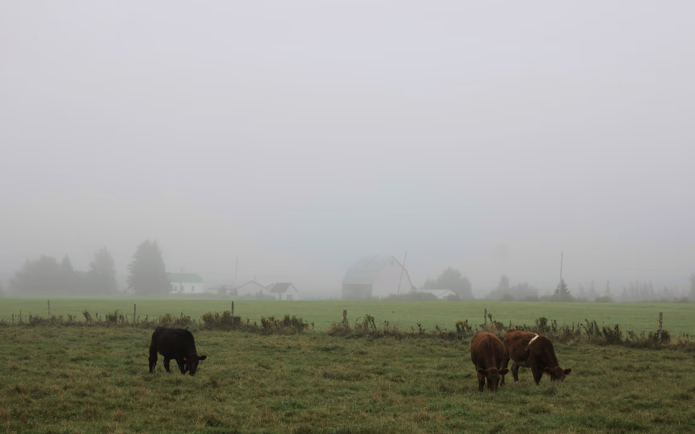
Operating through its network of public markets, MPM connects the city to local growers and producers.

The brief was to develop the next addition to Marchés Publics de Montréal’s packaged product line: a grain-based extension sold at MPM pop-ups, rooted in the idea of terroir, the relationship between food, geography, and culture.

scroll this way →
Photography by Tommy-Paul Keo
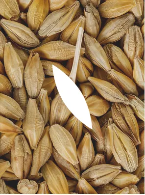
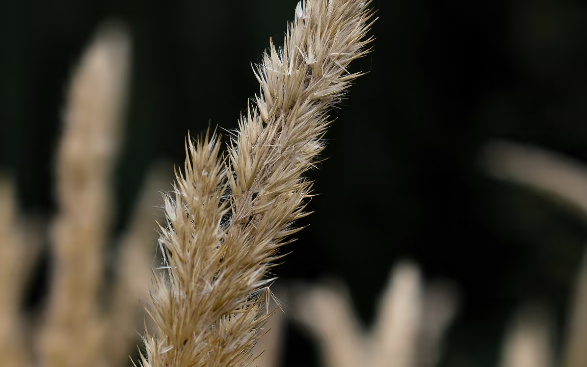
A close-up photograph highlighting the barley grains used as the basis for the packaging pattern. The elongated forms and layered arrangement inspired the repeated stitched motif applied throughout the identity system, translating the organic texture of the grain into a simplified visual language.
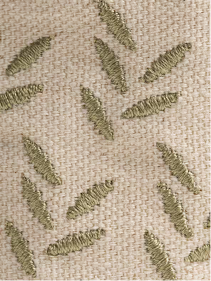
A close-up view of the stitched surface pattern applied across the reusable grain bags. Repeated linear motifs are embroidered directly onto the neutral fabric, creating a subtle textured detail that adds rhythm, tactility, and visual consistency throughout the packaging system.

Photography by Tommy-Paul Keo
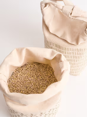
An open reusable fabric grain bag filled with grains, shown alongside a second closed bag in the background. The soft textile materials, visible contents, and minimal color palette highlight the tactile and natural qualities of the packaging system.

Photography by Tommy-Paul Keo

In response, I explored how grain packaging could embody terroir not only visually but also materially. Rather than creating a disposable solution, I developed a reusable system that prioritizes usability, longevity, and everyday handling.

I adopted an organic visual language that reflects MPM’s connection to land and sustainability while remaining minimal and contemporary.

Subheader

Most grain packaging is made from plastic or paper and optimized for cost efficiency rather than user experience. It often lacks portability and reliable resealing, reinforcing a short lifespan both materially and functionally.

Given the market setting and smaller production scale, I explored a reusable alternative that could extend the life of the packaging beyond a single use.
"Savour what the earth offers
with generosity."

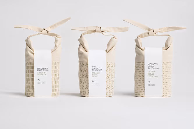
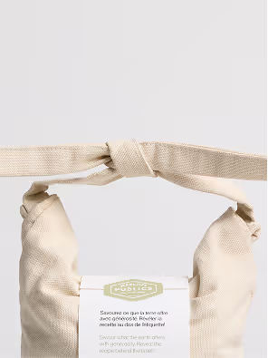
The final design is a durable cotton canvas bag with a strap closure that allows it to be refilled and reused.

The composition relies on controlled negative space to avoid visual clutter and allow the material to breathe. Inspired by traditional Japanese rice bags, the design takes the form of a sack proportioned for everyday portability and refilling.

Photography by Tommy-Paul Keo
A close-up photograph highlighting the barley grains used as the basis for the packaging pattern. The elongated forms and layered arrangement inspired the repeated stitched motif applied throughout the identity system, translating the organic texture of the grain into a simplified visual language.
A close-up view of the stitched surface pattern applied across the reusable grain bags. Repeated linear motifs are embroidered directly onto the neutral fabric, creating a subtle textured detail that adds rhythm, tactility, and visual consistency throughout the packaging system.

Photography by Tommy-Paul Keo
An open reusable fabric grain bag filled with grains, shown alongside a second closed bag in the background. The soft textile materials, visible contents, and minimal color palette highlight the tactile and natural qualities of the packaging system.

Photography by Tommy-Paul Keo

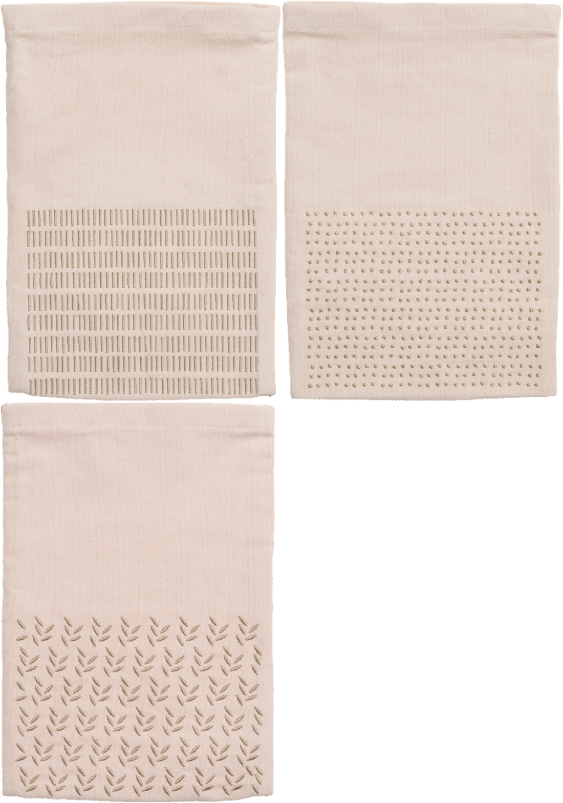
A subtle pattern system differentiates each grain type while maintaining a cohesive visual identity. The palette is limited to a single sage green to reinforce clarity and consistency across variations.

This restrained approach allows the fabric’s and pattern’s intricacy to stand out without overwhelming the form.

Photography by Tommy-Paul Keo
A close-up photograph highlighting the barley grains used as the basis for the packaging pattern. The elongated forms and layered arrangement inspired the repeated stitched motif applied throughout the identity system, translating the organic texture of the grain into a simplified visual language.
A close-up view of the stitched surface pattern applied across the reusable grain bags. Repeated linear motifs are embroidered directly onto the neutral fabric, creating a subtle textured detail that adds rhythm, tactility, and visual consistency throughout the packaging system.

Photography by Tommy-Paul Keo
An open reusable fabric grain bag filled with grains, shown alongside a second closed bag in the background. The soft textile materials, visible contents, and minimal color palette highlight the tactile and natural qualities of the packaging system.

Photography by Tommy-Paul Keo

A double-sided label provides cooking instructions and key information while optimizing paper use. Once removed, the bag functions independently for long-term reuse.

Grain Bags

Packaging Design

Operating through its network of public markets, MPM connects the city to local growers and producers.

The brief was to develop the next addition to Marchés Publics de Montréal’s packaged product line: a grain-based extension sold at MPM pop-ups, rooted in the idea of terroir, the relationship between food, geography, and culture.

In response, I explored how grain packaging could embody terroir not only visually but also materially. Rather than creating a disposable solution, I developed a reusable system that prioritizes usability, longevity, and everyday handling.

I adopted an organic visual language that reflects MPM’s connection to land and sustainability while remaining minimal and contemporary.

Subheader

Most grain packaging is made from plastic or paper and optimized for cost efficiency rather than user experience. It often lacks portability and reliable resealing, reinforcing a short lifespan both materially and functionally.

Given the market setting and smaller production scale, I explored a reusable alternative that could extend the life of the packaging beyond a single use.
A looping GIF showcasing the stitched pattern applied to a reusable fabric grain bag. The subtle movement emphasizes the texture, rhythm, and repeated linear motif across the neutral textile surface while highlighting the handcrafted and tactile qualities of the packaging design.

Photography by Tommy-Paul Keo

"Savour what the earth offers with generosity."

The final design is a durable cotton canvas bag with a strap closure that allows it to be refilled and reused.

The composition relies on controlled negative space to avoid visual clutter and allow the material to breathe. Inspired by traditional Japanese rice bags, the design takes the form of a sack proportioned for everyday portability and refilling.

Photography by Tommy-Paul Keo
A close-up photograph highlighting the barley grains used as the basis for the packaging pattern. The elongated forms and layered arrangement inspired the repeated stitched motif applied throughout the identity system, translating the organic texture of the grain into a simplified visual language.
A close-up view of the stitched surface pattern applied across the reusable grain bags. Repeated linear motifs are embroidered directly onto the neutral fabric, creating a subtle textured detail that adds rhythm, tactility, and visual consistency throughout the packaging system.

Photography by Tommy-Paul Keo
An open reusable fabric grain bag filled with grains, shown alongside a second closed bag in the background. The soft textile materials, visible contents, and minimal color palette highlight the tactile and natural qualities of the packaging system.

Photography by Tommy-Paul Keo

A subtle pattern system differentiates each grain type while maintaining a cohesive visual identity. The palette is limited to a single sage green to reinforce clarity and consistency across variations.

This restrained approach allows the fabric’s and pattern’s intricacy to stand out without overwhelming the form.

A double-sided label provides cooking instructions and key information while optimizing paper use. Once removed, the bag functions independently for long-term reuse.