A Book About Bread

Book Design

Bread-making is a process rooted in craft and patience. From the texture of the dough to the structure of the finished loaf, each stage reveals subtle variations in form and surface.

The goal was to present traditional techniques in a way that feels both approachable and refined. The cookbook is designed for beginner to intermediate bakers seeking a reliable and well-structured guide as they develop their skills.

scroll this way →
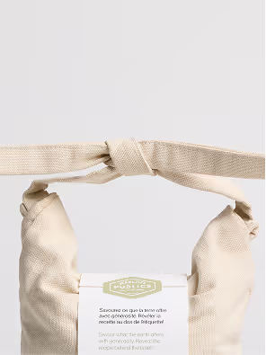
Photography by Tommy-Paul Keo
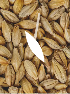
A close-up photograph highlighting the barley grains used as the basis for the packaging pattern. The elongated forms and layered arrangement inspired the repeated stitched motif applied throughout the identity system, translating the organic texture of the grain into a simplified visual language.
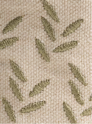
A close-up view of the stitched surface pattern applied across the reusable grain bags. Repeated linear motifs are embroidered directly onto the neutral fabric, creating a subtle textured detail that adds rhythm, tactility, and visual consistency throughout the packaging system.

Photography by Tommy-Paul Keo
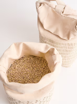
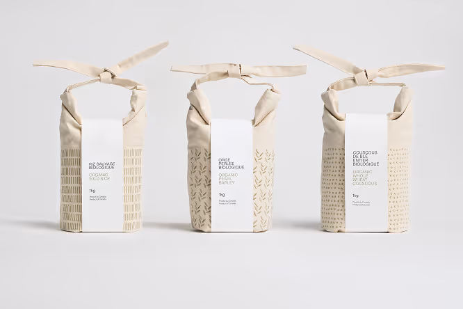
An open reusable fabric grain bag filled with grains, shown alongside a second closed bag in the background. The soft textile materials, visible contents, and minimal color palette highlight the tactile and natural qualities of the packaging system.

Photography by Tommy-Paul Keo

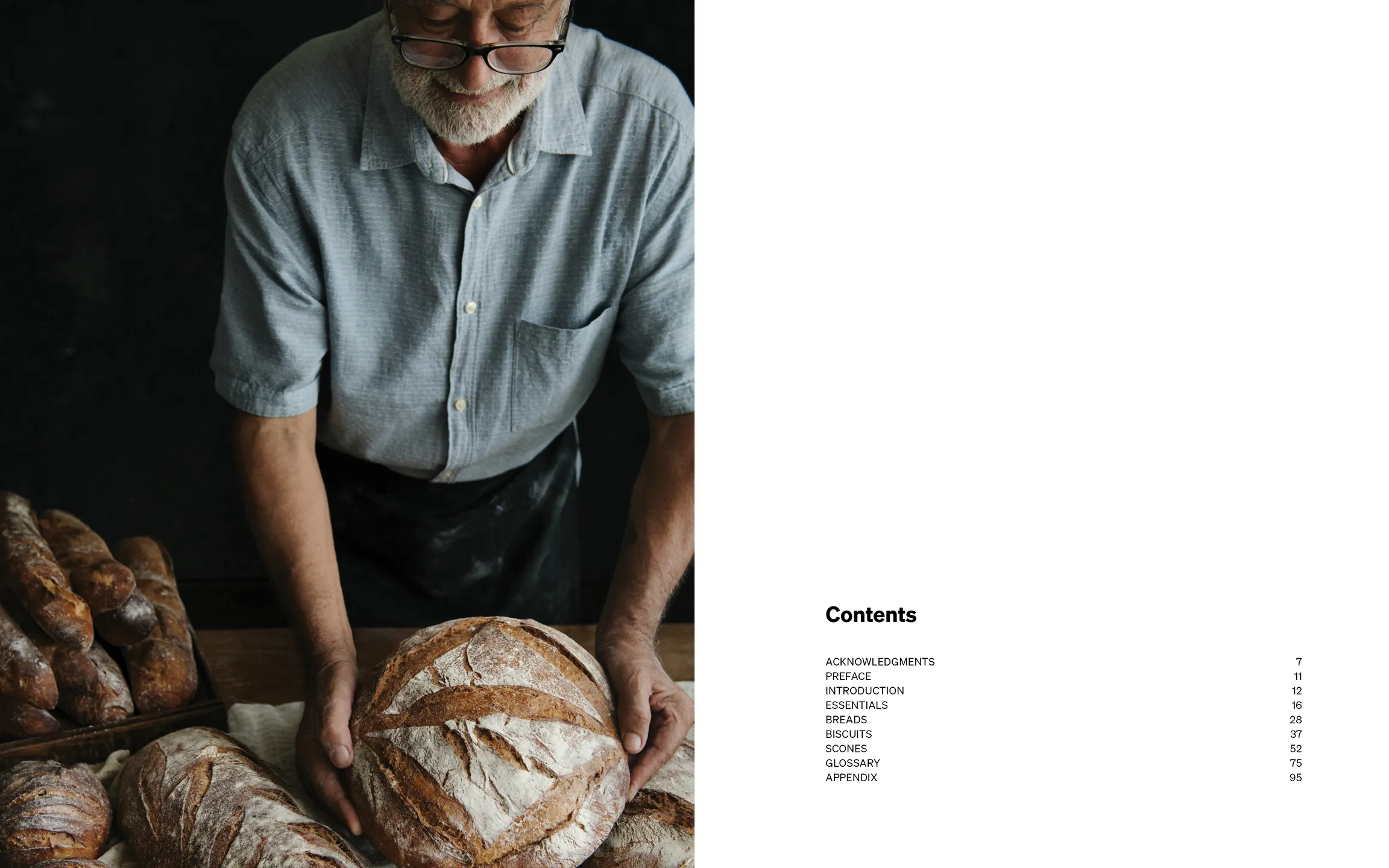
The project explores the design of a cookbook focused on artisanal bread, examining how publication design can communicate the tactile and process-driven nature of baking while remaining clear and accessible for readers learning the craft.

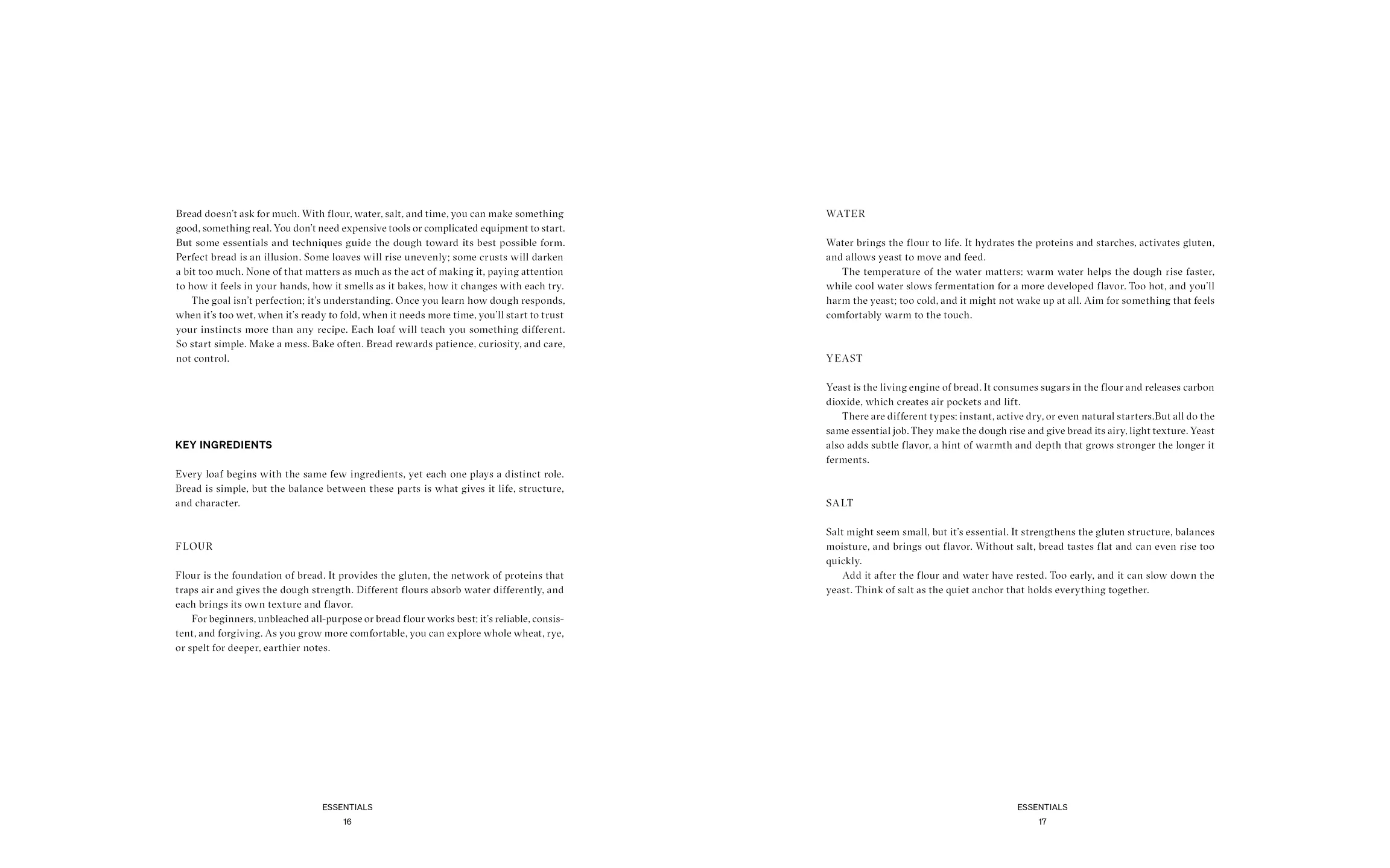
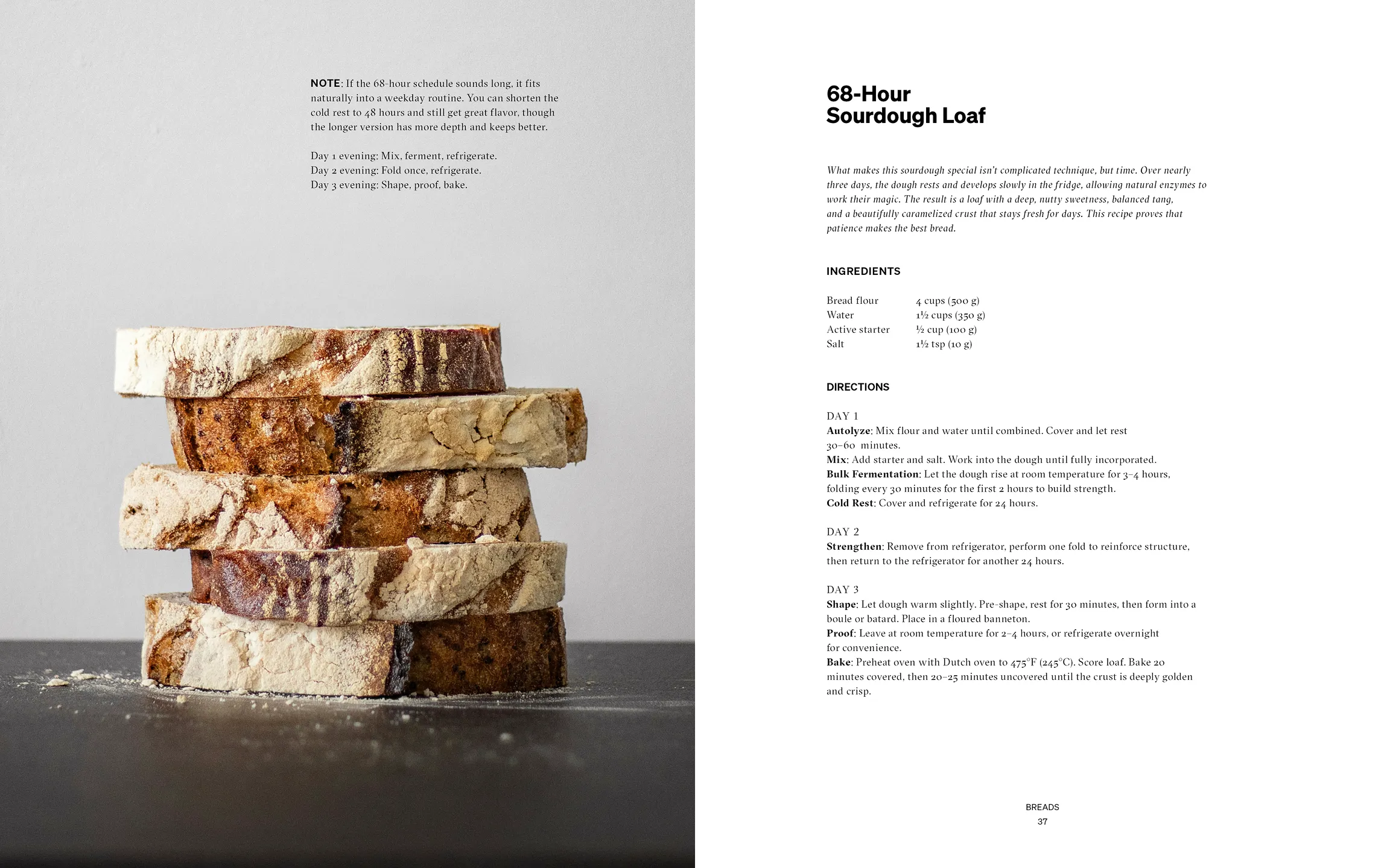
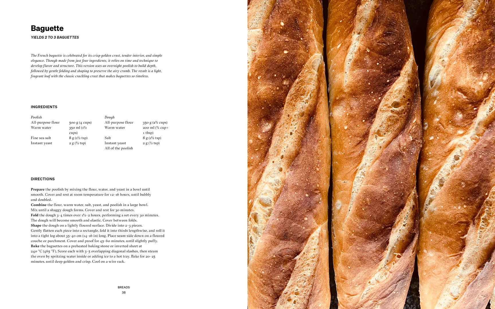
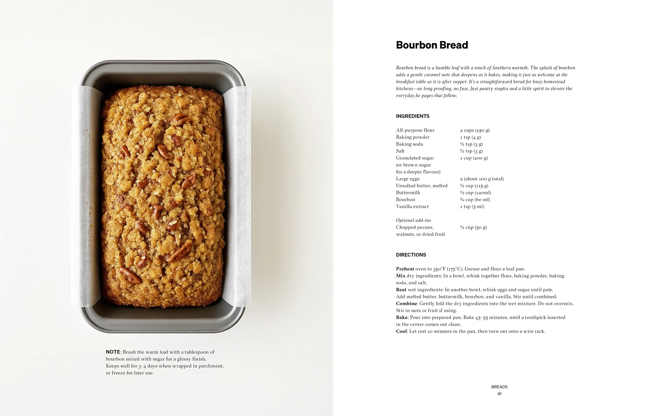
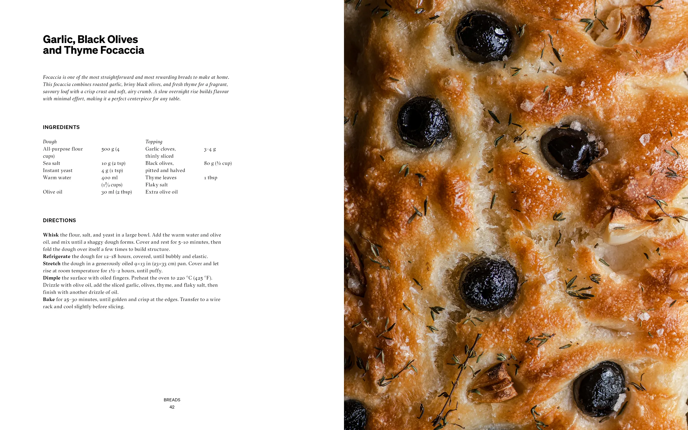
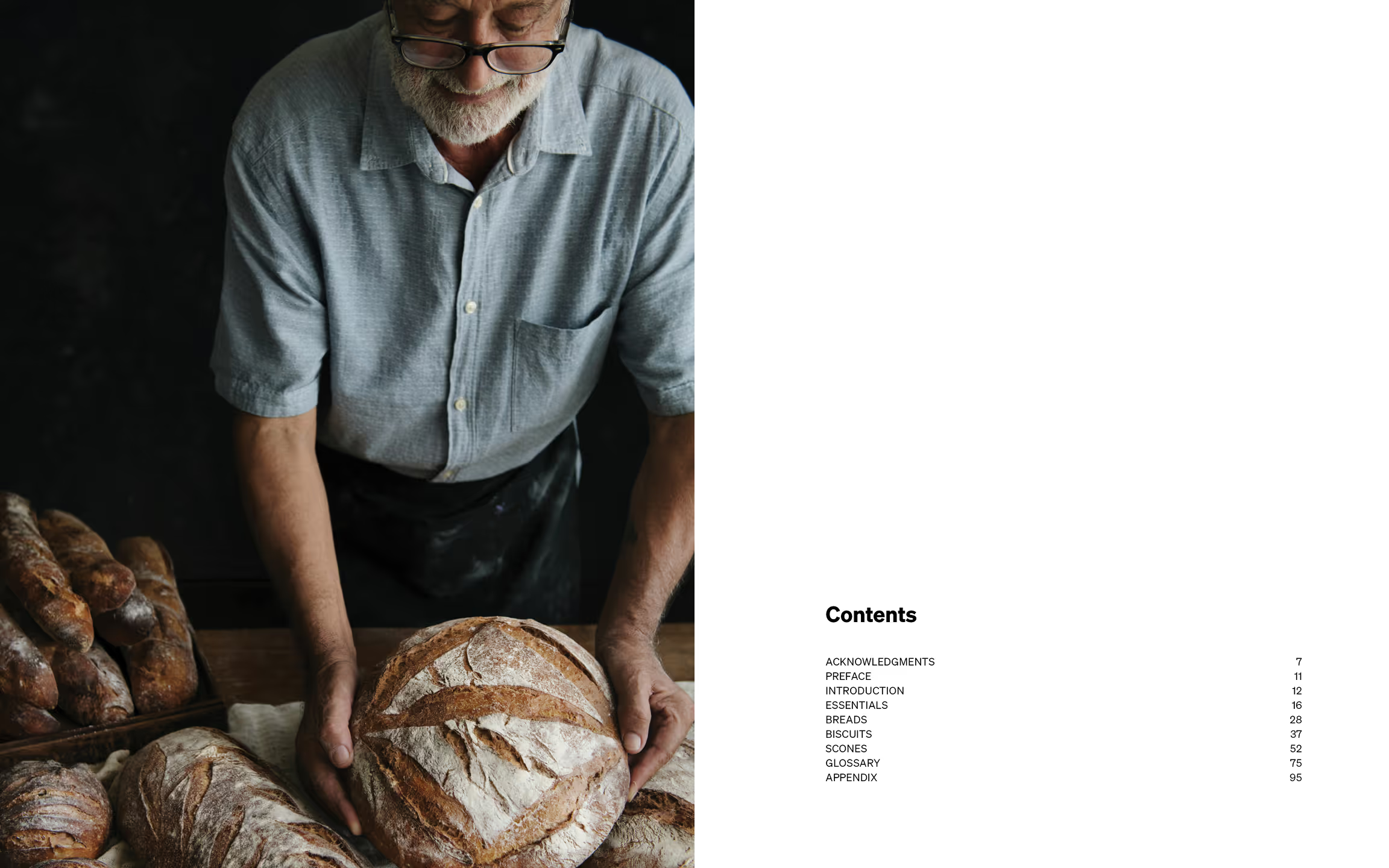
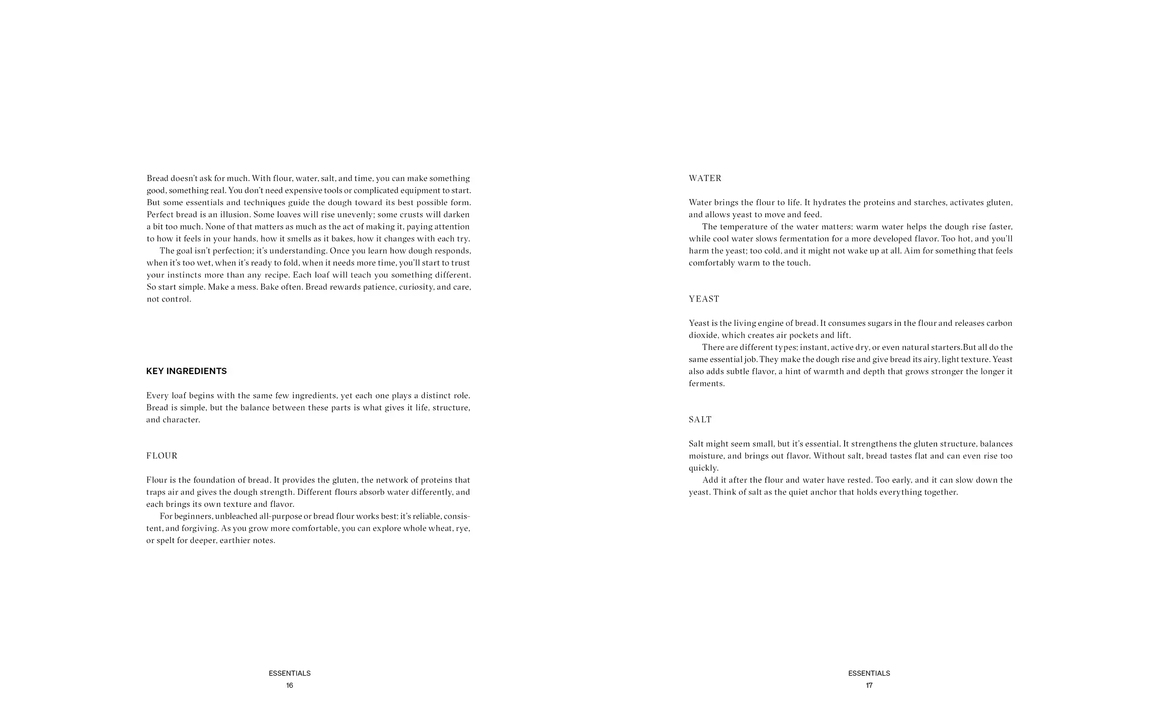
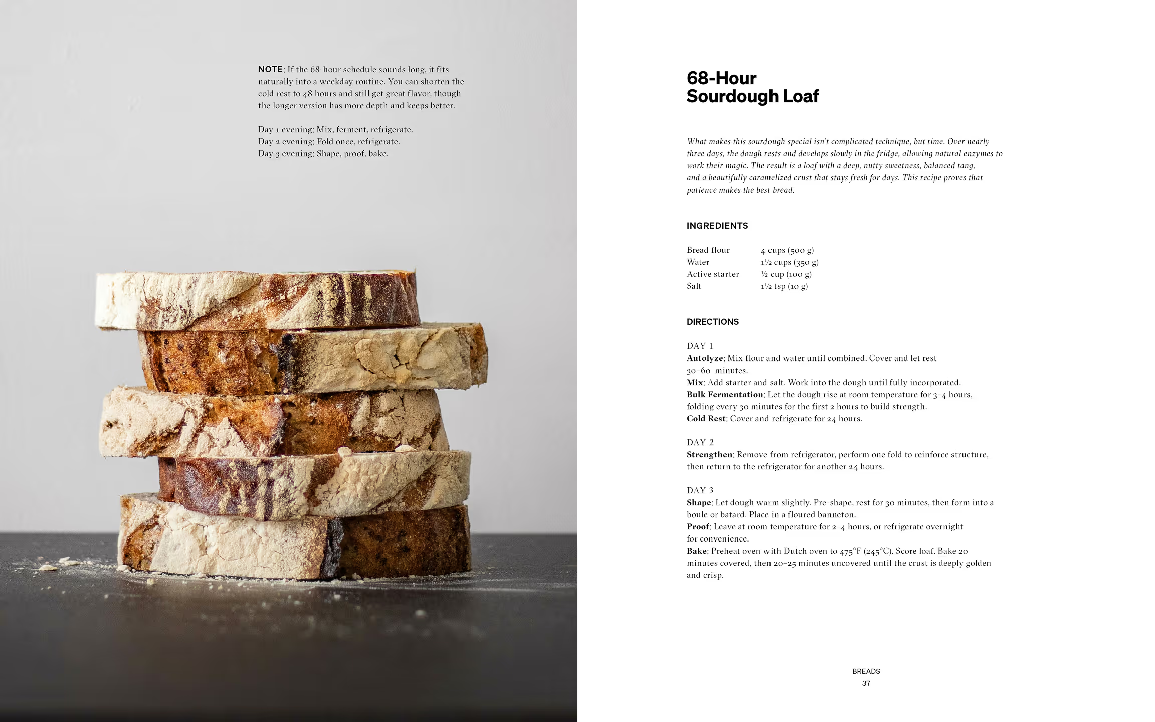
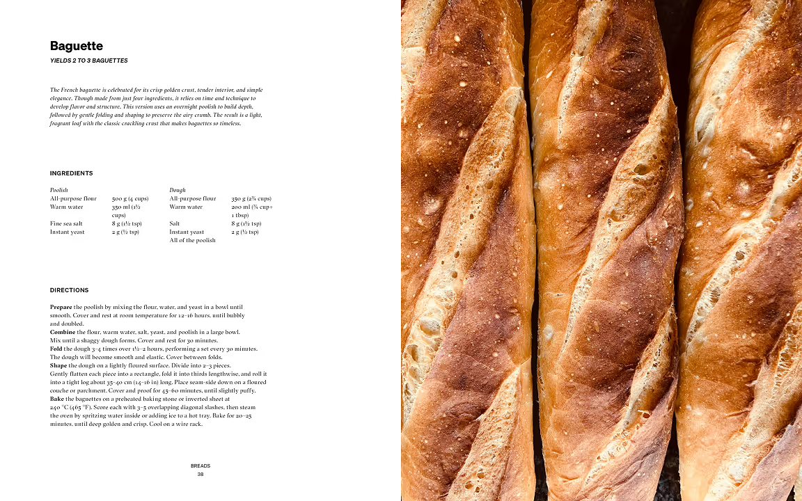
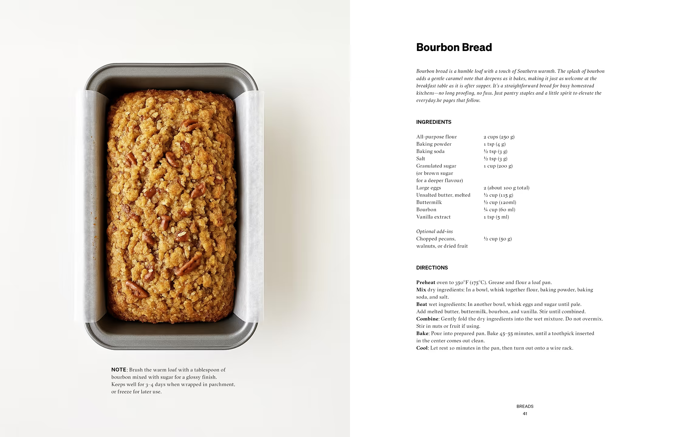
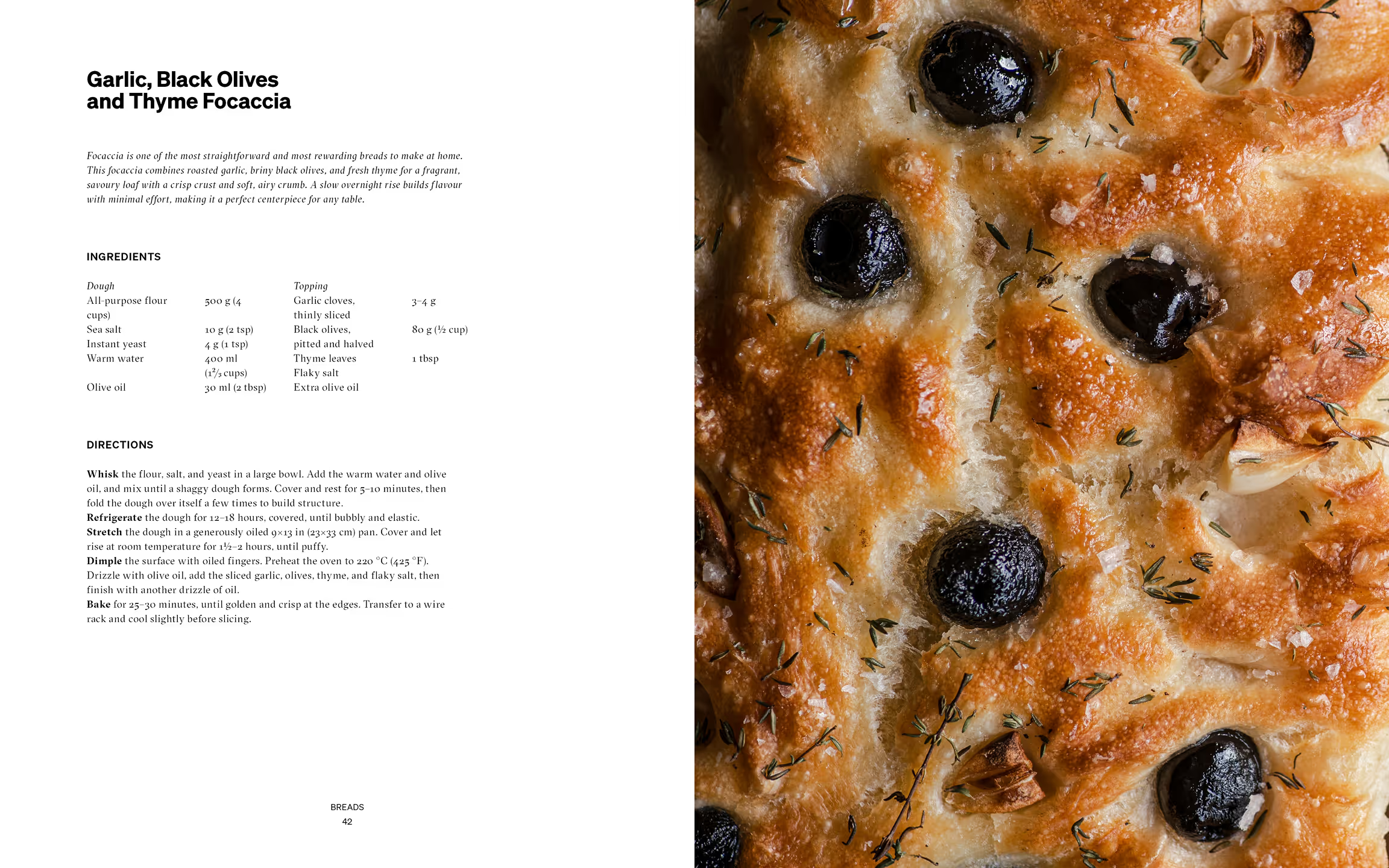
The tone of the publication is neutral and approachable, written in a way that feels accessible to newcomers while still maintaining a refined and polished presence. Visually, the direction draws from moody, artisanal cookbooks, using rustic still-life photography and a consistent, structured layout to support clarity and rhythm throughout the book.

“A process shaped
by patience, material, and time.”

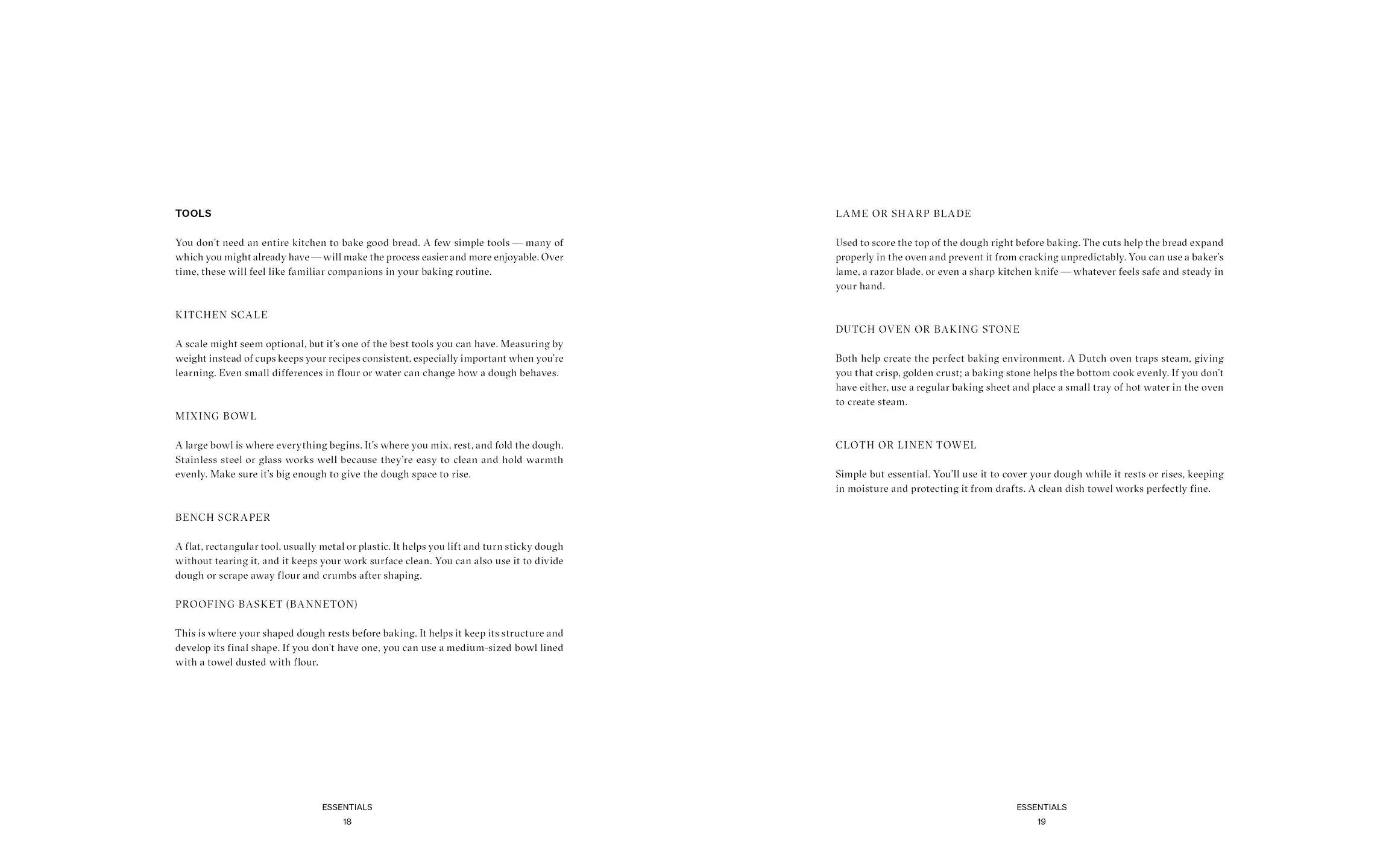
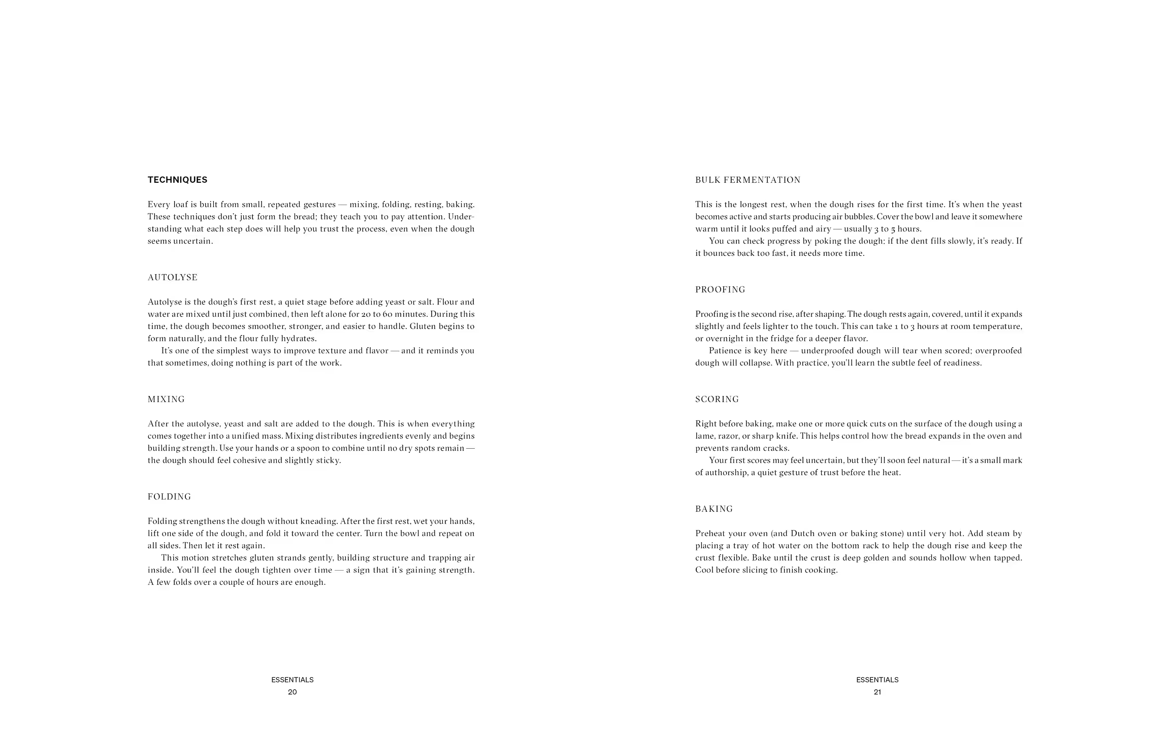
The resulting publication approaches cookbook design with the same philosophy as bread-making itself: simple ingredients, patience, and attention to material detail. The typographic system pairs GT Sectra with Sohne, balancing elegance with clarity.

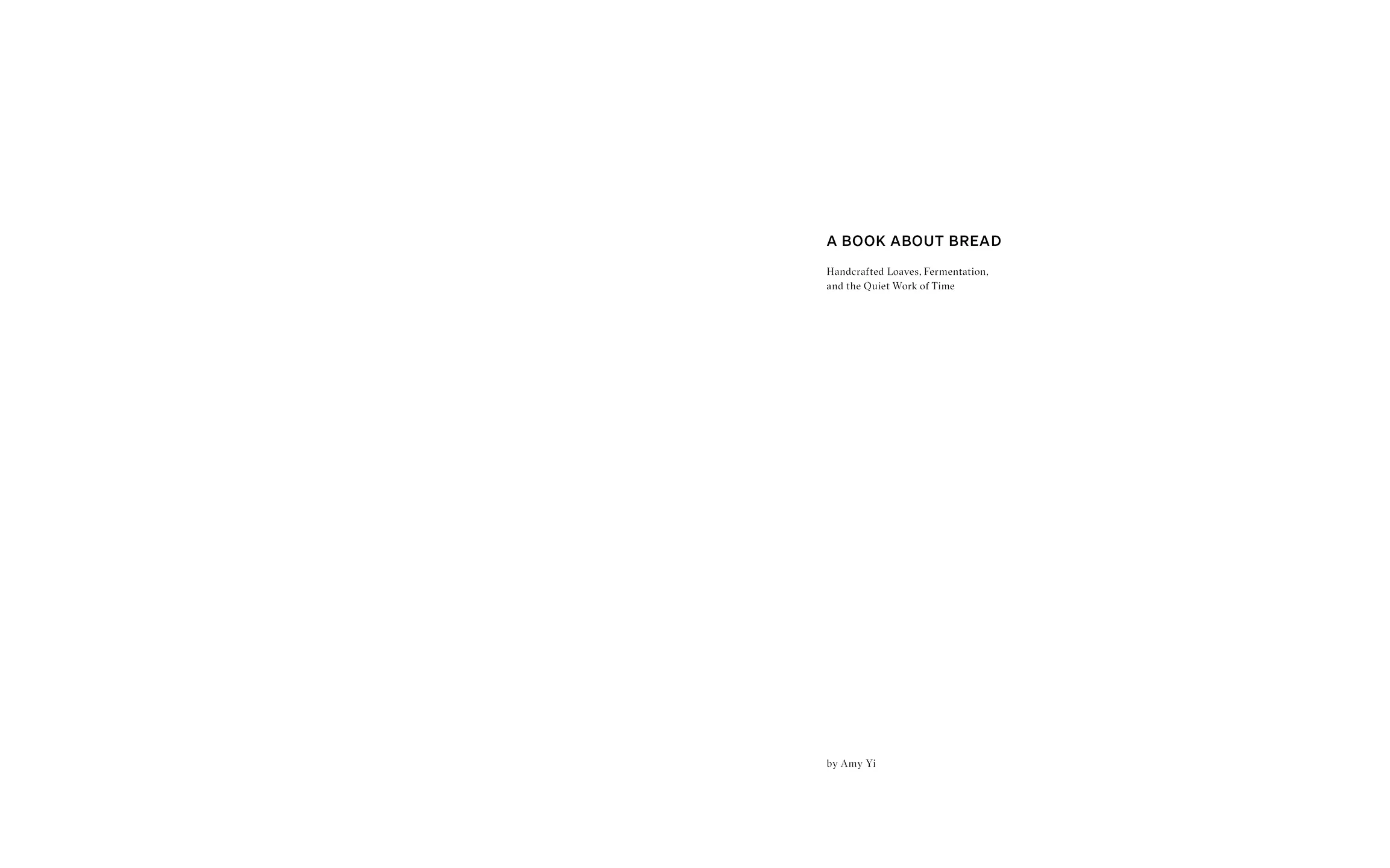
Subheader

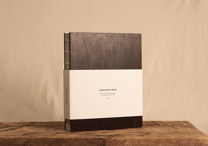
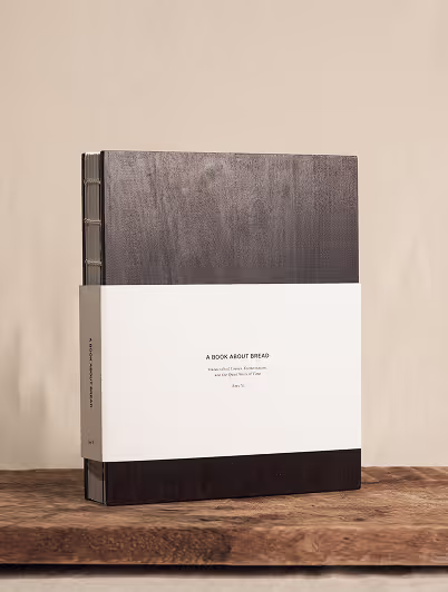
Material choices reinforce the artisanal theme. A wood cover references kitchen surfaces and craft, while Coptic binding exposes the spine, echoing the organic imperfection found in handmade bread.

The interior is printed on 100T text-weight uncoated paper, while felt-textured stock is used for the endpapers and sleeve. These tactile materials introduce a warm, soft quality that reflects the comforting and handcrafted nature of the book.

Photography by Tommy-Paul Keo
A close-up photograph highlighting the barley grains used as the basis for the packaging pattern. The elongated forms and layered arrangement inspired the repeated stitched motif applied throughout the identity system, translating the organic texture of the grain into a simplified visual language.
A close-up view of the stitched surface pattern applied across the reusable grain bags. Repeated linear motifs are embroidered directly onto the neutral fabric, creating a subtle textured detail that adds rhythm, tactility, and visual consistency throughout the packaging system.

Photography by Tommy-Paul Keo
An open reusable fabric grain bag filled with grains, shown alongside a second closed bag in the background. The soft textile materials, visible contents, and minimal color palette highlight the tactile and natural qualities of the packaging system.

Photography by Tommy-Paul Keo

The sleeve remains minimal on the exterior, inviting readers to discover subtle elements once opened, such as bread-printed textures and small narrative moments within the section openers. These understated details reward closer engagement while maintaining the book’s calm and restrained tone.

A Book About Bread

Book Design

Bread-making is a process rooted in craft and patience. From the texture of the dough to the structure of the finished loaf, each stage reveals subtle variations in form and surface.

The goal was to present traditional techniques in a way that feels both approachable and refined. The cookbook is designed for beginner to intermediate bakers seeking a reliable and well-structured guide as they develop their skills.

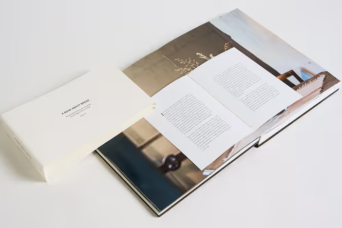
A cookbook exploring breadmaking through slow processes, tactile materials, and quiet editorial pacing. The restrained typography and muted cover composition reflect themes of patience, craftsmanship, and simplicity.

Photography by Tommy-Paul Keo

The project explores the design of a cookbook focused on artisanal bread, examining how publication design can communicate the tactile and process-driven nature of baking while remaining clear and accessible for readers learning the craft.

The tone of the publication is neutral and approachable, written in a way that feels accessible to newcomers while still maintaining a refined and polished presence. Visually, the direction draws from moody, artisanal cookbooks, using rustic still-life photography and a consistent, structured layout to support clarity and rhythm throughout the book.

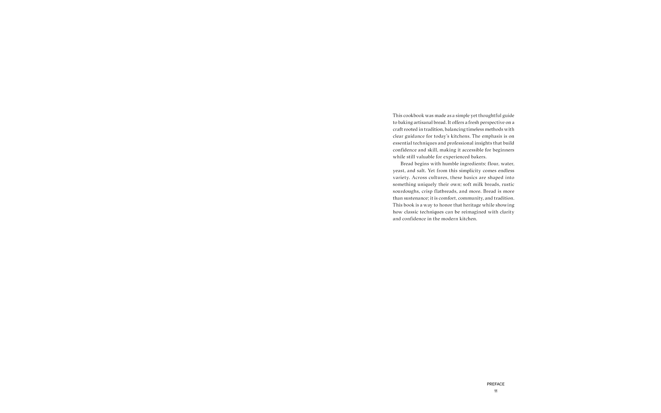
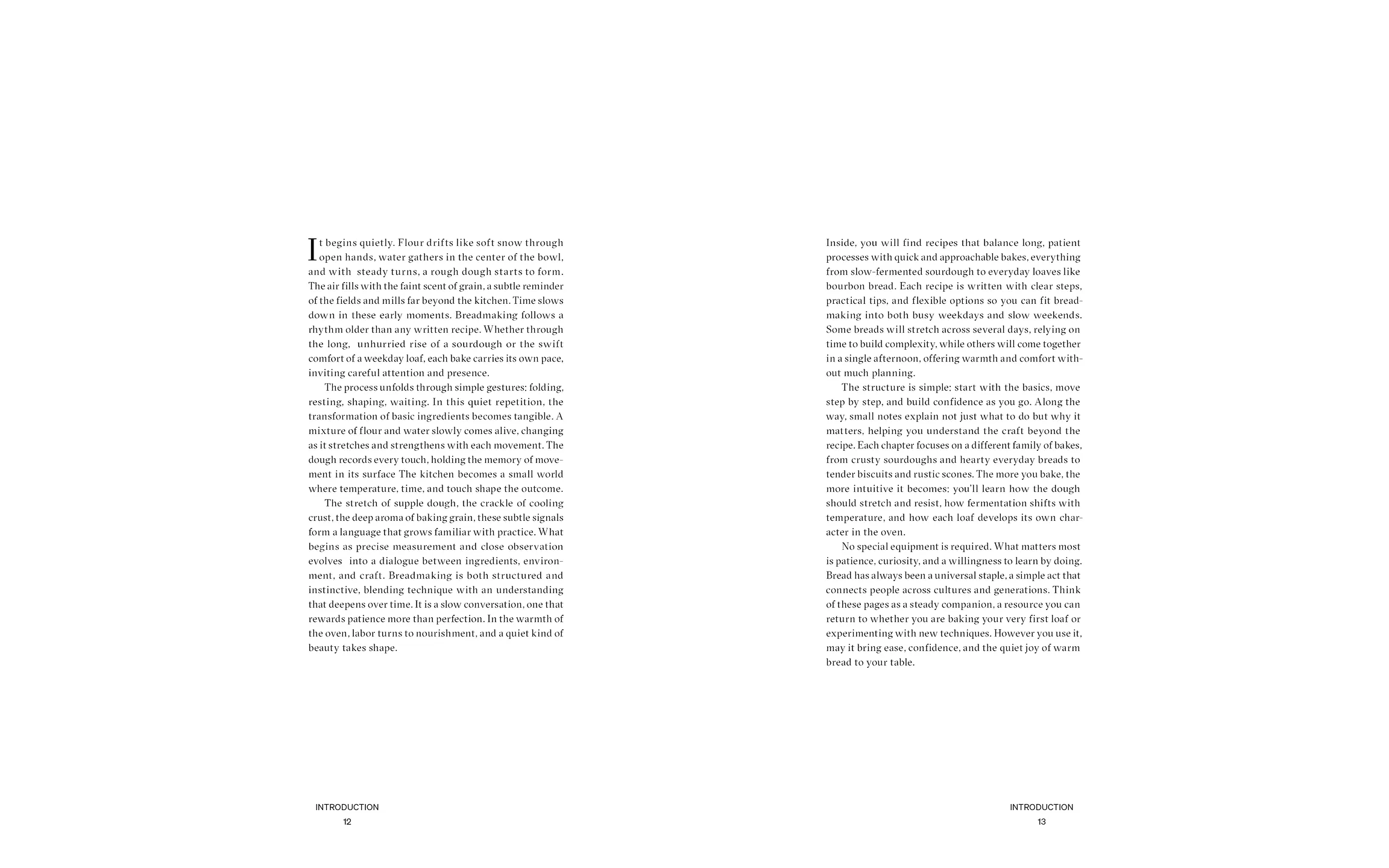
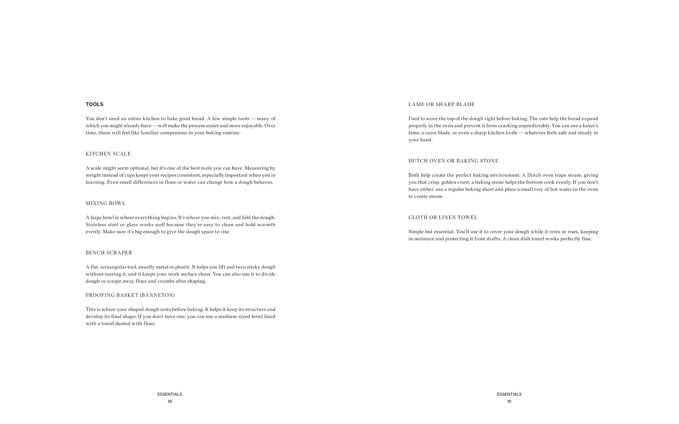
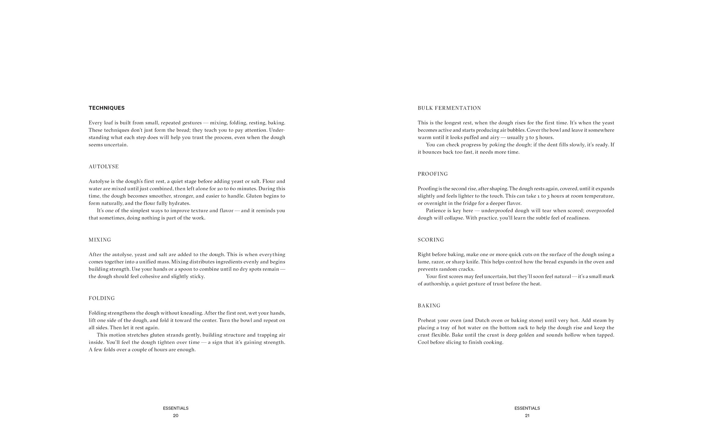
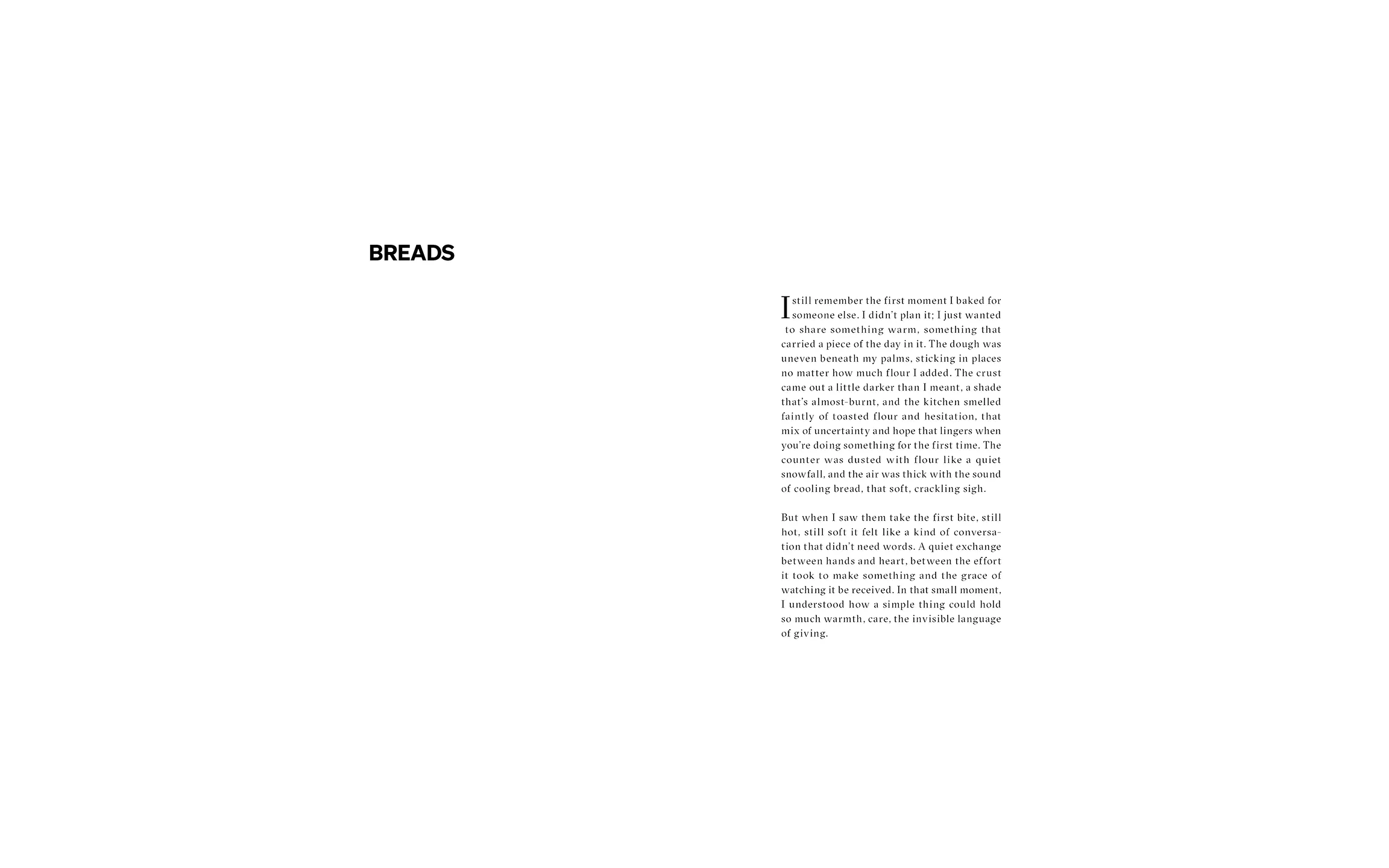
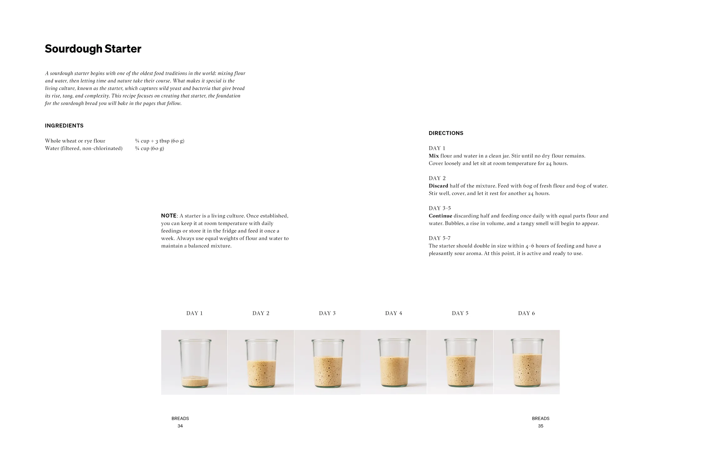
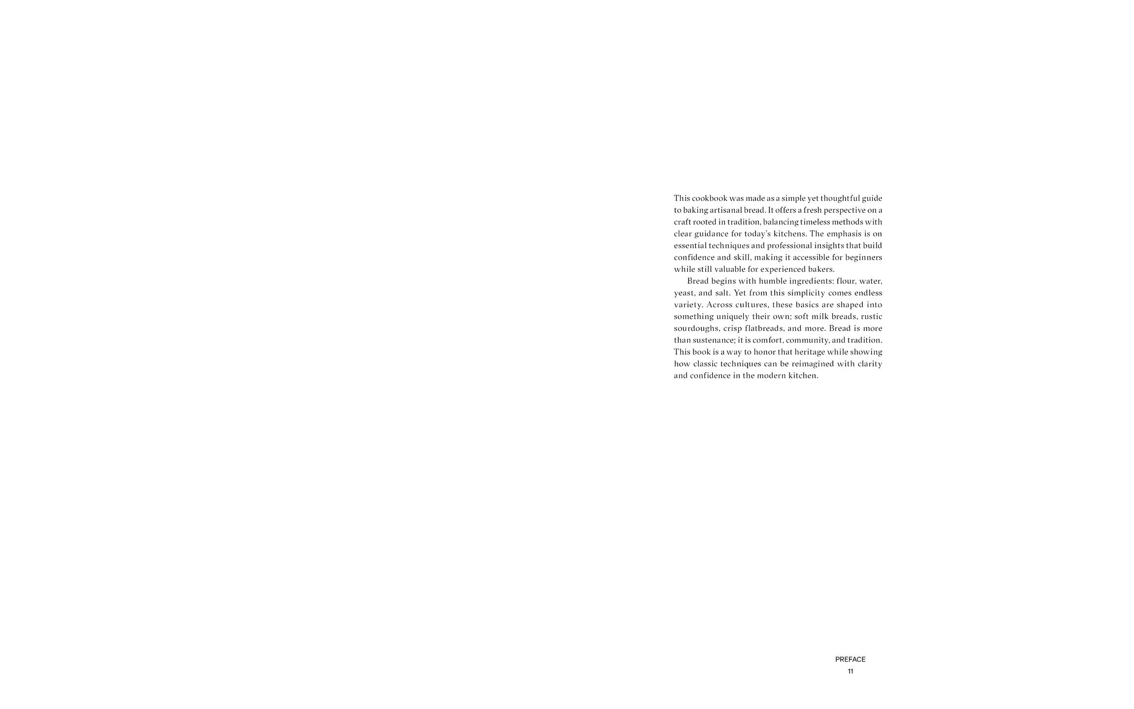
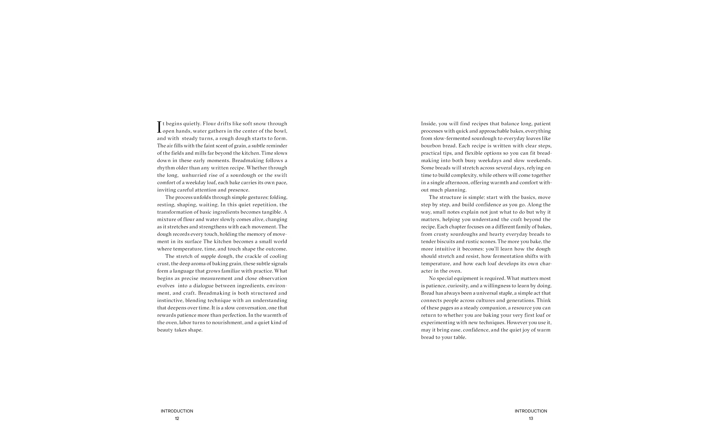
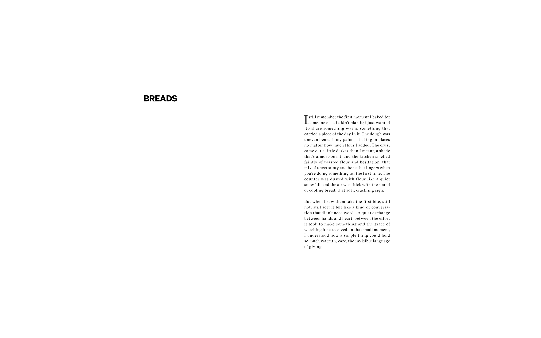
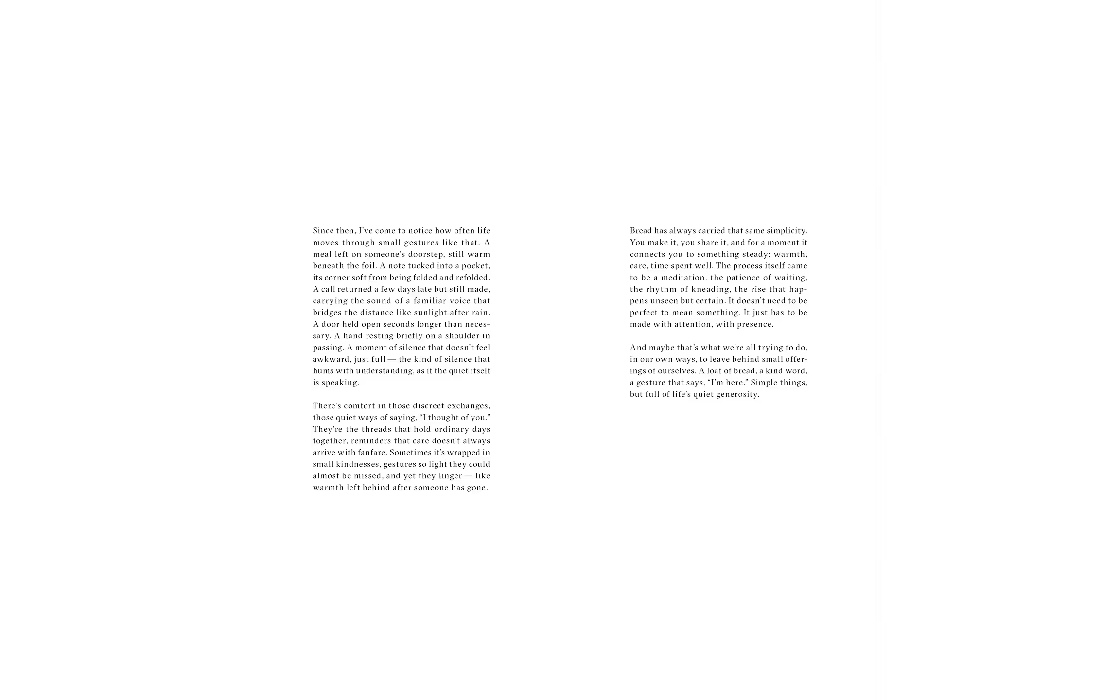
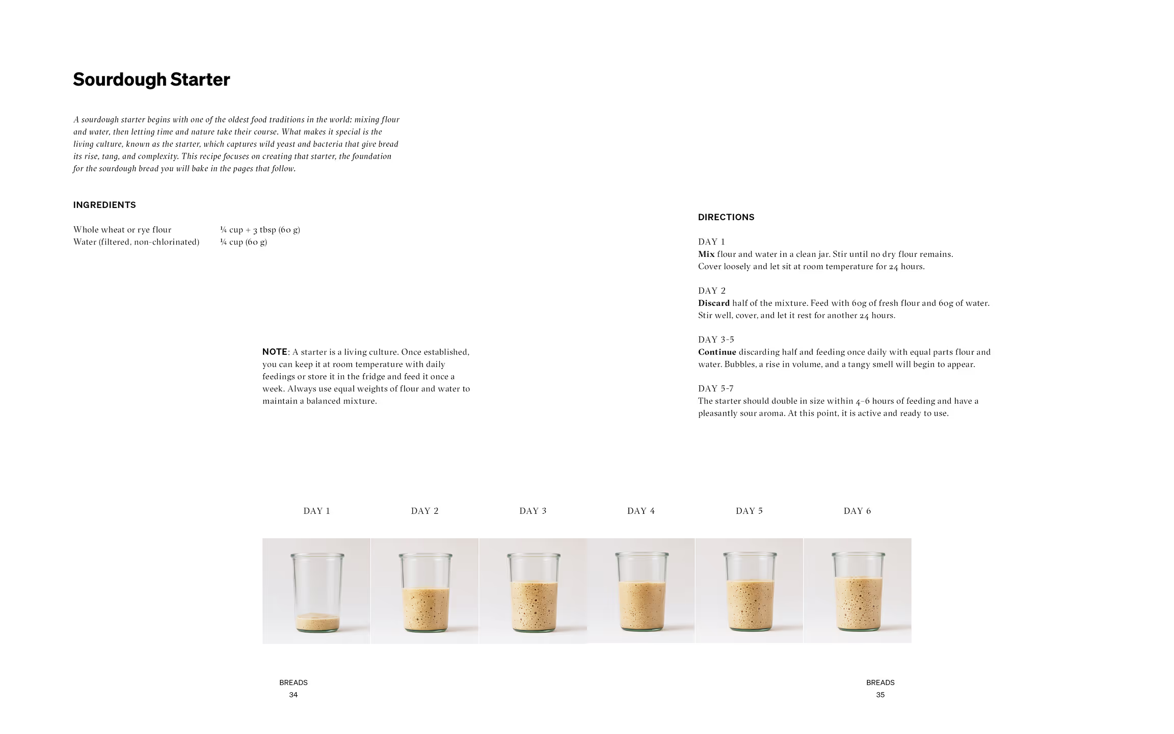
A photographed interior spread showcasing the publication’s layout system, components, pacing, and material qualities. The composition highlights the relationship between imagery, typography, and negative space, reinforcing the publication’s quiet and tactile reading experience.

Photography by Tommy-Paul Keo

“A process shaped by patience, material, and time.”

The resulting publication approaches cookbook design with the same philosophy as bread-making itself: simple ingredients, patience, and attention to material detail. The typographic system pairs GT Sectra with Sohne, balancing elegance with clarity.
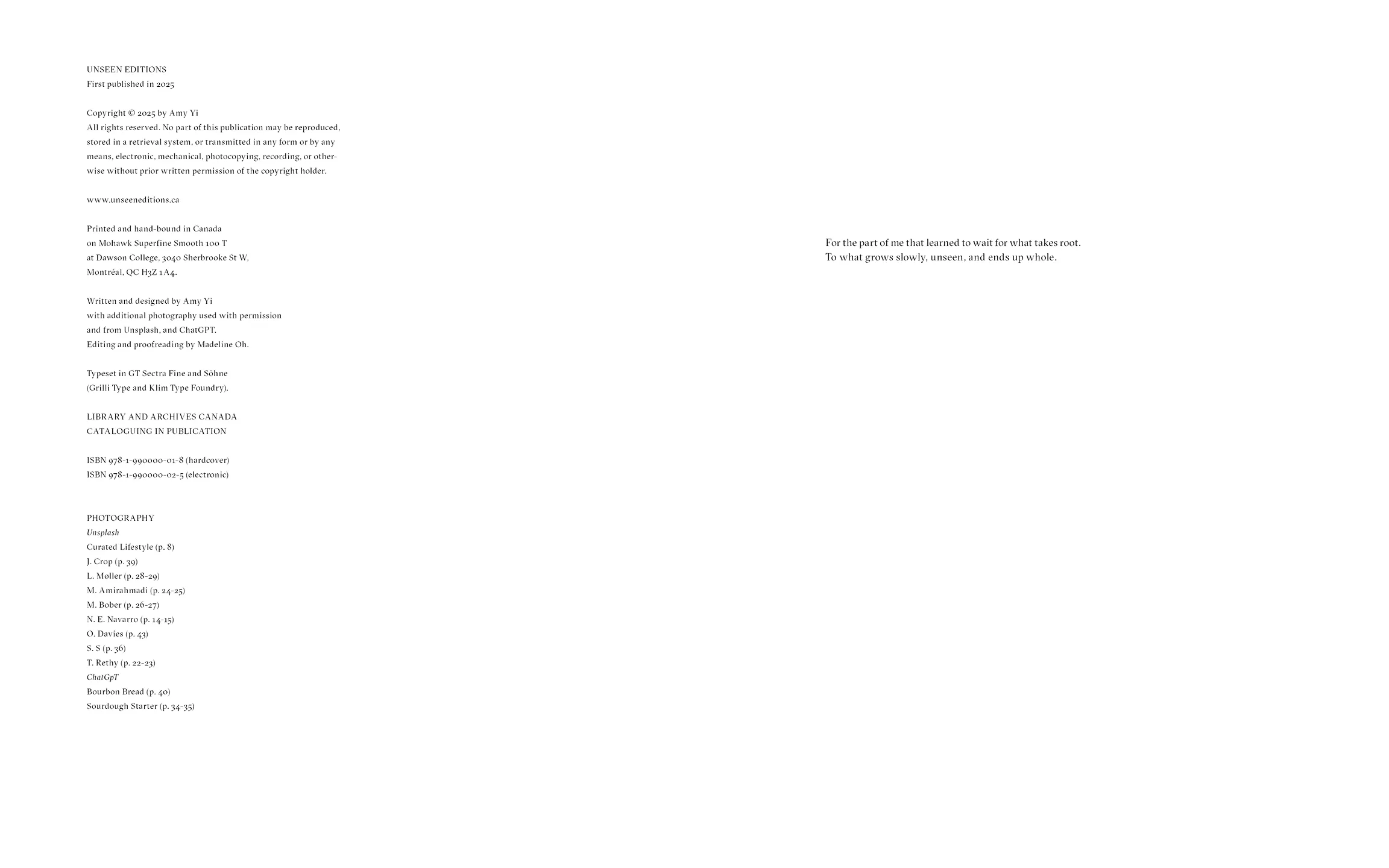
Material choices reinforce the artisanal theme. A wood cover references kitchen surfaces and craft, while Coptic binding exposes the spine, echoing the organic imperfection found in handmade bread.
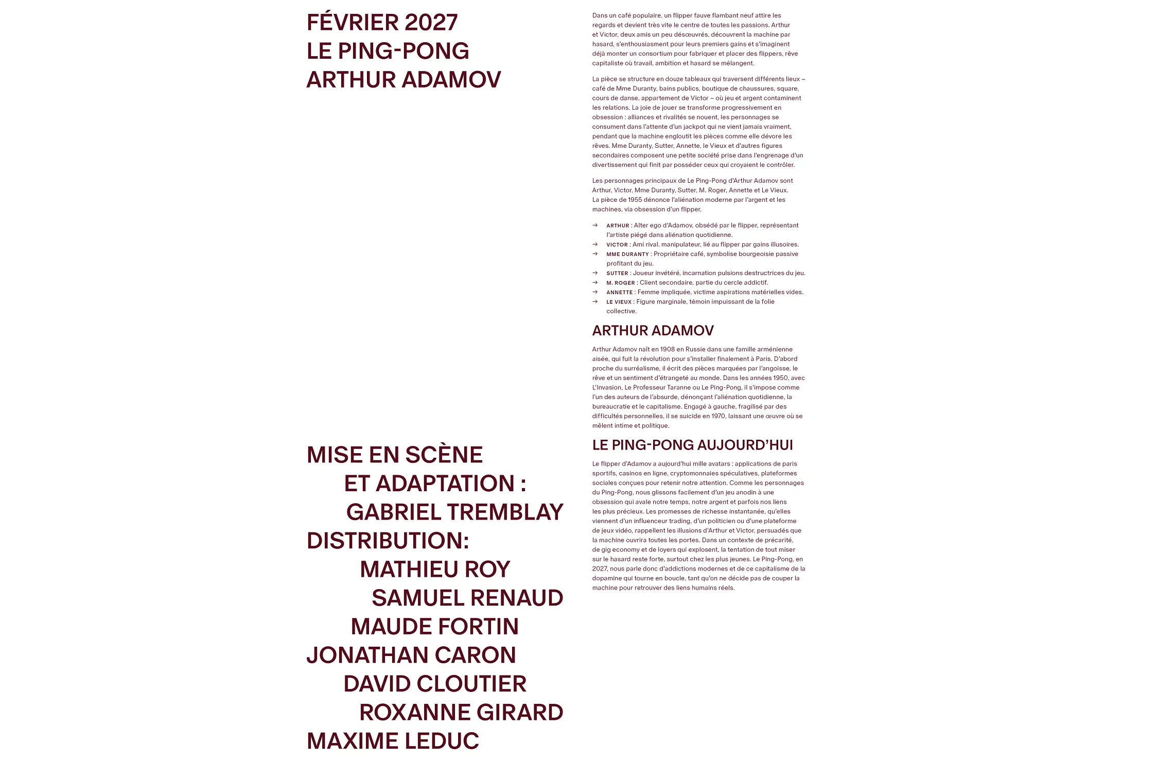
The interior is printed on 100T text-weight uncoated paper, while felt-textured stock is used for the endpapers and sleeve. These tactile materials introduce a warm, soft quality that reflects the comforting and handcrafted nature of the book.

The sleeve remains minimal on the exterior, inviting readers to discover subtle elements once opened, such as bread-printed textures and small narrative moments within the section openers. These understated details reward closer engagement while maintaining the book’s calm and restrained tone.