Everything Squared / Squared Roots

Poster + Promotional Design

Formed in London in 1992, Seefeel blends post-rock, shoegaze, and experimental electronic music, combining live instrumentation with sampling and digital manipulation. In this context, Squared Roots feels airier and more diffuse than its predecessor, Everything Squared, being less of a remix and more of a warped reflection of the original.

From Everything Squared / Squared Roots by Seefeel, the brief was to design concert promotional material that reflects the band’s identity in a cohesive and compelling way.

scroll this way →
Photography by Tommy-Paul Keo
A close-up photograph highlighting the barley grains used as the basis for the packaging pattern. The elongated forms and layered arrangement inspired the repeated stitched motif applied throughout the identity system, translating the organic texture of the grain into a simplified visual language.
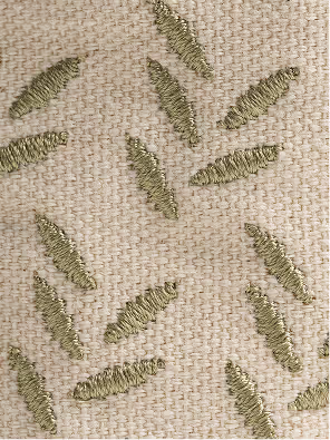
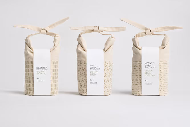
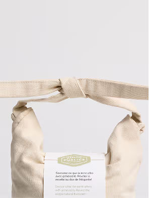
A close-up view of the stitched surface pattern applied across the reusable grain bags. Repeated linear motifs are embroidered directly onto the neutral fabric, creating a subtle textured detail that adds rhythm, tactility, and visual consistency throughout the packaging system.

Photography by Tommy-Paul Keo
An open reusable fabric grain bag filled with grains, shown alongside a second closed bag in the background. The soft textile materials, visible contents, and minimal color palette highlight the tactile and natural qualities of the packaging system.

Photography by Tommy-Paul Keo

I initially struggled to find a direction that reflected both albums. After spending an excessive amount of time listening closely to their music, I experimented with mark-making, but the results felt disconnected from their sound.

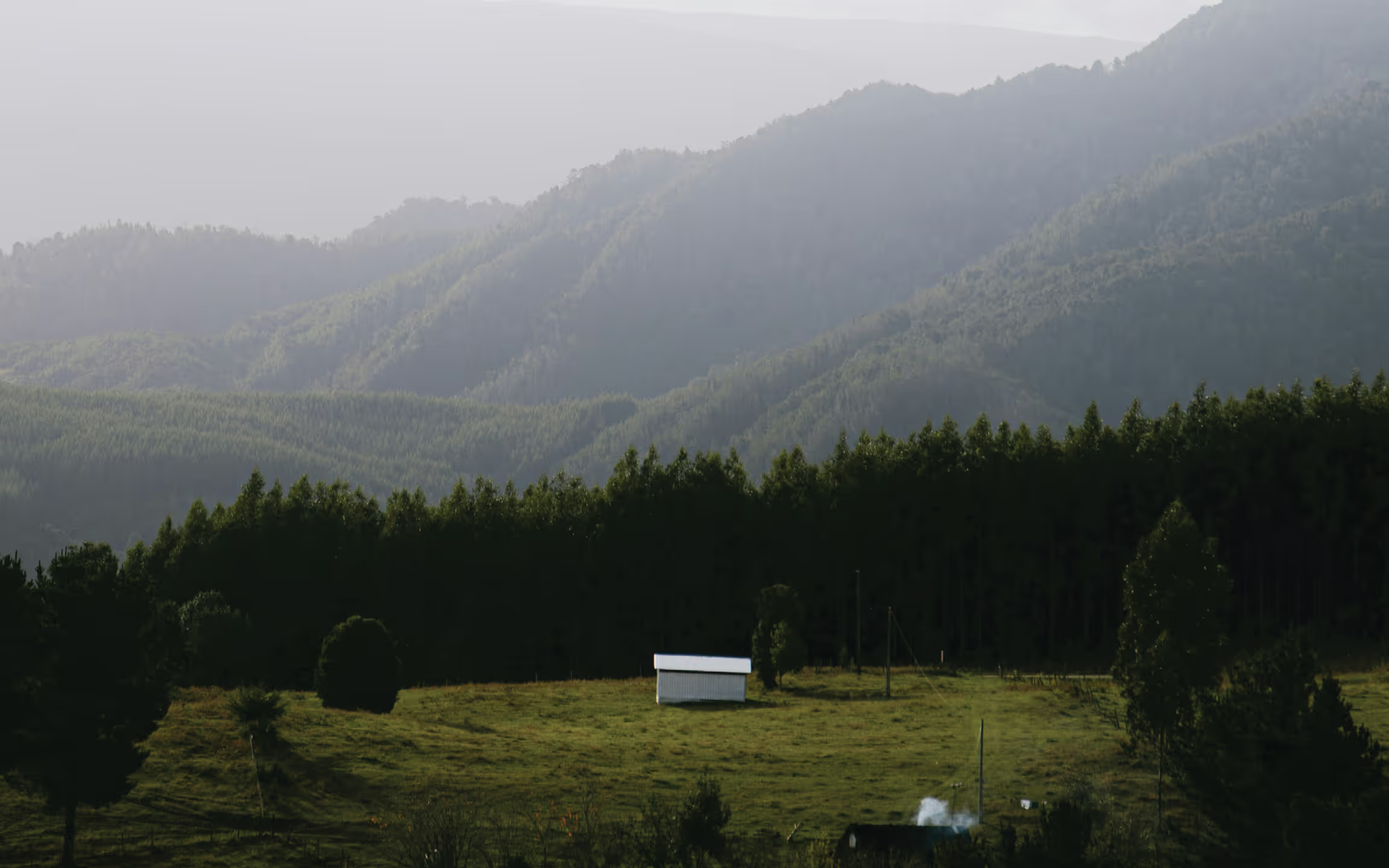
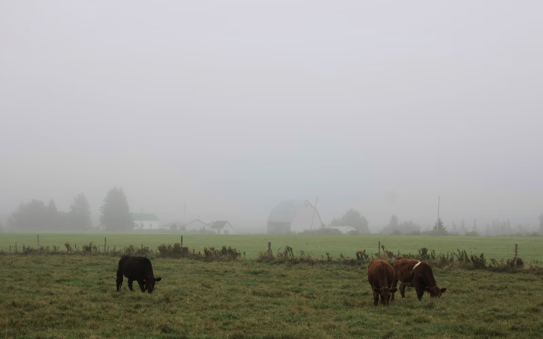
I shifted my approach and went outside to photograph the winter landscape near a river using my old digital camera. The stark visuals and strong contrast naturally echoed the raw, layered qualities of the music.

After editing the images in black and white, I printed them and cut each photograph into squares, rearranging the pieces within each image to construct new grid compositions. Once I found a composition that worked, I scanned it to form the foundation of the poster.

“A process shaped
by patience, material, and time.”

This process resulted in an organized chaos that reflects the atmosphere of Seefeel’s Everything Squared / Squared Roots. Their music feels both meditative and uneasy, and the poster aims to convey a similar experience.

The grid composition was constructed by hand, scanned, and digitally inverted, with tonal and color adjustments made in Photoshop. This process preserved the tactile halftone texture while introducing a slightly synthetic palette that reflects the band’s blend of organic instrumentation and electronic sound.

Bold typography cuts across the delicate background, creating tension between structure and disruption. A monospaced typeface was used for supporting information, adding a colder, technical contrast to the organic imagery.
Subheader

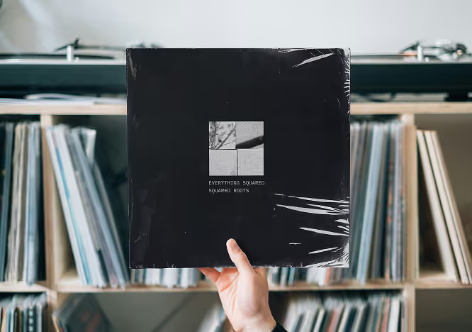
The visual language was later extended across additional formats, including a vinyl sleeve and social media applications.

Subheader

To reflect the layered, fragmented quality of the music, the vinyl cover incorporates overlapping elements, multiple folds, and a structure derived from the poster’s square-based grid. A more intimate tone is introduced through negative space, quieter typography, and the use of natural elements.

The folding structure encourages tactility and discovery while remaining functional, protecting the record and allowing for easy handling. Overall, the design reveals a more restrained side of the project, balancing the poster’s expressive qualities with a quieter, more immersive experience.

Everything Squared / Squared Roots

Poster + Promotional Design

Formed in London in 1992, Seefeel blends post-rock, shoegaze, and experimental electronic music, combining live instrumentation with sampling and digital manipulation. In this context, Squared Roots feels airier and more diffuse than its predecessor, Everything Squared, being less of a remix and more of a warped reflection of the original.

From Everything Squared / Squared Roots by Seefeel, the brief was to design concert promotional material that reflects the band’s identity in a cohesive and compelling way.

I initially struggled to find a direction that reflected both albums. After spending an excessive amount of time listening closely to their music, I experimented with mark-making, but the results felt disconnected from their sound.

I shifted my approach and went outside to photograph the winter landscape near a river using my old digital camera. The stark visuals and strong contrast naturally echoed the raw, layered qualities of the music.

After editing the images in black and white, I printed them and cut each photograph into squares, rearranging the pieces within each image to construct new grid compositions. Once I found a composition that worked, I scanned it to form the foundation of the poster.

“A process shaped
by patience, material, and time.”

This process resulted in an organized chaos that reflects the atmosphere of Seefeel’s Everything Squared / Squared Roots. Their music feels both meditative and uneasy, and the poster aims to convey a similar experience.

The grid composition was constructed by hand, scanned, and digitally inverted, with tonal and color adjustments made in Photoshop. This process preserved the tactile halftone texture while introducing a slightly synthetic palette that reflects the band’s blend of organic instrumentation and electronic sound.

Bold typography cuts across the delicate background, creating tension between structure and disruption. A monospaced typeface was used for supporting information, adding a colder, technical contrast to the organic imagery.
The visual language was later extended across additional formats, including a vinyl sleeve and social media applications.
To reflect the layered, fragmented quality of the music, the vinyl cover incorporates overlapping elements, multiple folds, and a structure derived from the poster’s square-based grid. A more intimate tone is introduced through negative space, quieter typography, and the use of natural elements.

The folding structure encourages tactility and discovery while remaining functional, protecting the record and allowing for easy handling. Overall, the design reveals a more restrained side of the project, balancing the poster’s expressive qualities with a quieter, more immersive experience.