Theatre of the Absurd

Publication Design

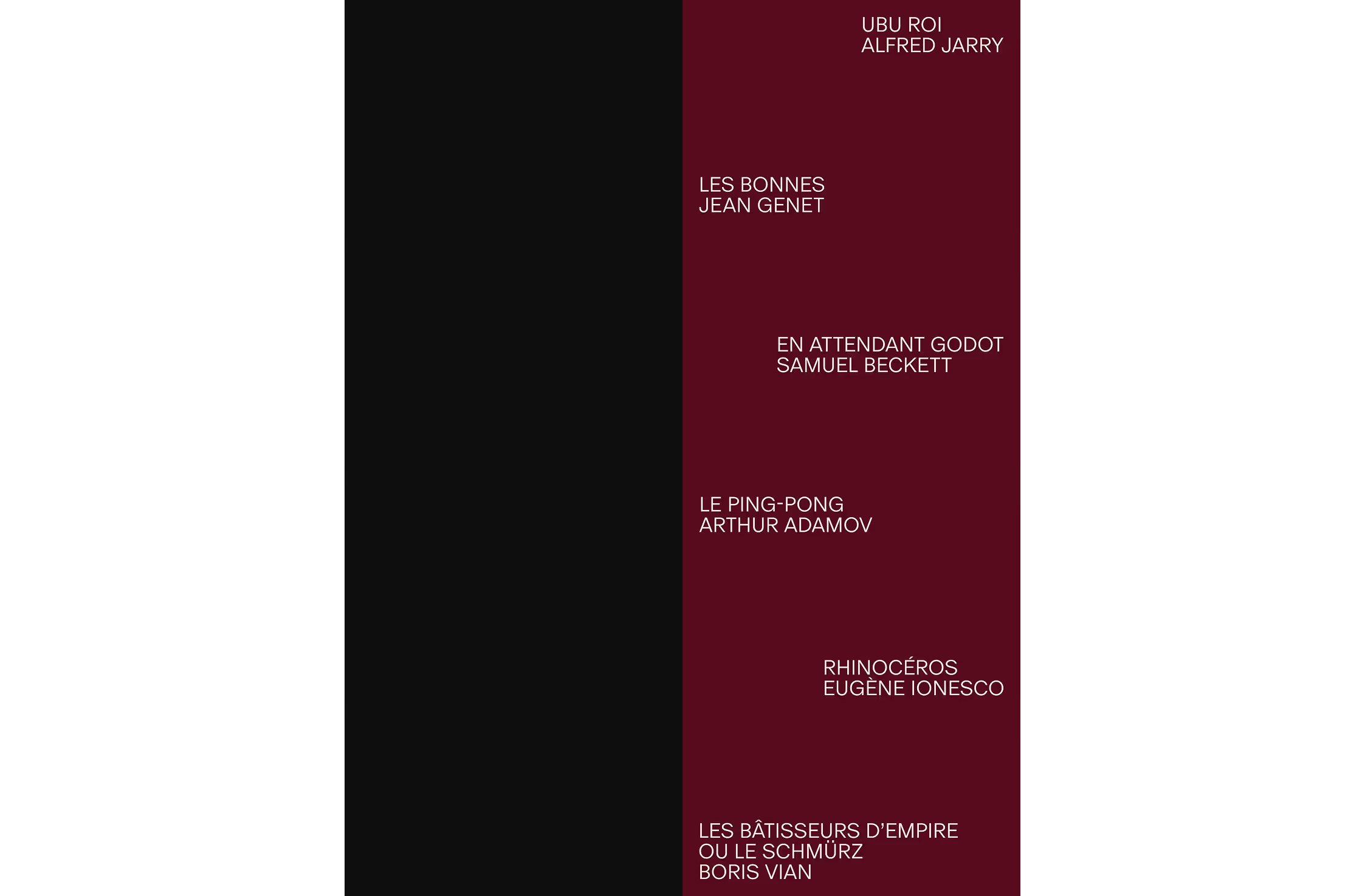
Theatre of the Absurd describes plays that portray human existence as uncertain and often illogical, frequently using interrupted dialogue, repetition, and unconventional narrative structures.

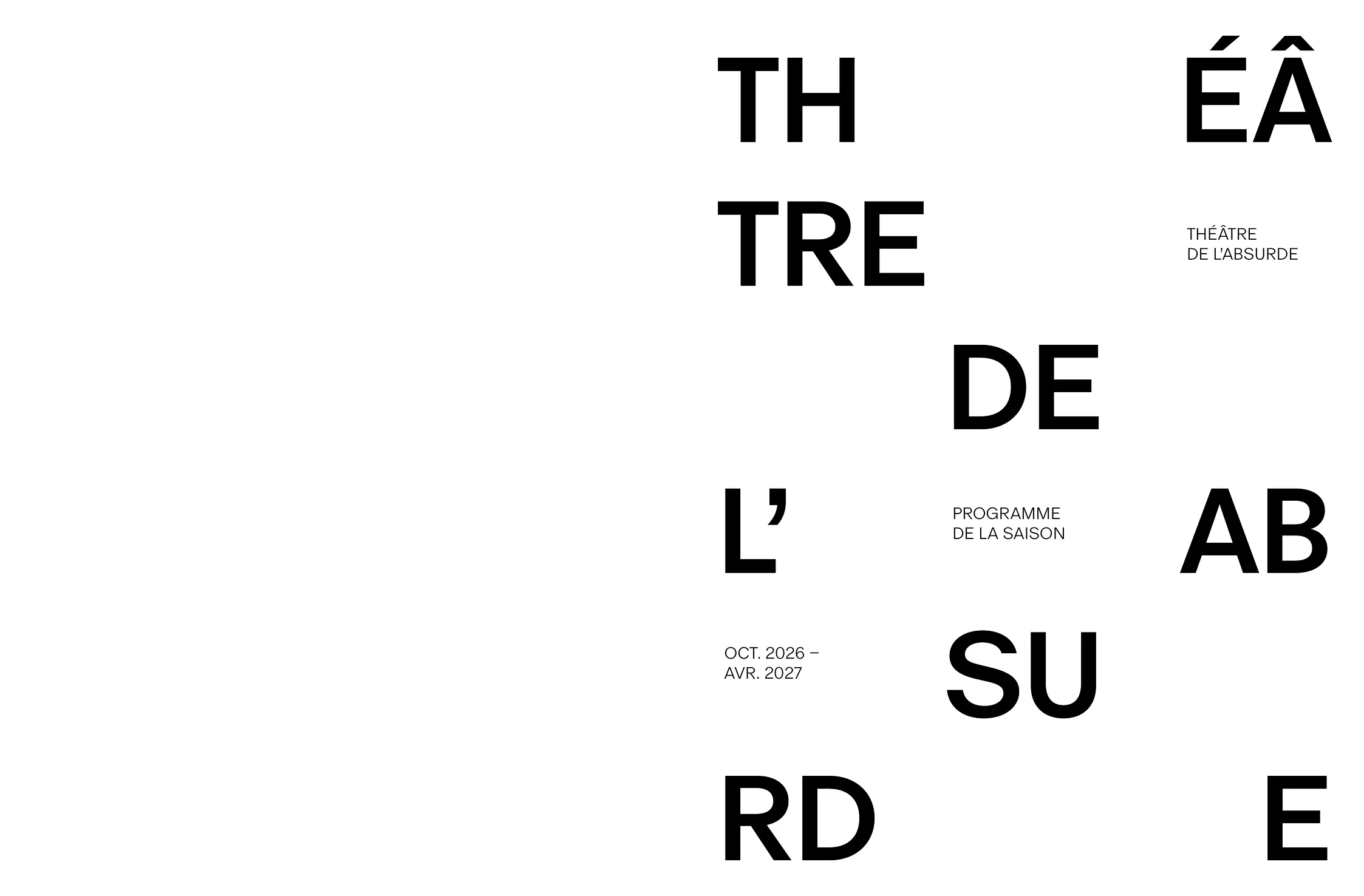
The project was to design a theatre program for Theatre of the Absurd. The program needed to function both as a promotional piece for upcoming productions and as a record documenting the season’s plays, cast members, and creative teams.

scroll this way →
Photography by Tommy-Paul Keo
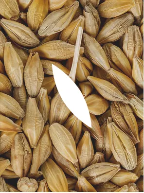
A close-up photograph highlighting the barley grains used as the basis for the packaging pattern. The elongated forms and layered arrangement inspired the repeated stitched motif applied throughout the identity system, translating the organic texture of the grain into a simplified visual language.
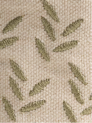
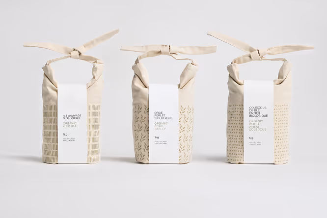
A close-up view of the stitched surface pattern applied across the reusable grain bags. Repeated linear motifs are embroidered directly onto the neutral fabric, creating a subtle textured detail that adds rhythm, tactility, and visual consistency throughout the packaging system.

Photography by Tommy-Paul Keo
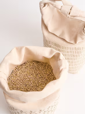
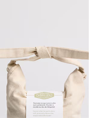
An open reusable fabric grain bag filled with grains, shown alongside a second closed bag in the background. The soft textile materials, visible contents, and minimal color palette highlight the tactile and natural qualities of the packaging system.

Photography by Tommy-Paul Keo

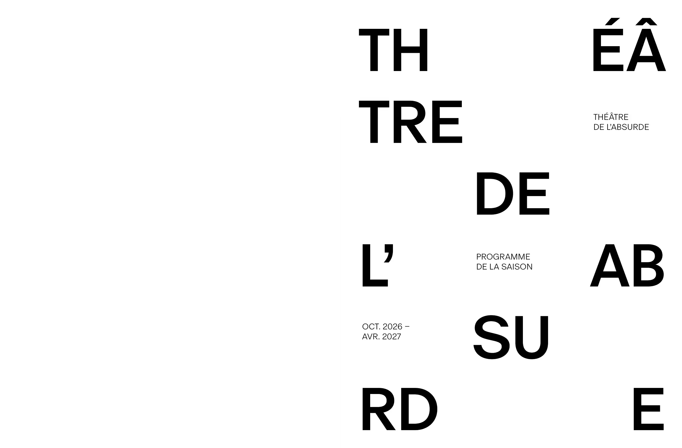
The design approach highlights the logic of absurdist theatre. Instead of presenting information in
a strictly linear way, the brochure invites readers to encounter visual and emotional elements first,
with informational content revealed more deliberately afterward. This reverses the typical hierarchy of theatre programs, where text usually leads the experience.

“A process shaped
by patience, material, and time.”

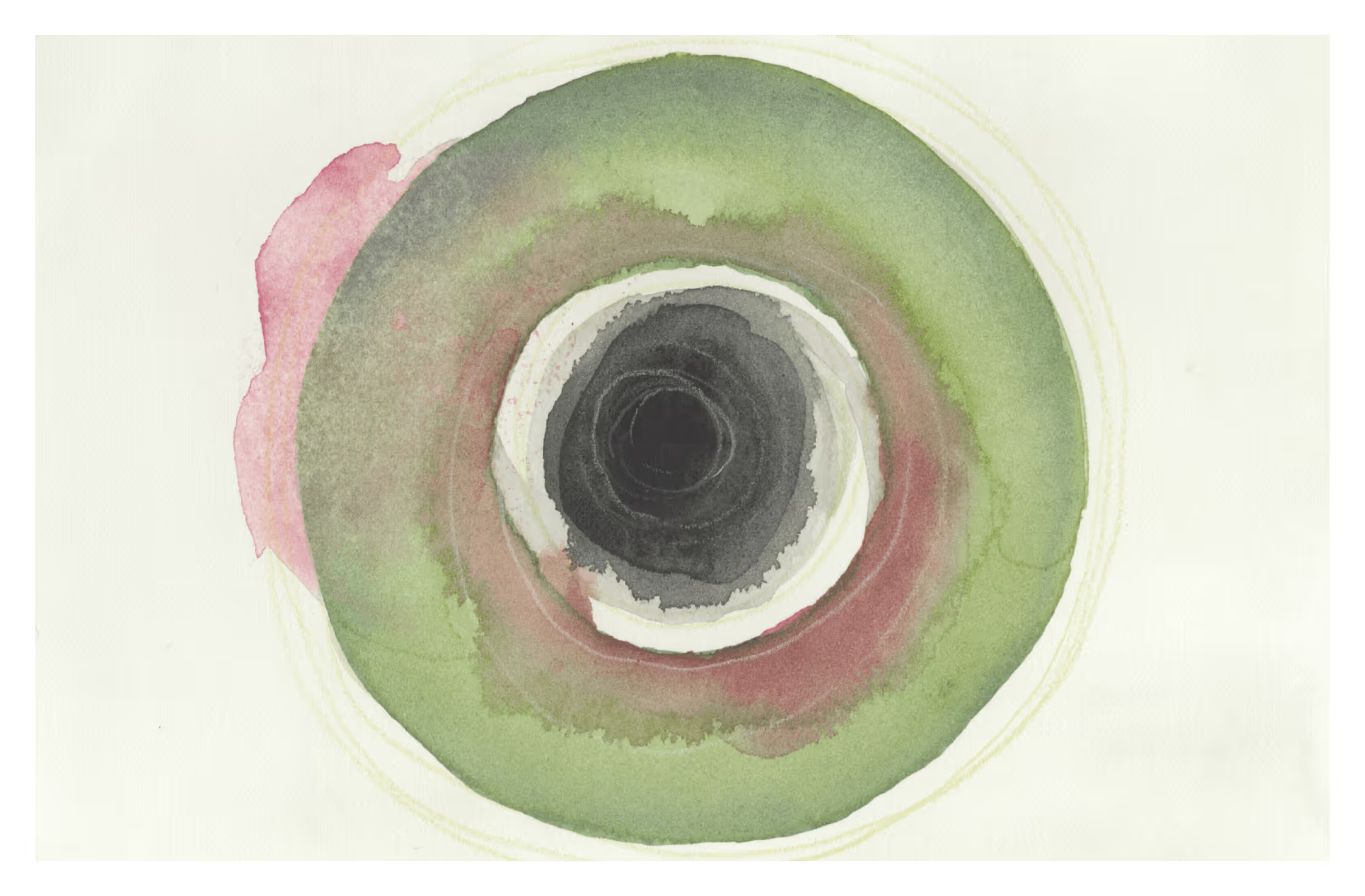
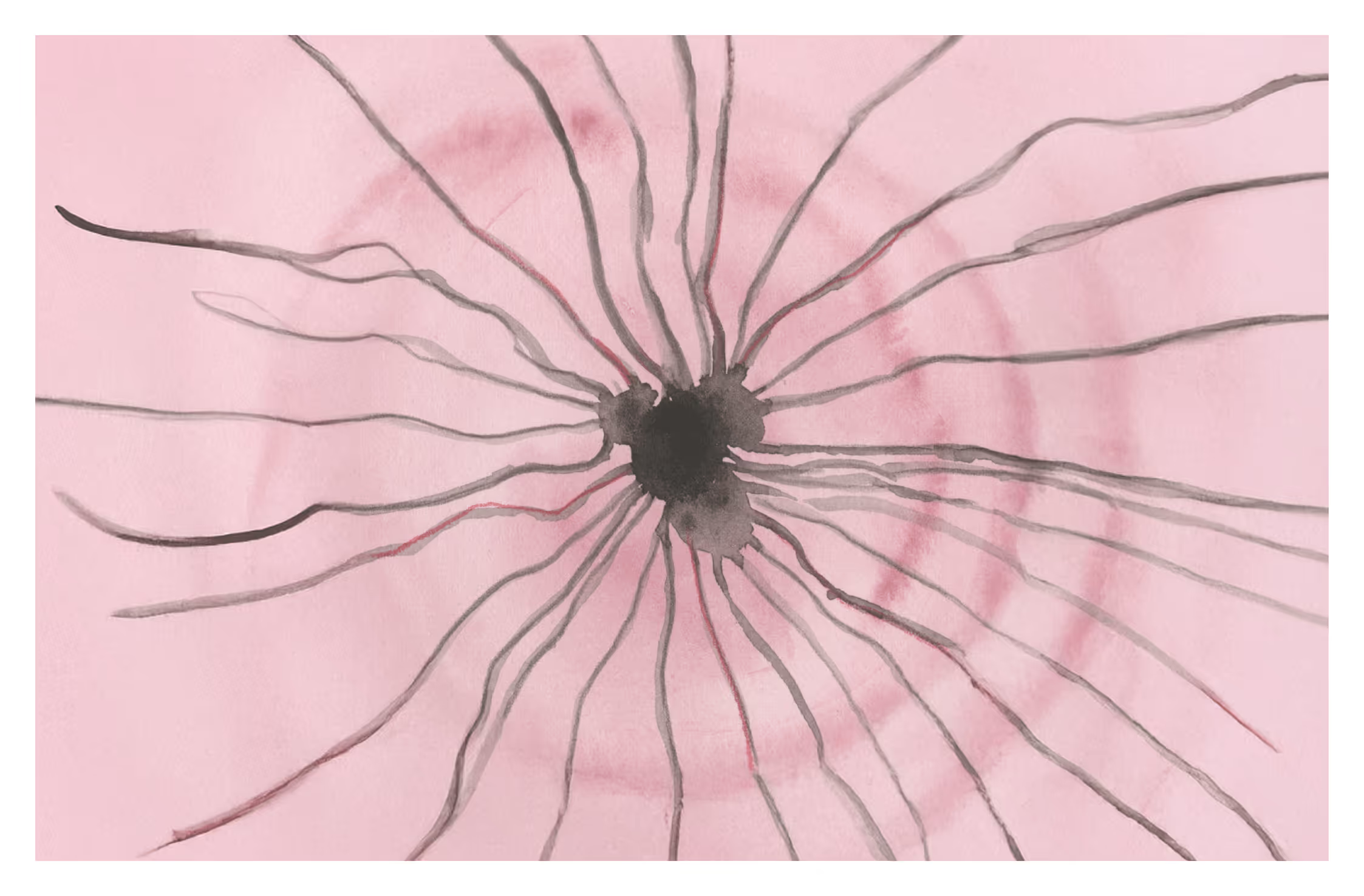
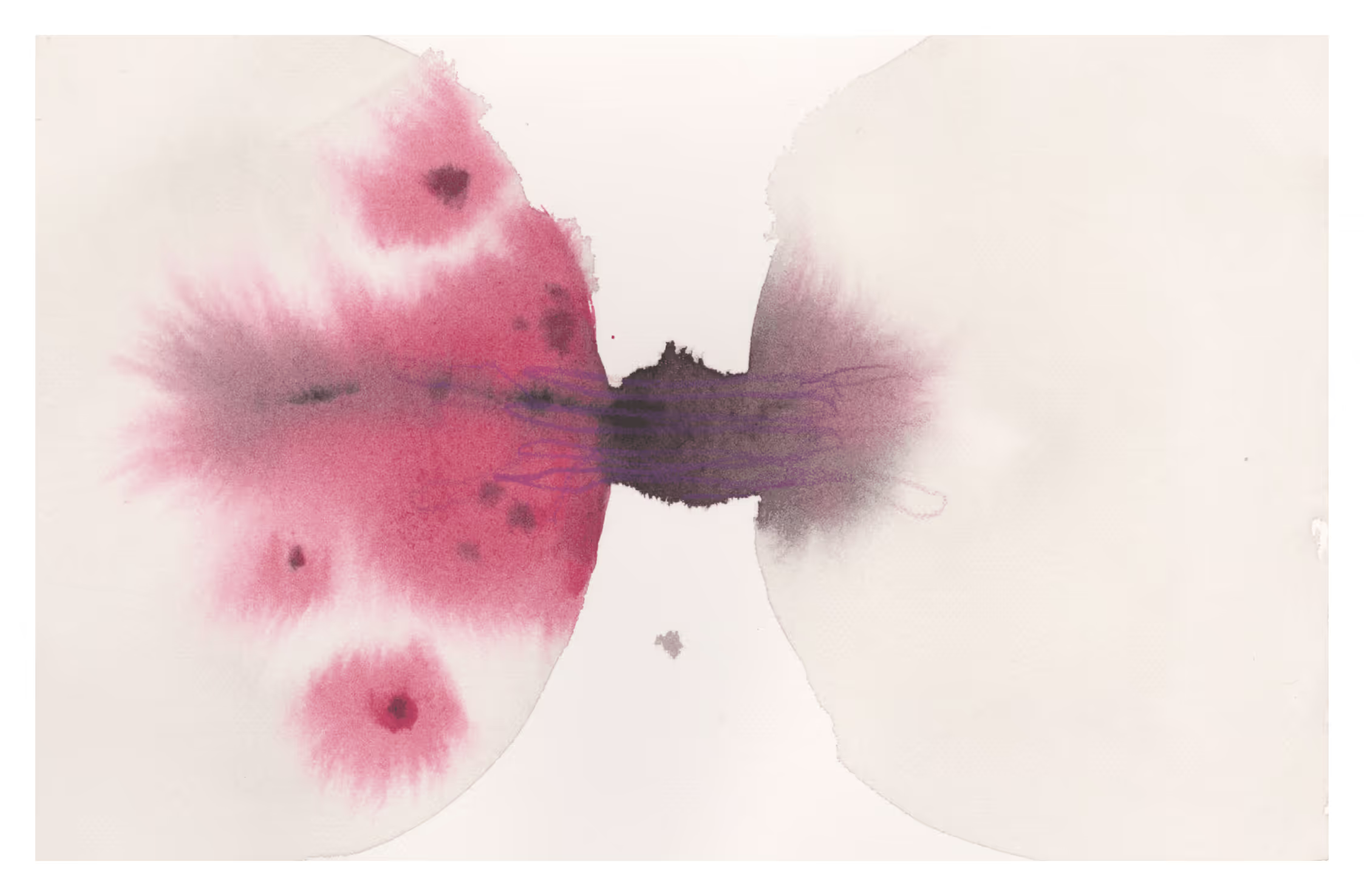
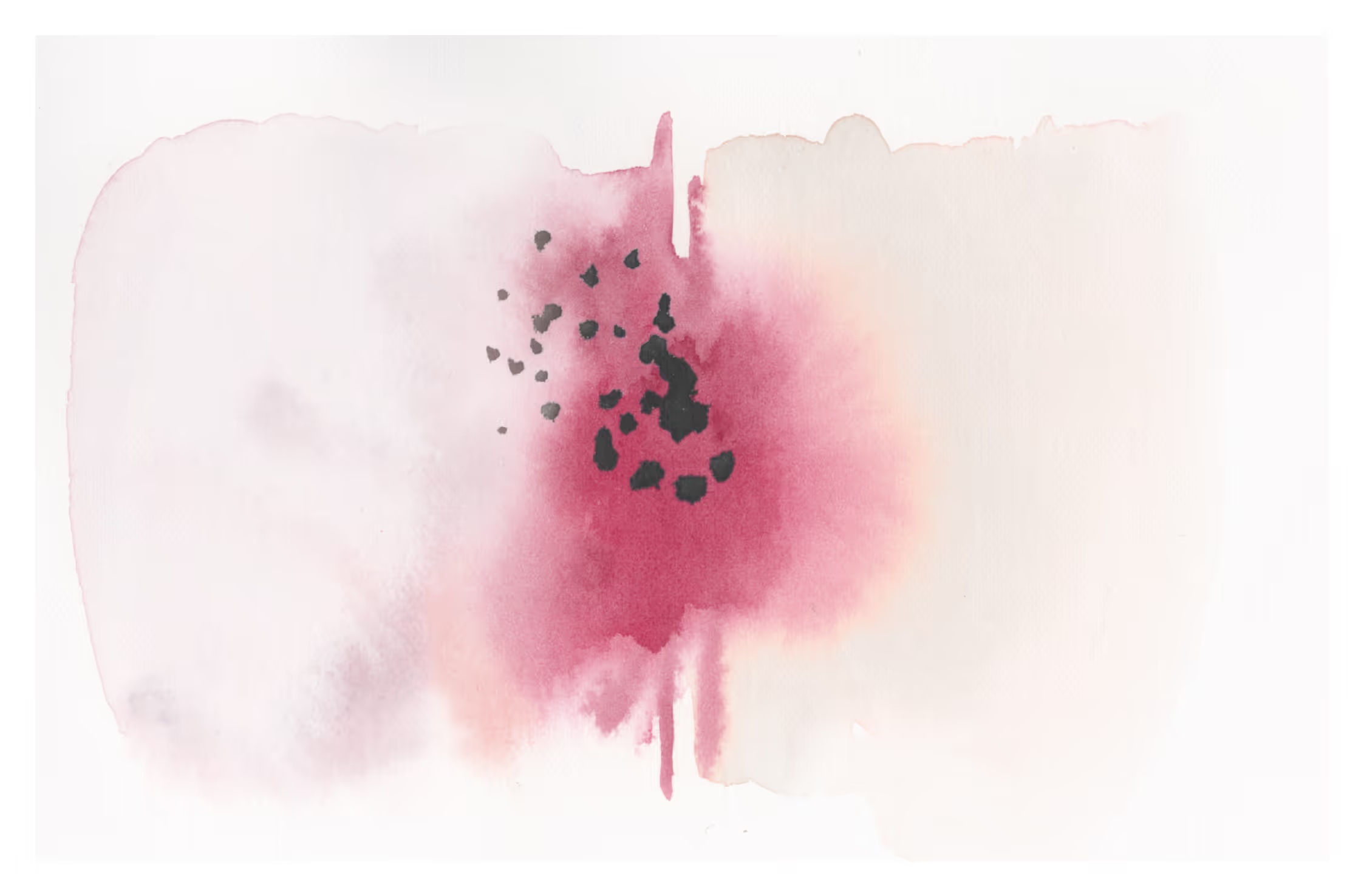
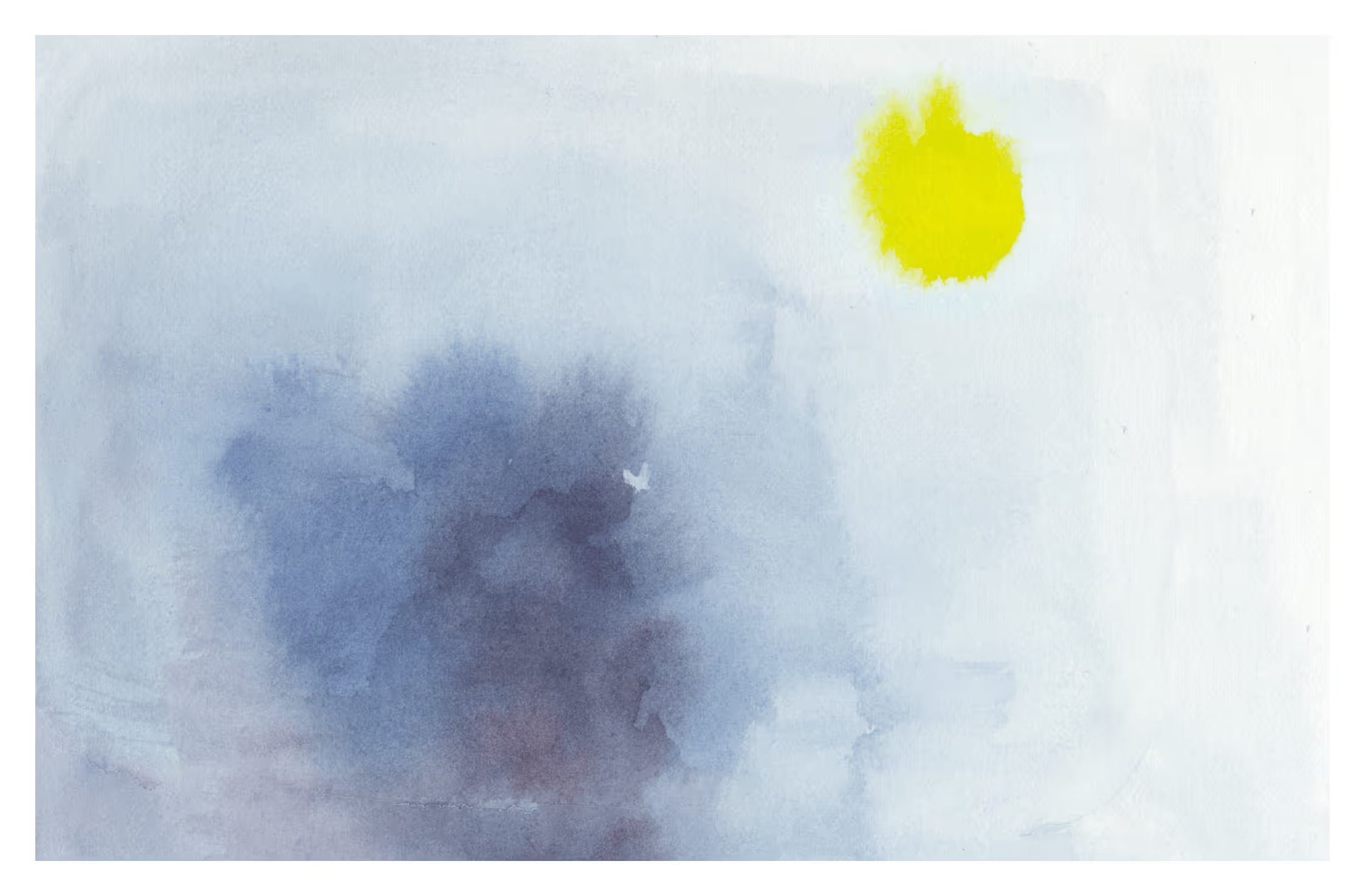
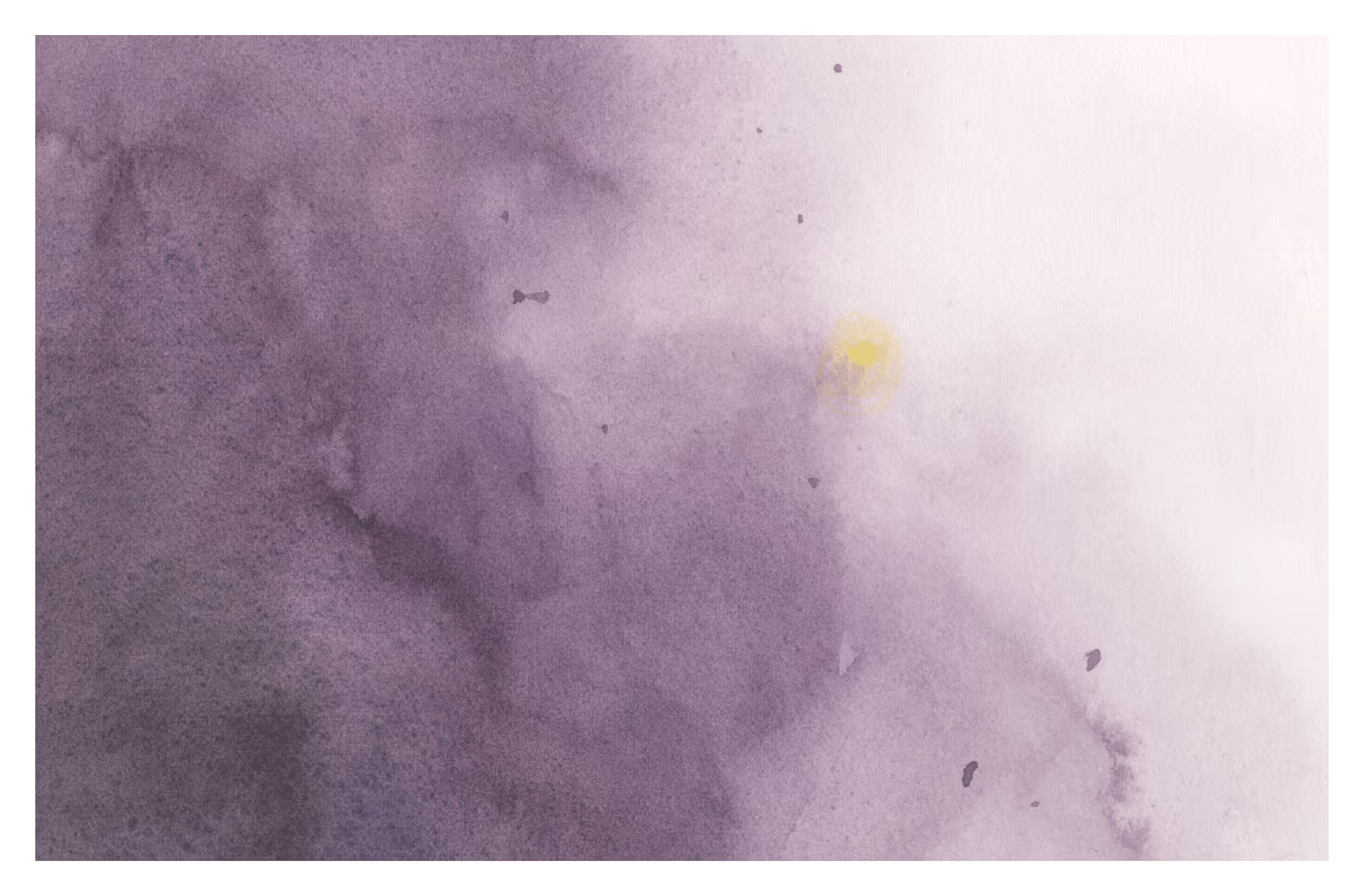
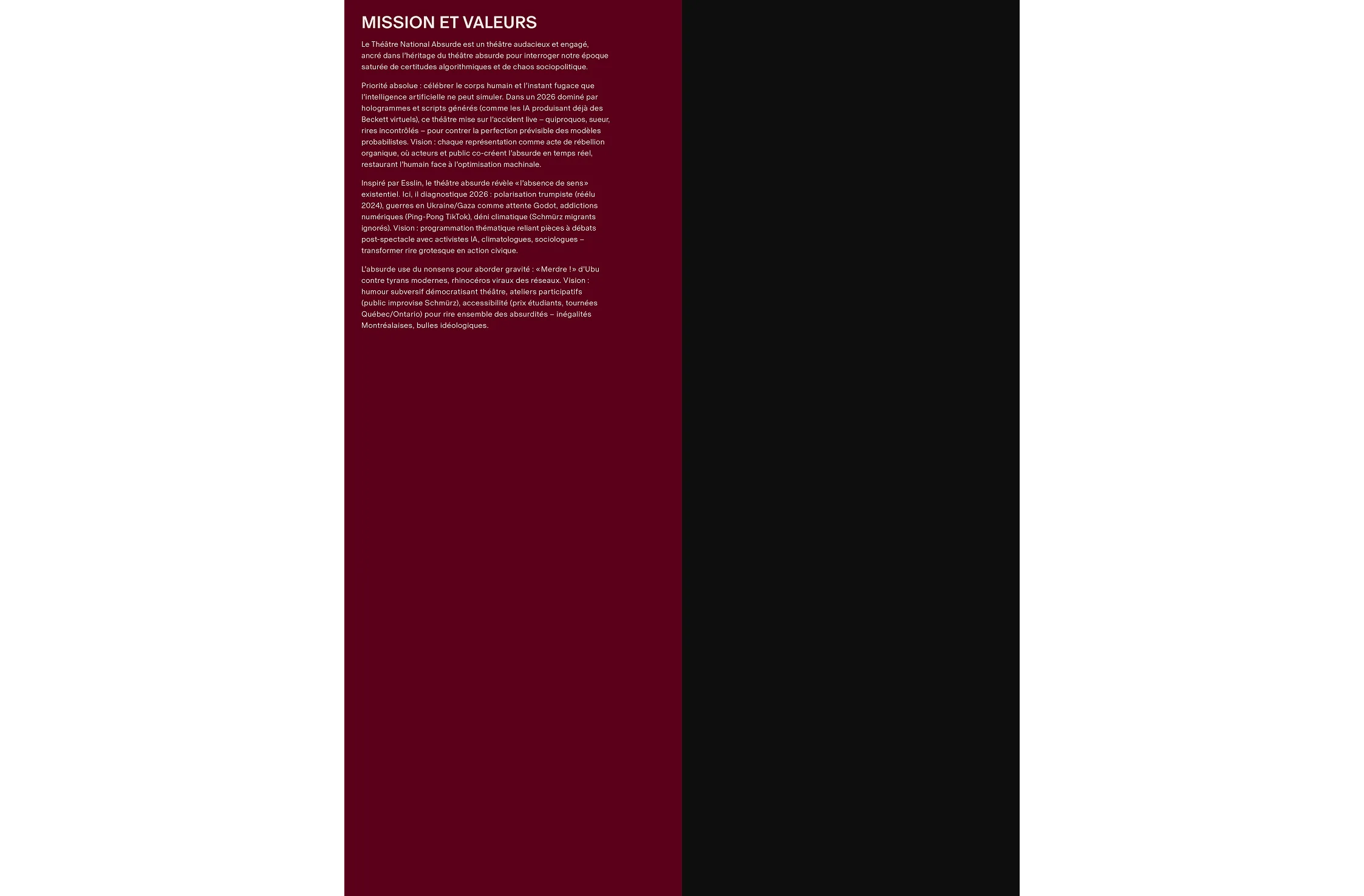
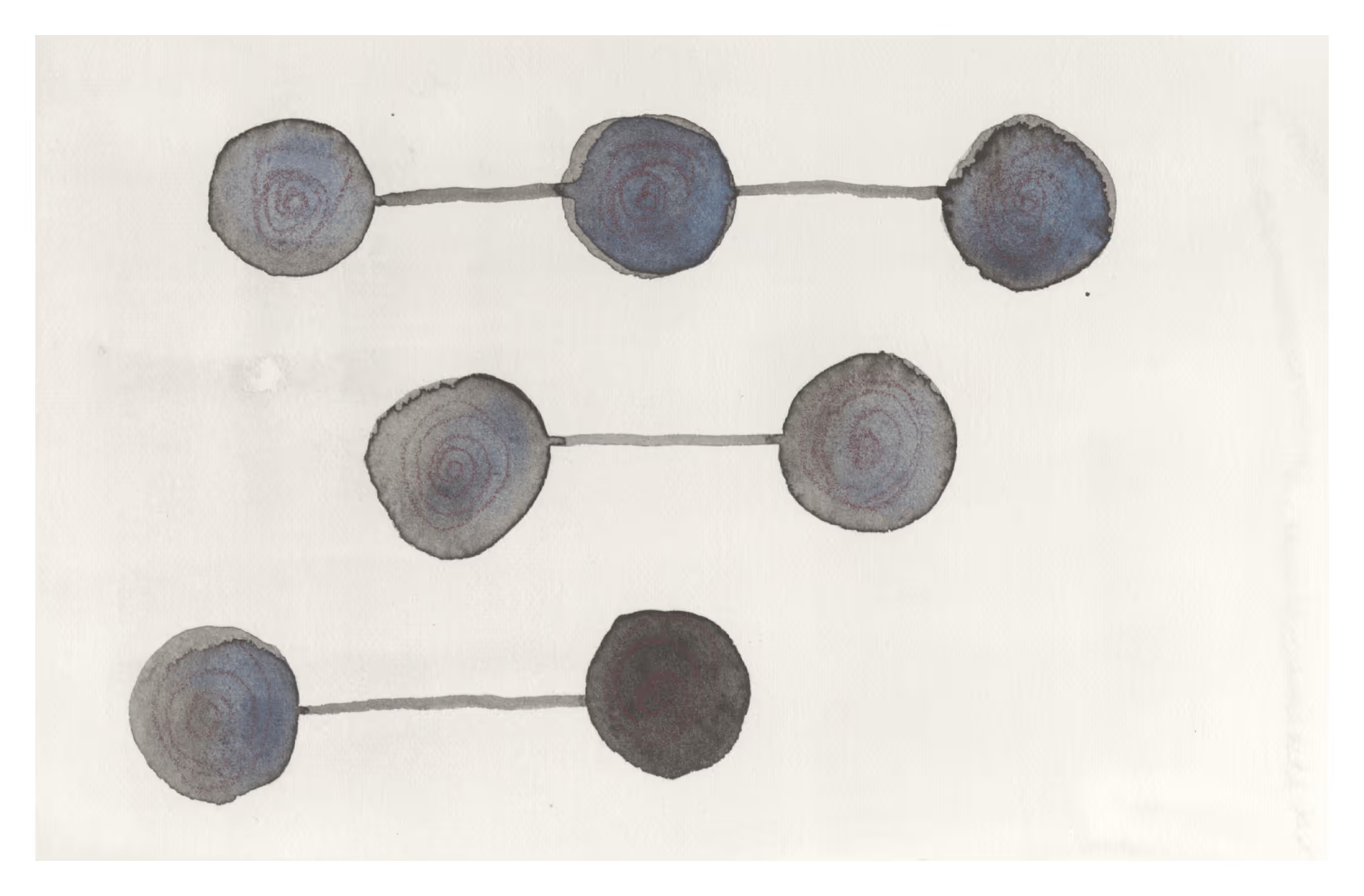
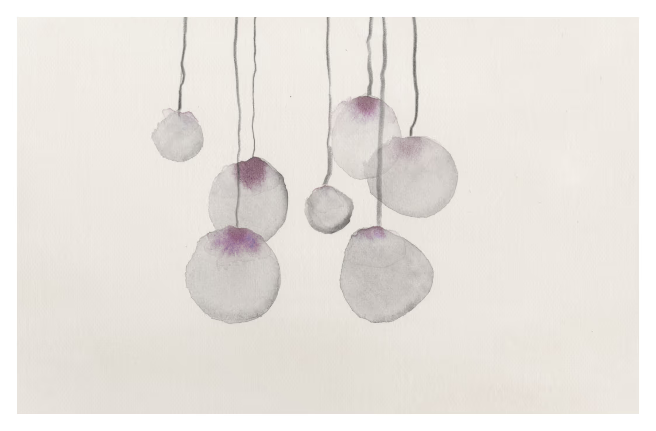
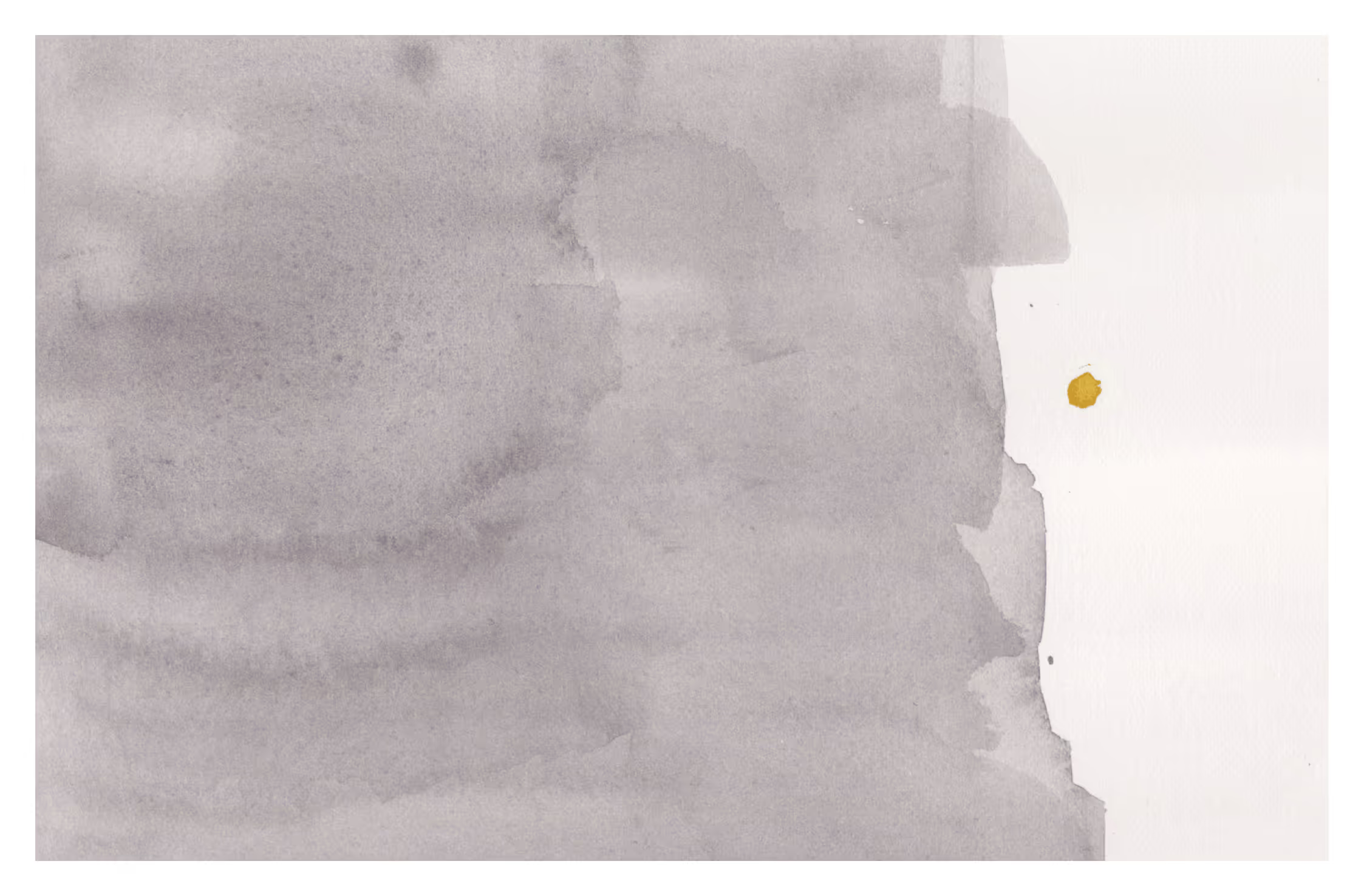
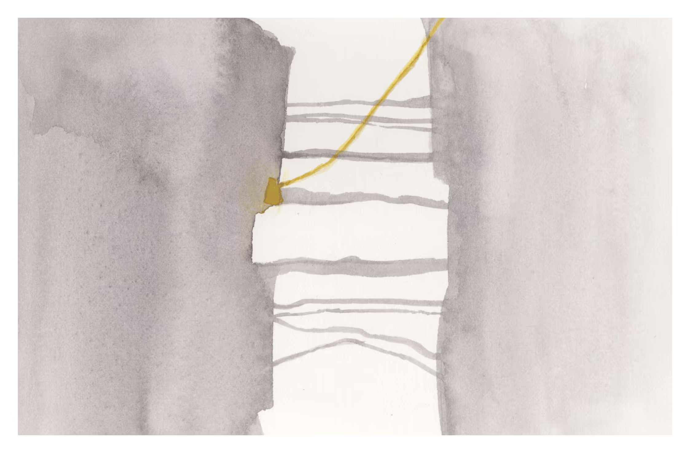
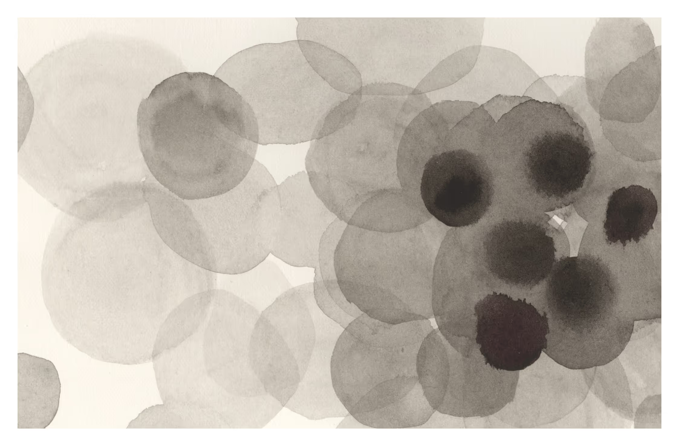
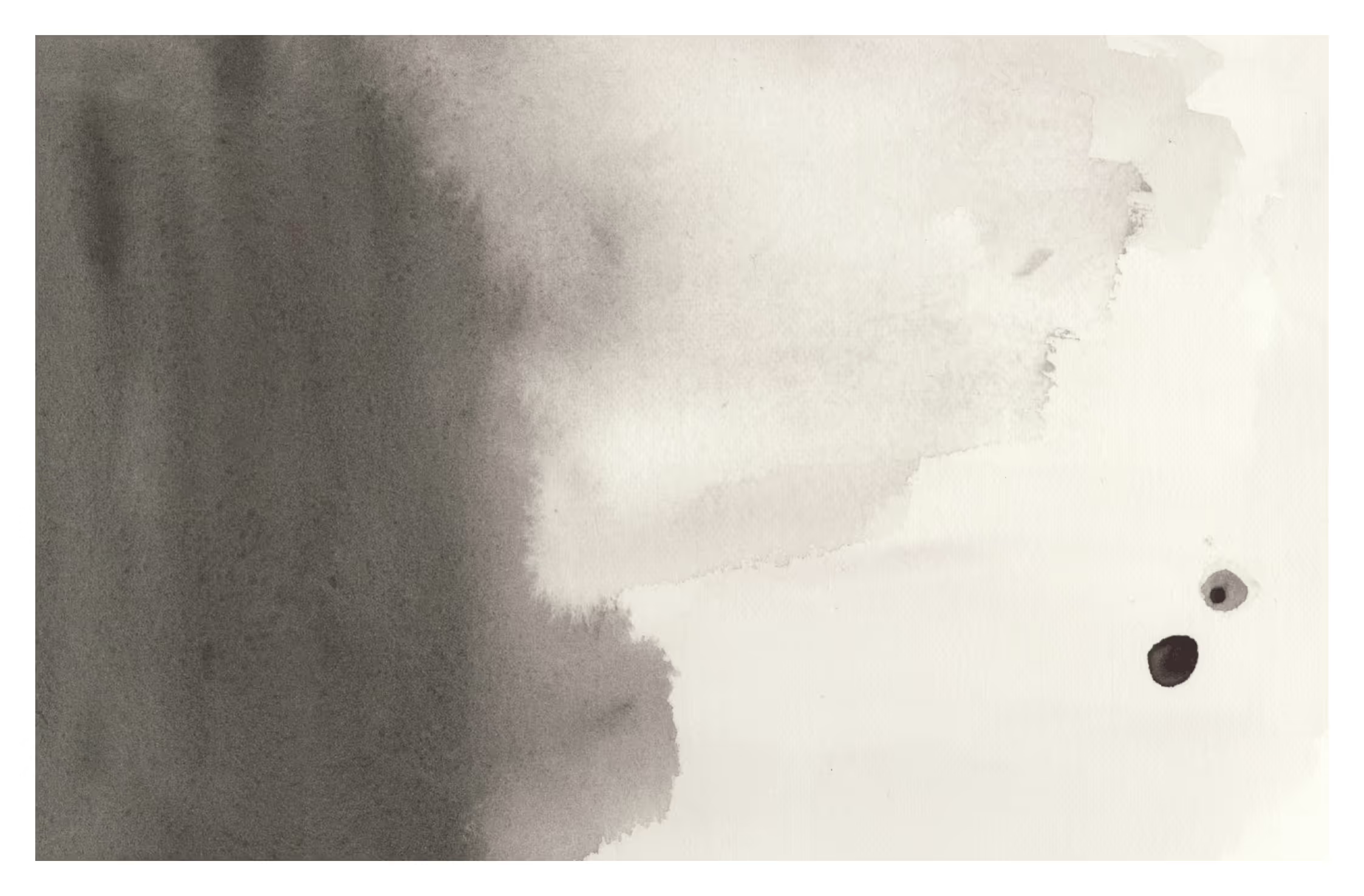
Mark-making became the primary method for expressing the abstract dynamics of each play. Rather than illustrating scenes or characters directly, gestural compositions were developed to suggest character relationships, themes, and underlying tensions.

While the imagery encourages interpretation, the brochure still follows a consistent layout structure so readers can clearly navigate the program once they move from visual exploration to the informational content.

Subheader

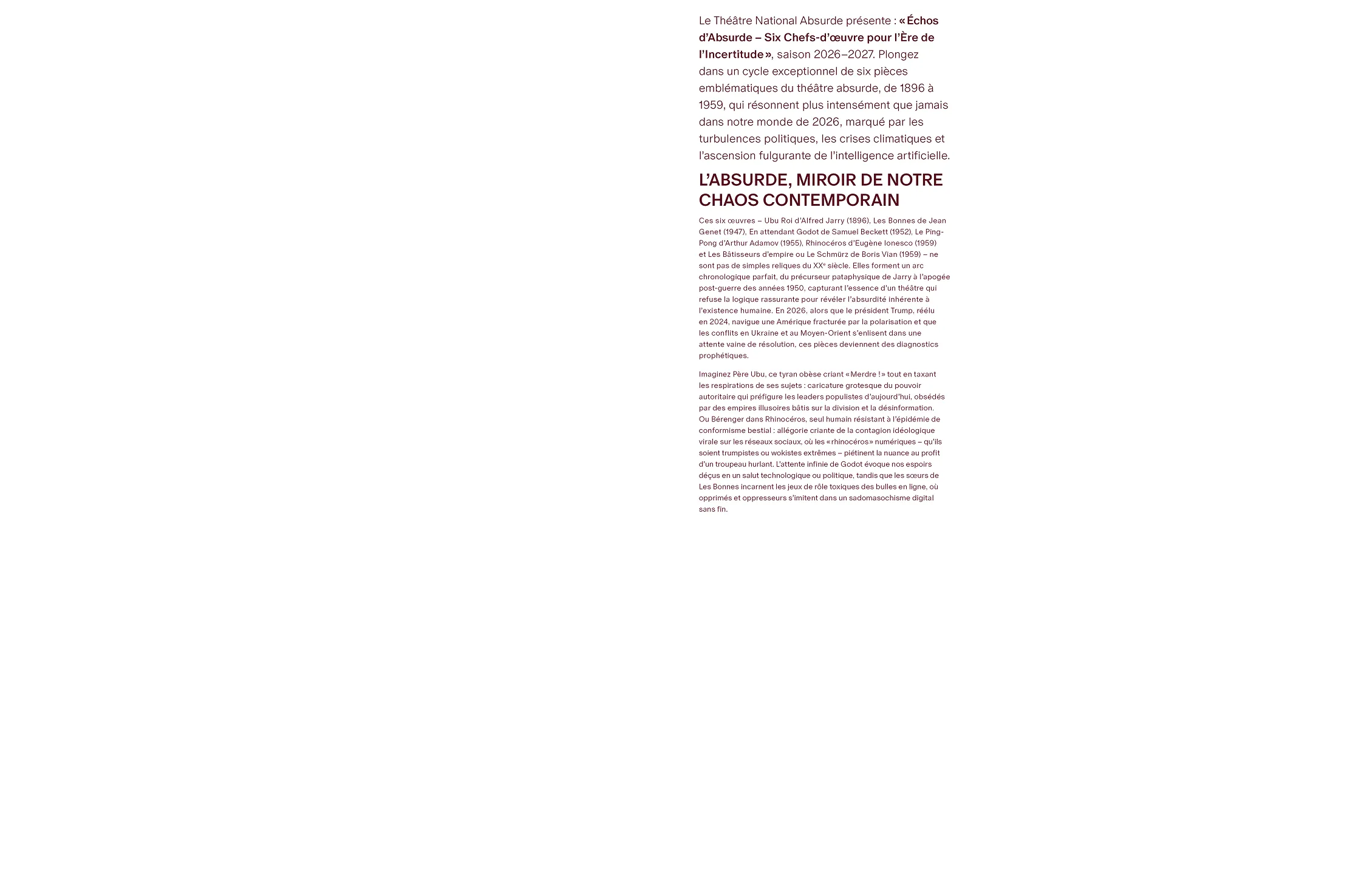
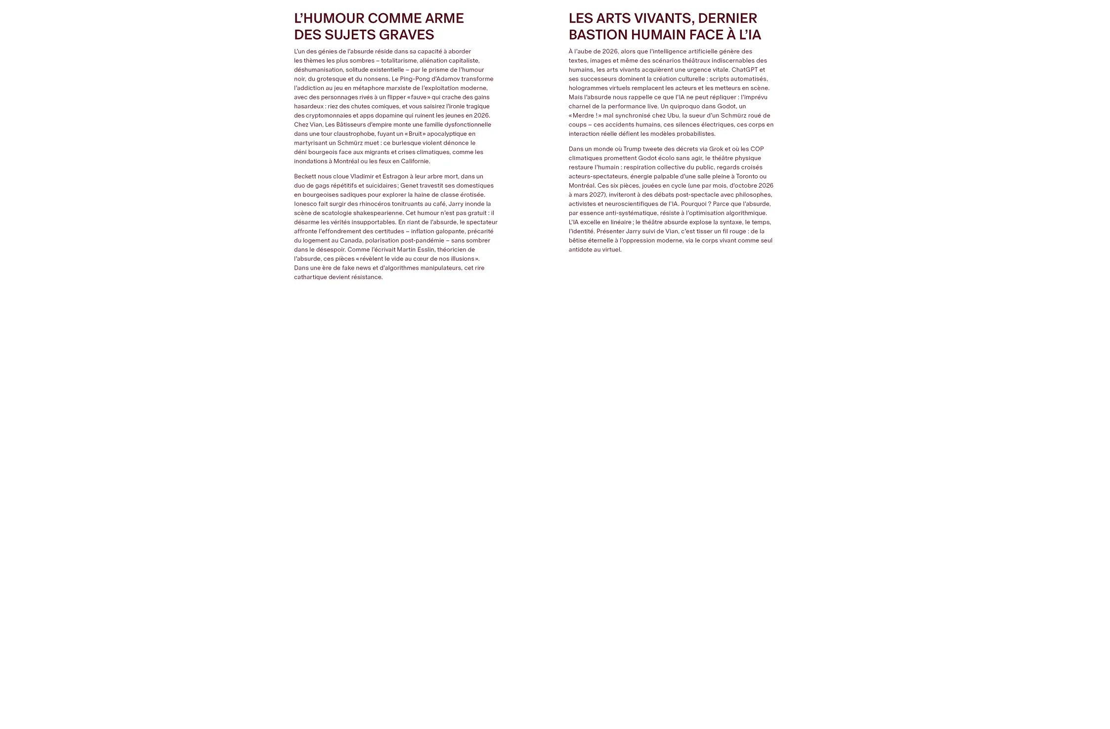
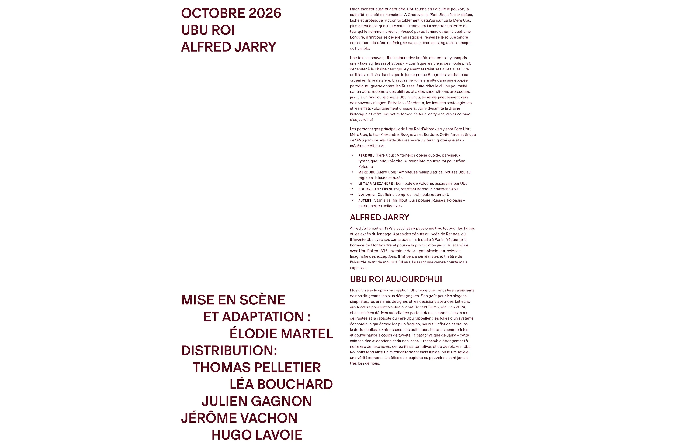
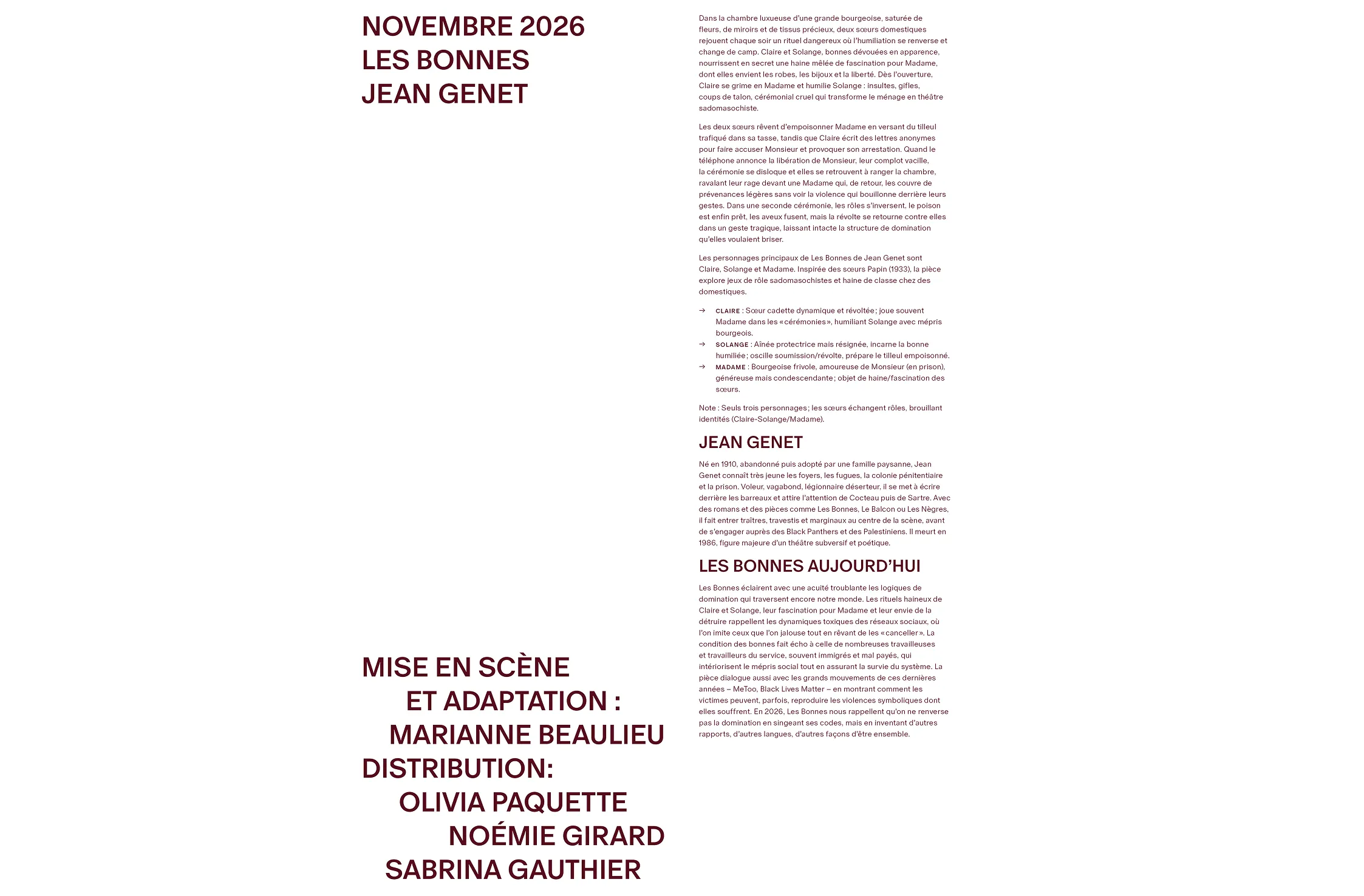
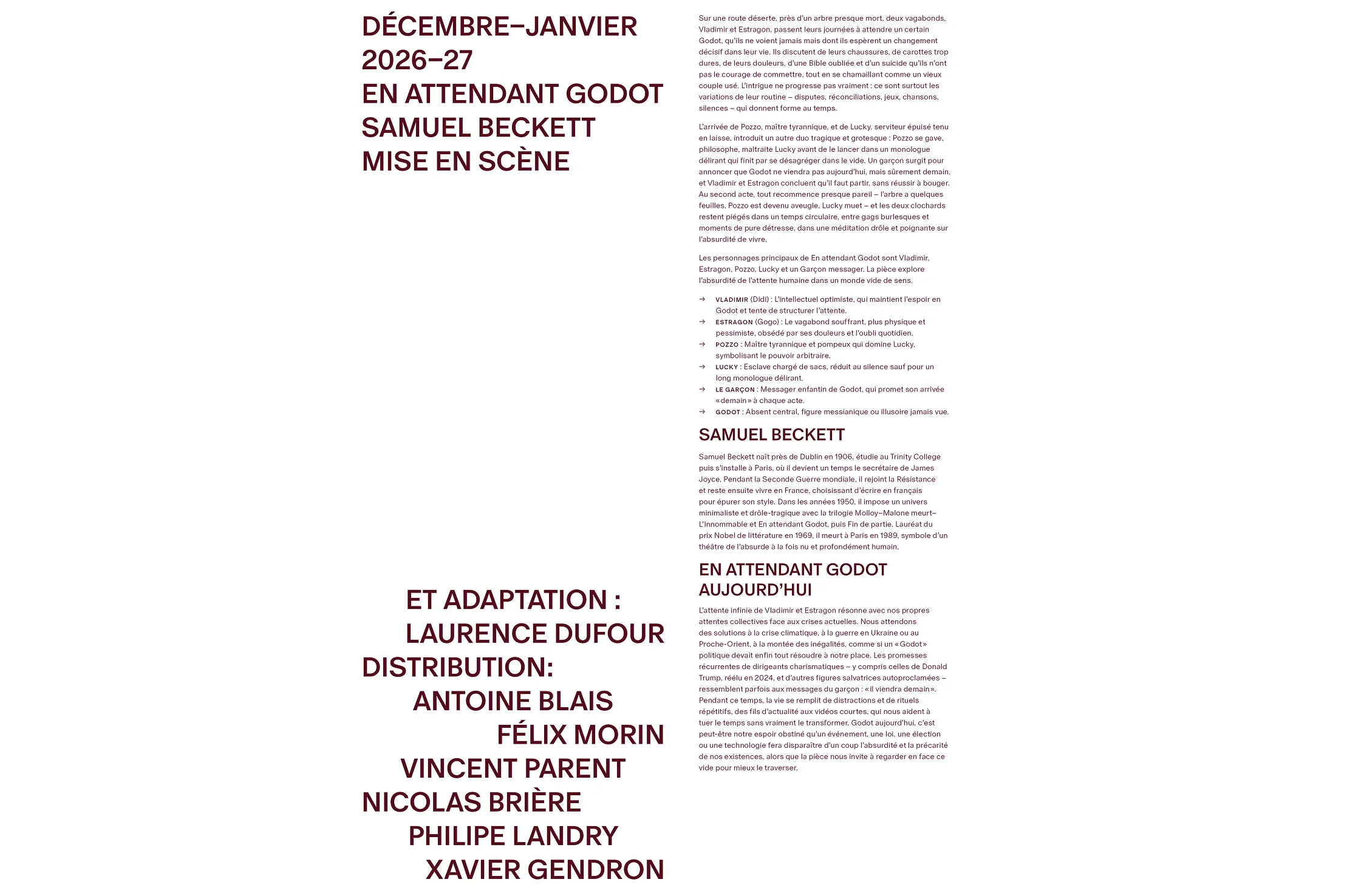
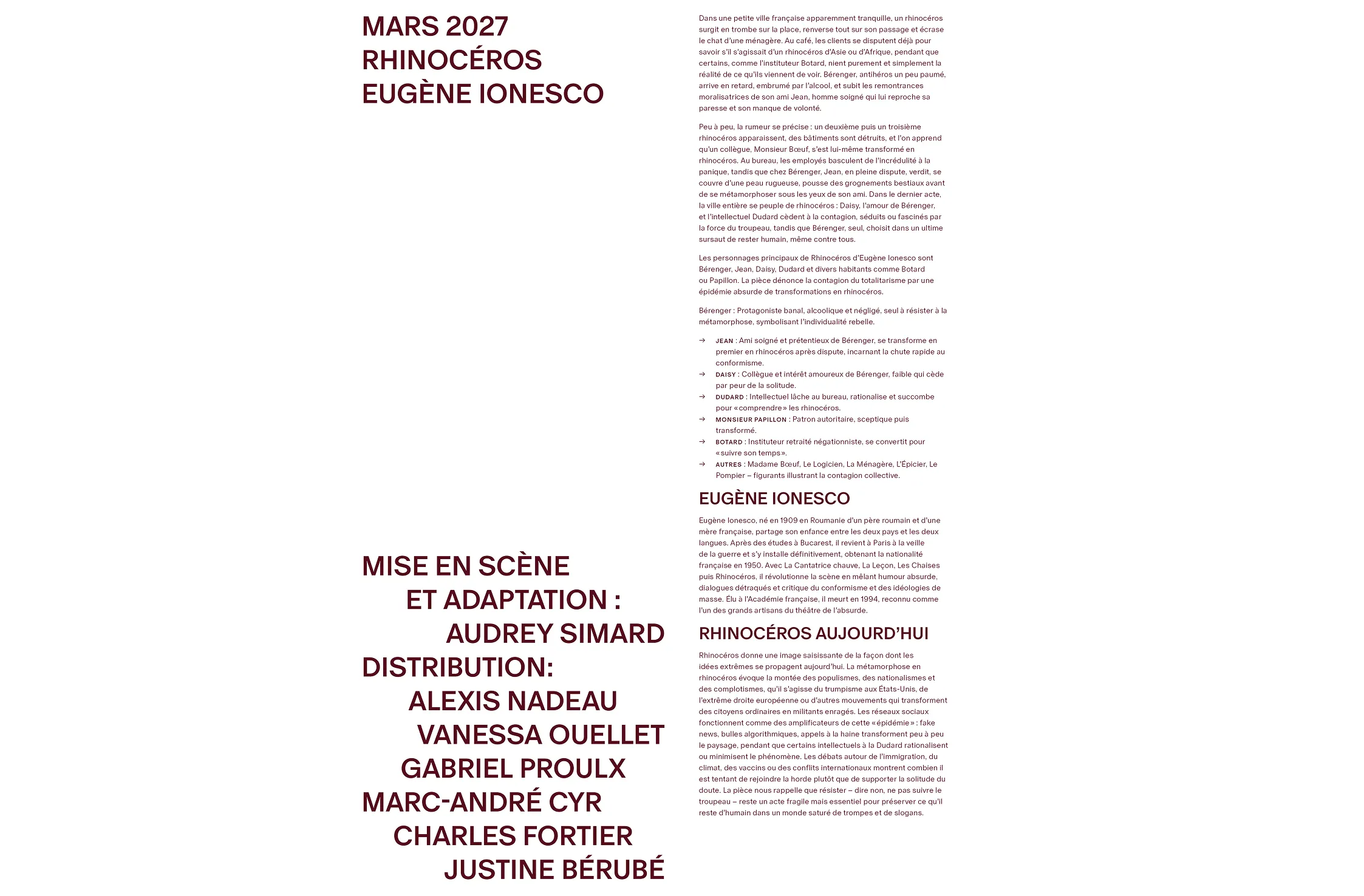
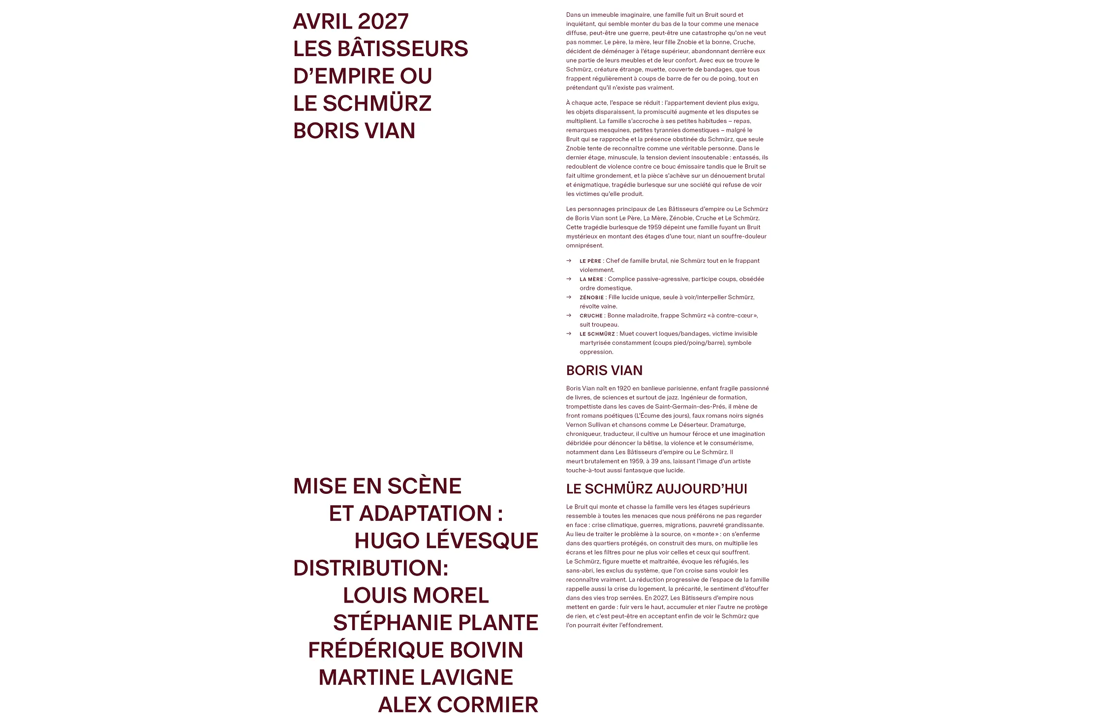
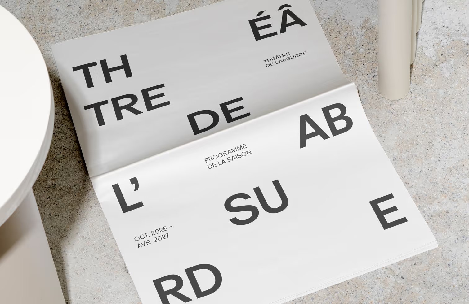
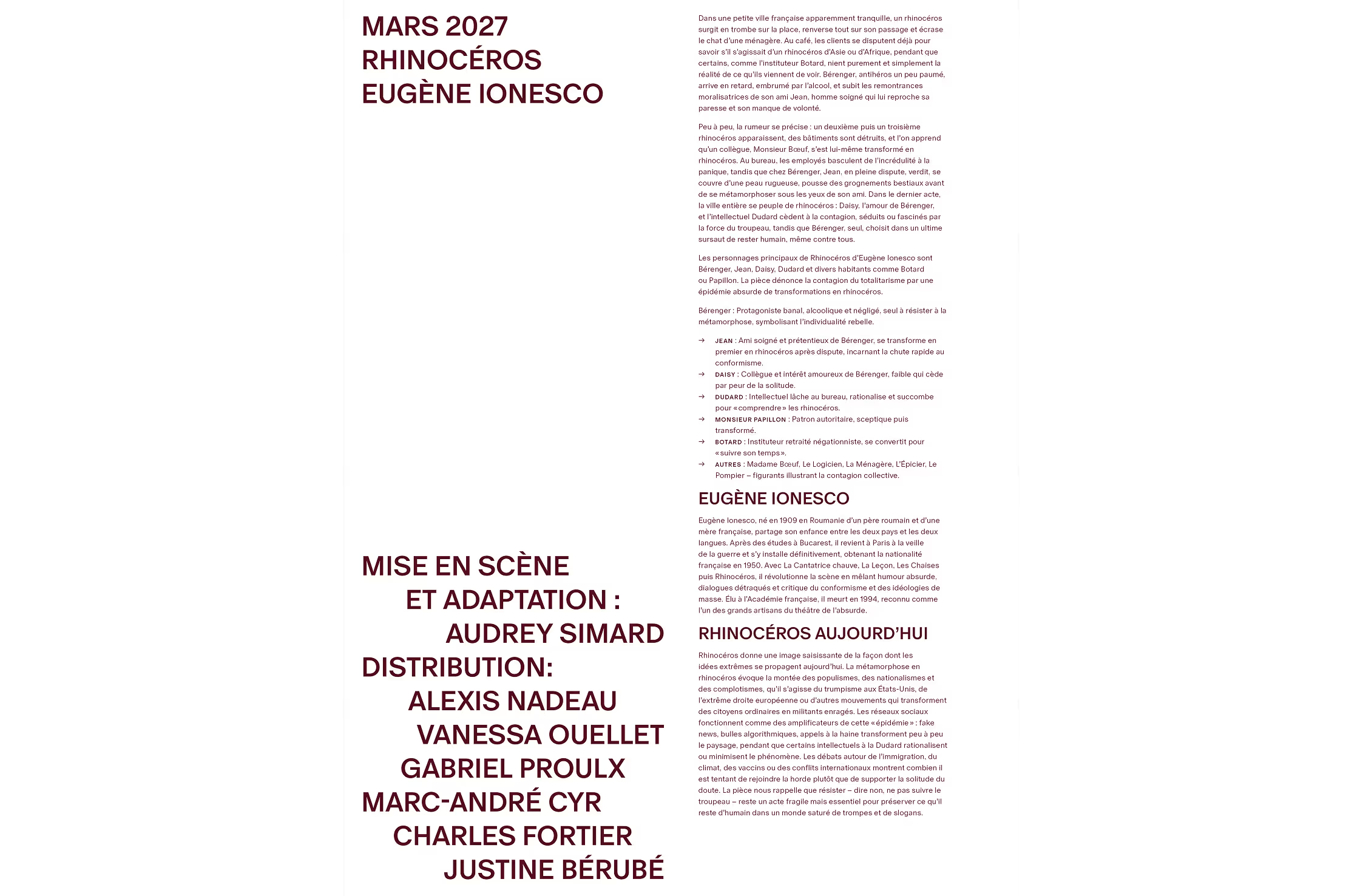
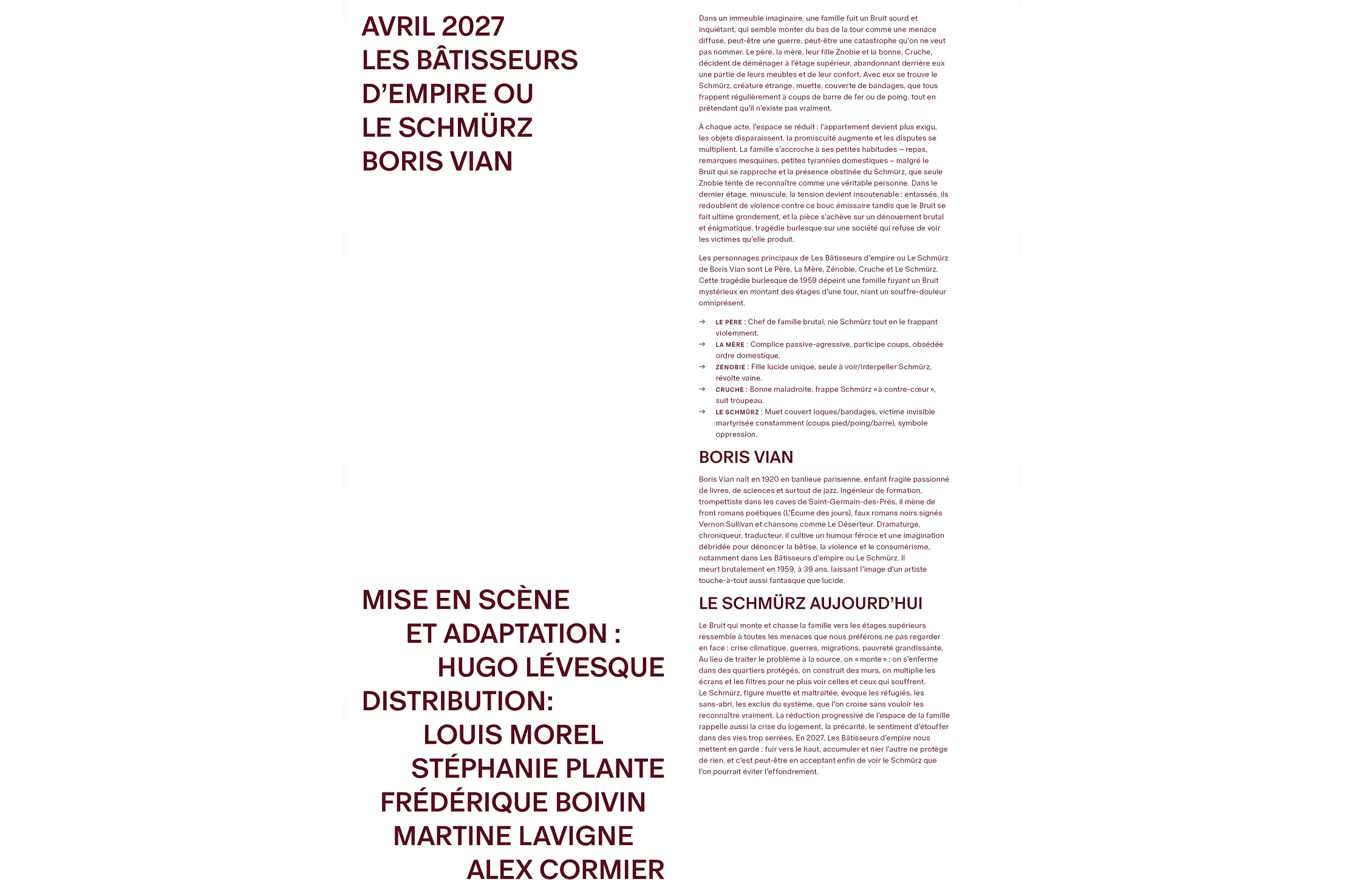
The final program is a 52-page tabloid-format brochure. The larger scale allows the gestural compositions to be experienced at full size, highlighting texture and movement while giving the artworks an impactful visual presence.

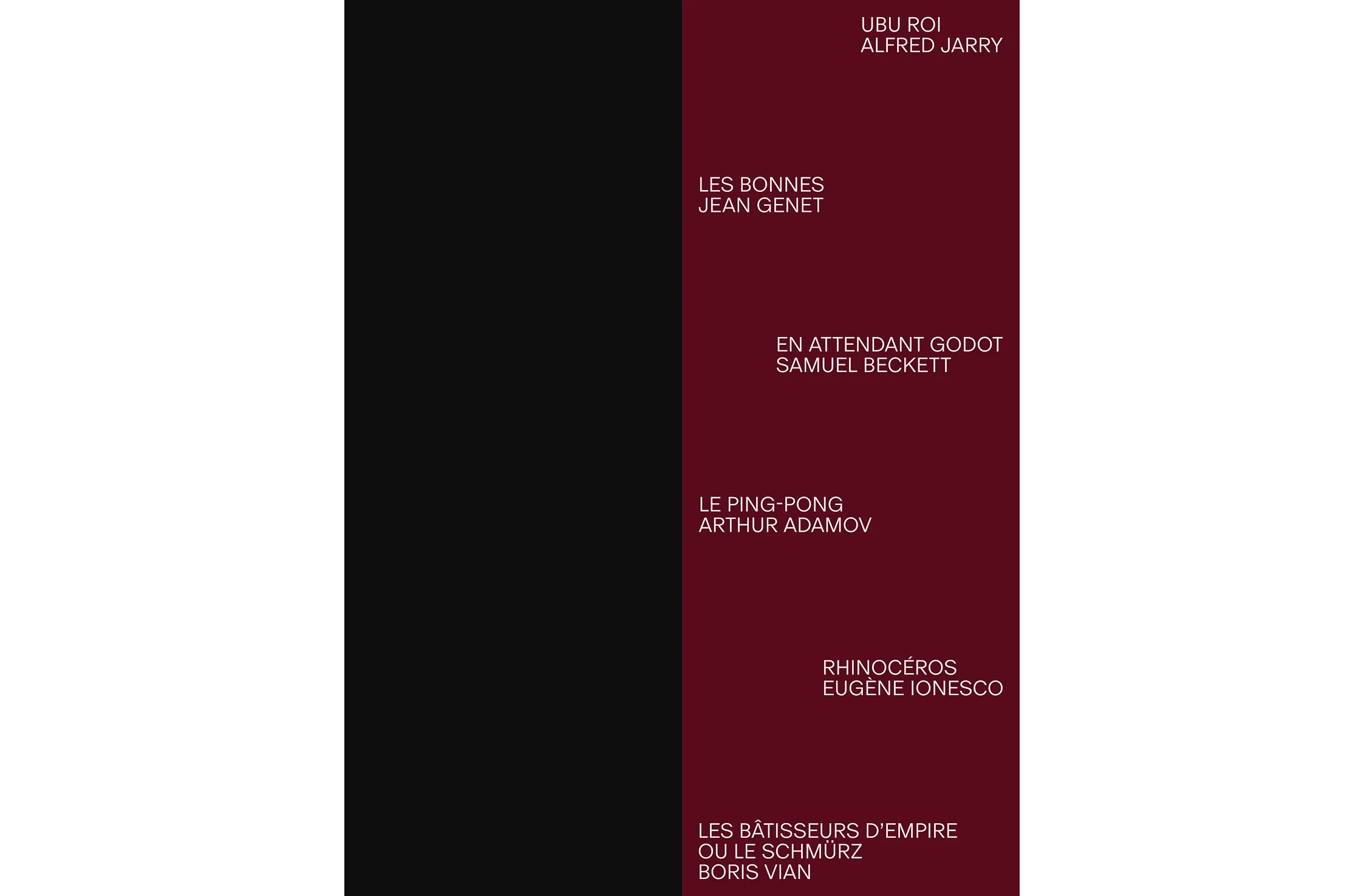
The format can also be folded in half, making the publication easier to handle during a performance. Each play is showcased through a distinct abstract composition that emphasizes emotional tensions and charcater dynamics while maintaining open to interpretation.

Subheader

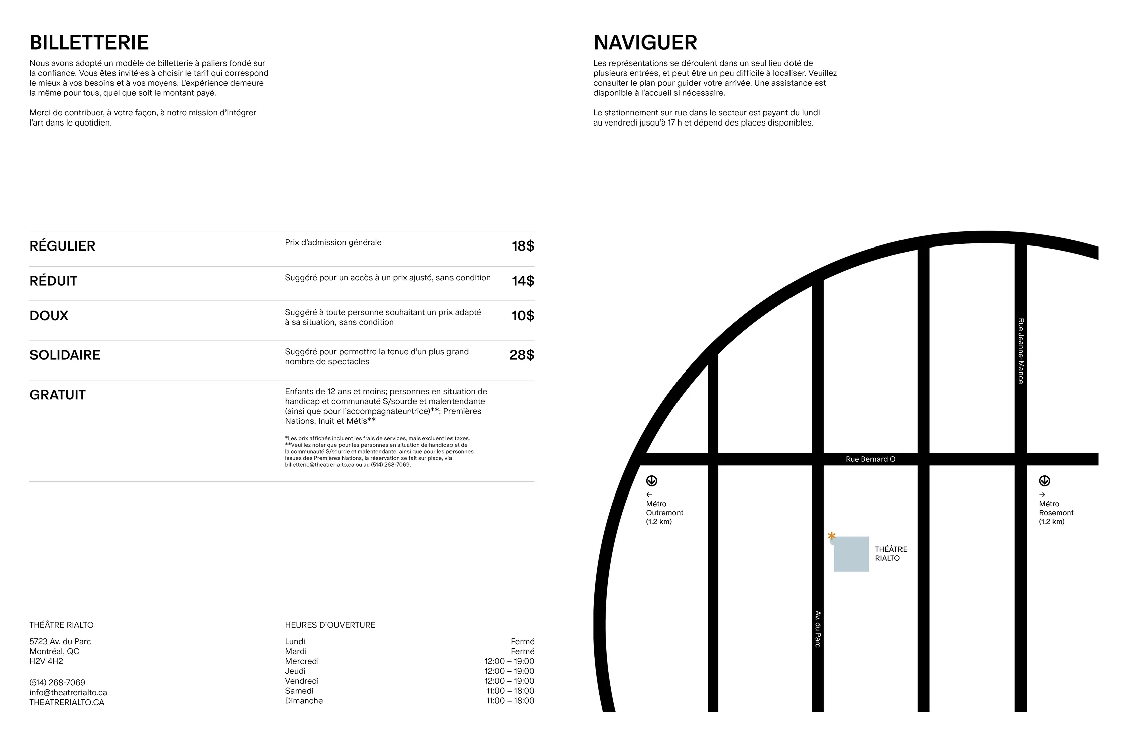
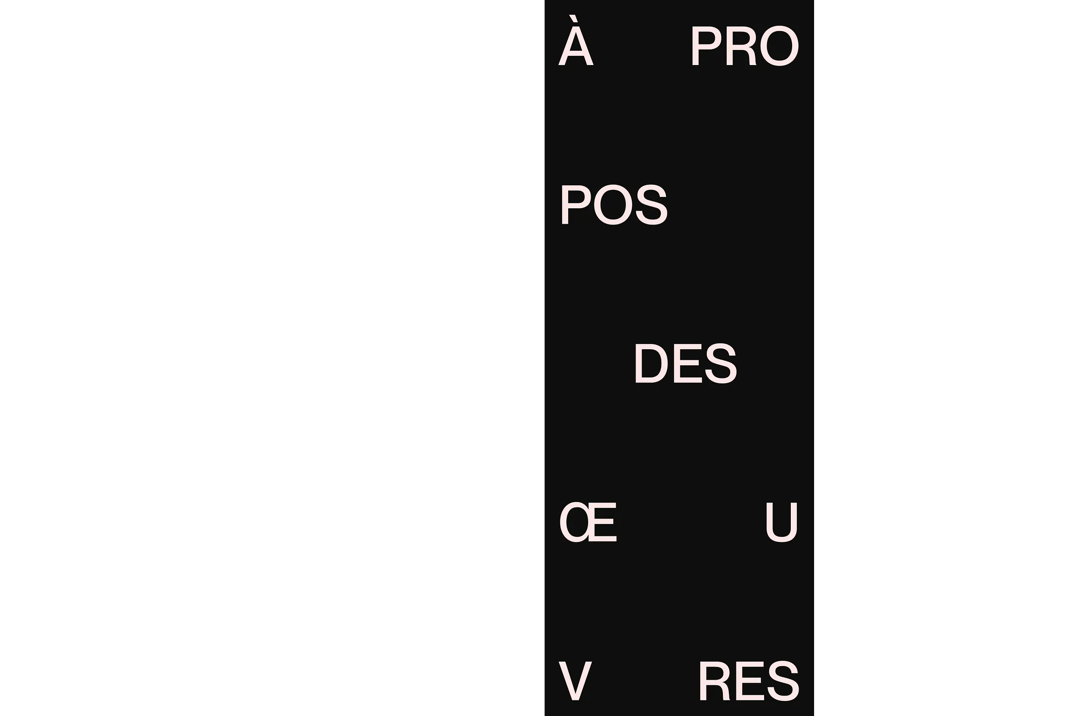
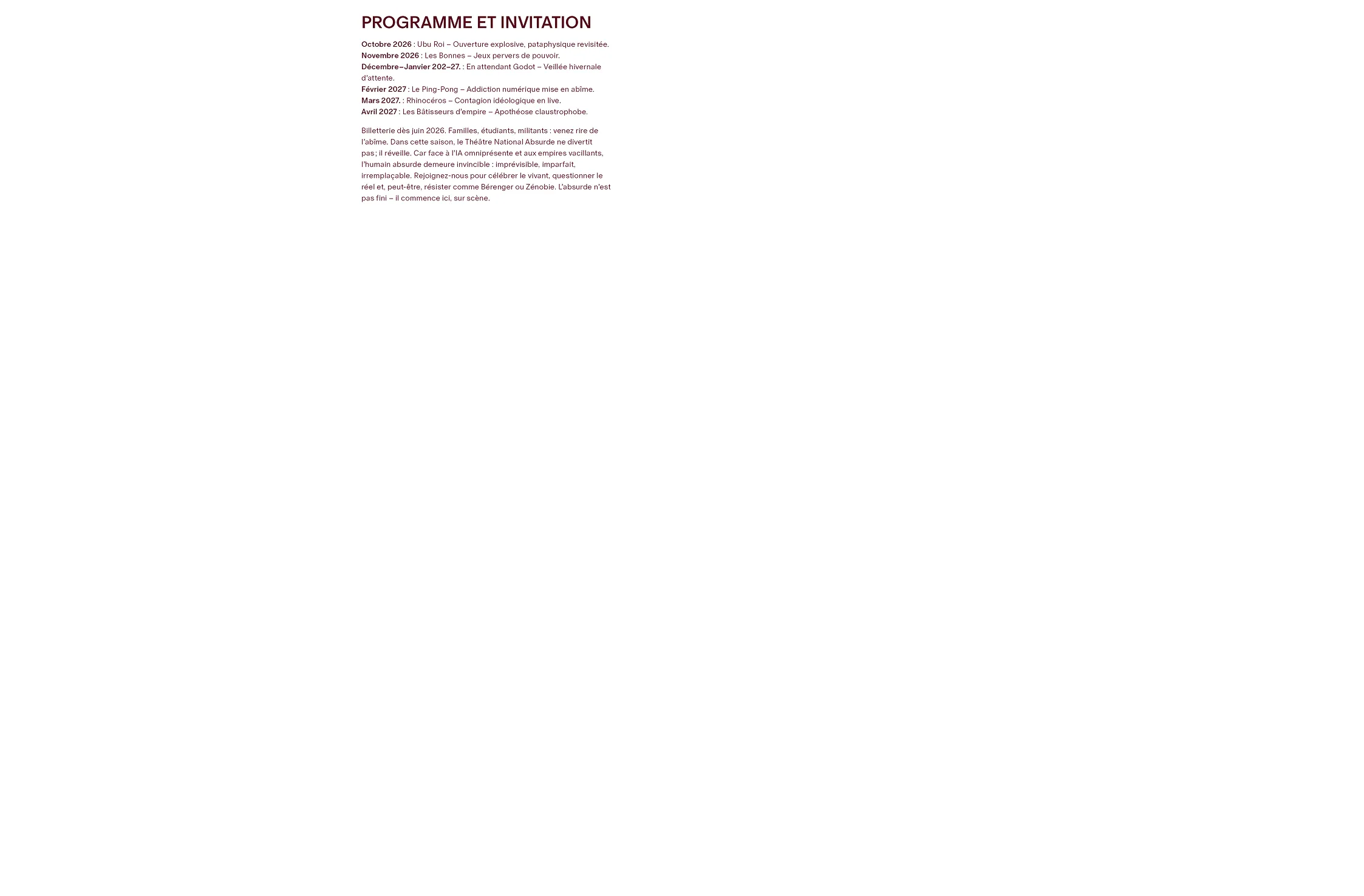
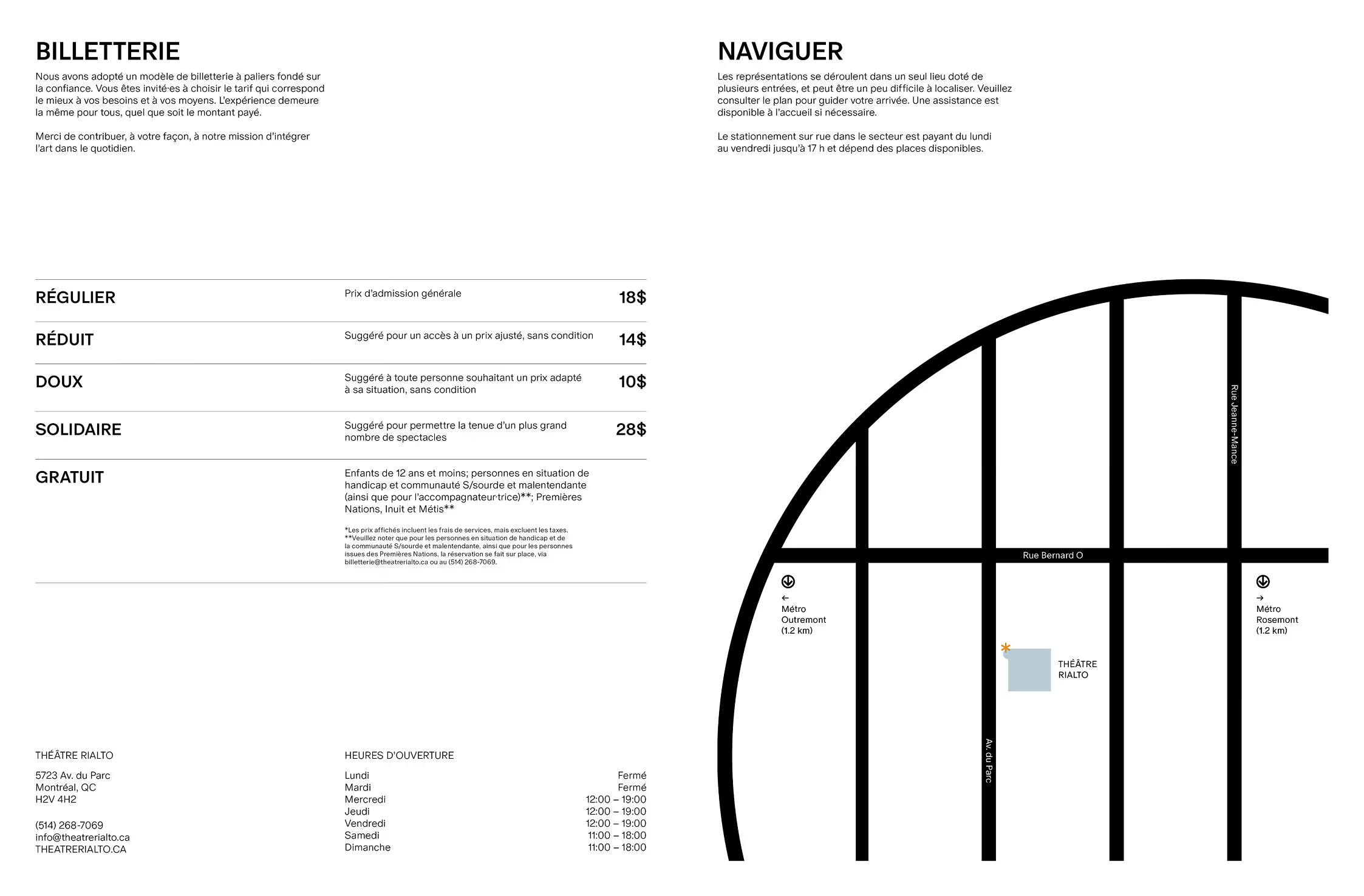
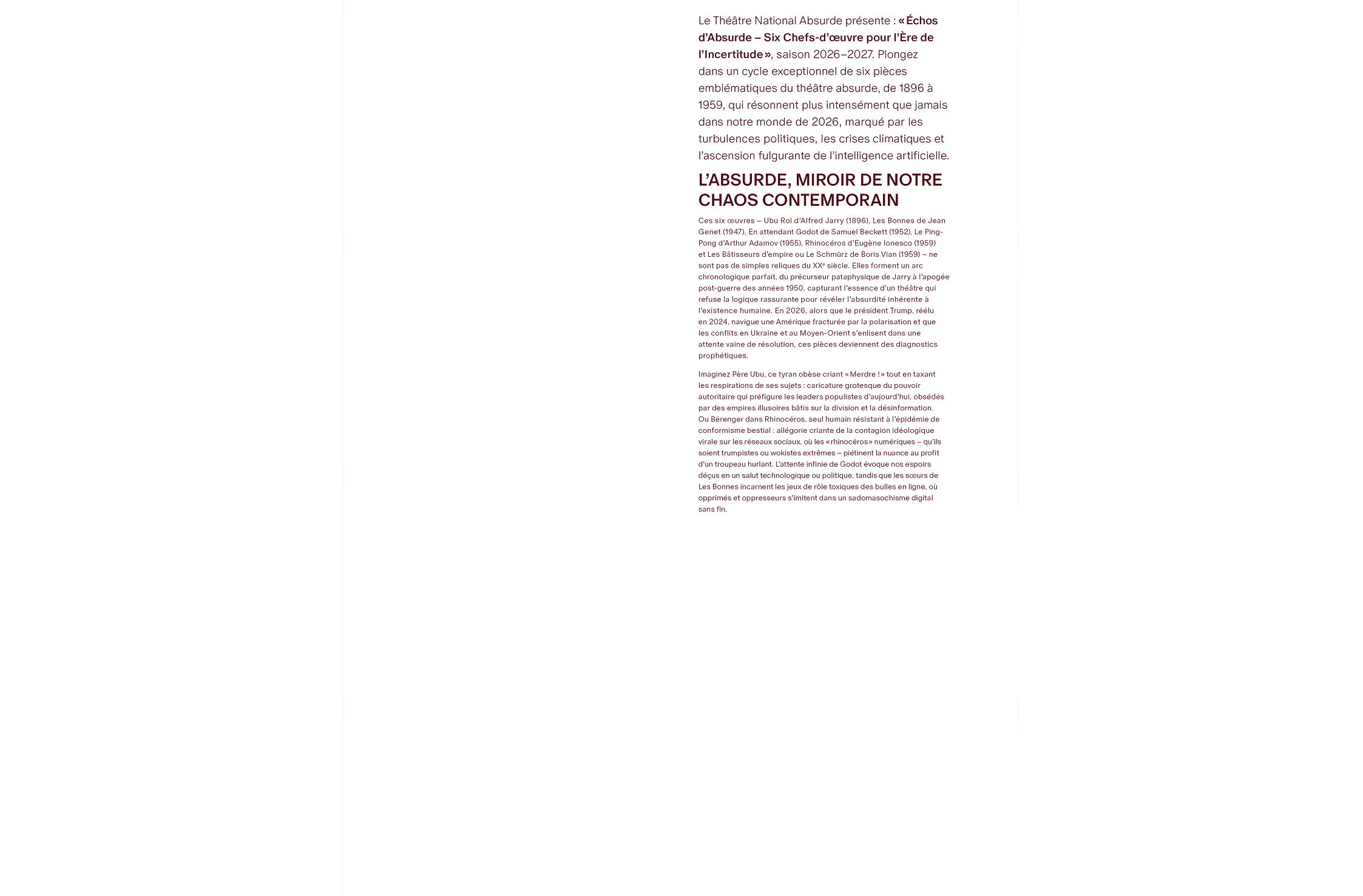
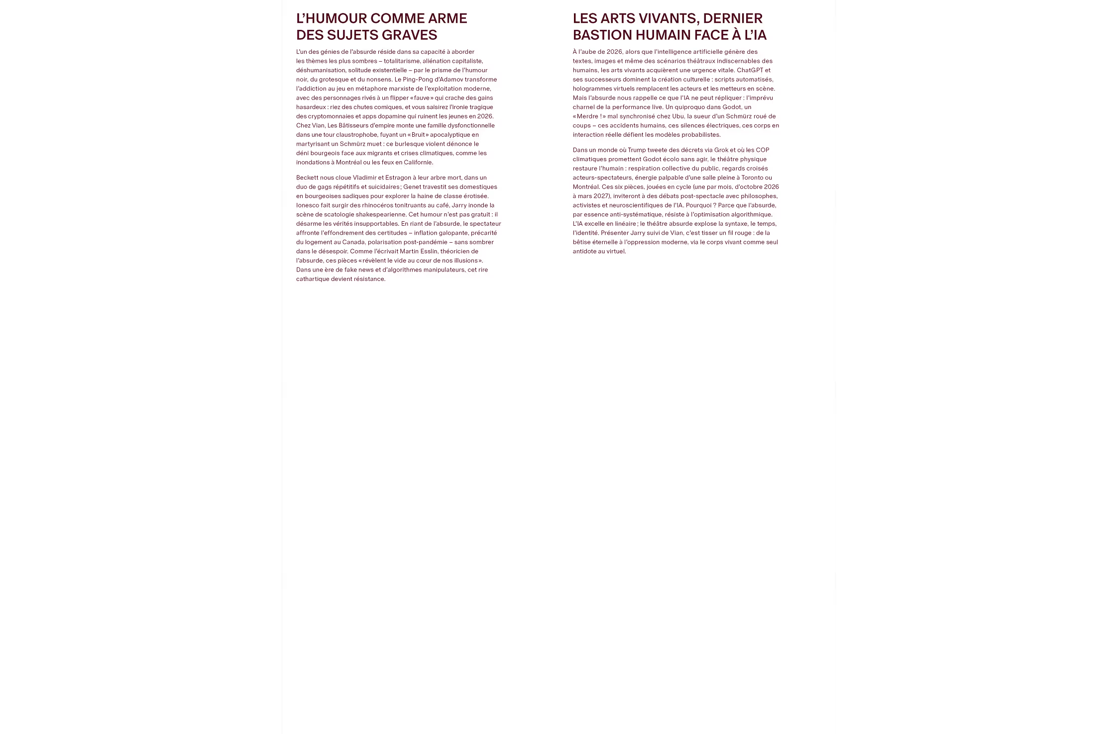
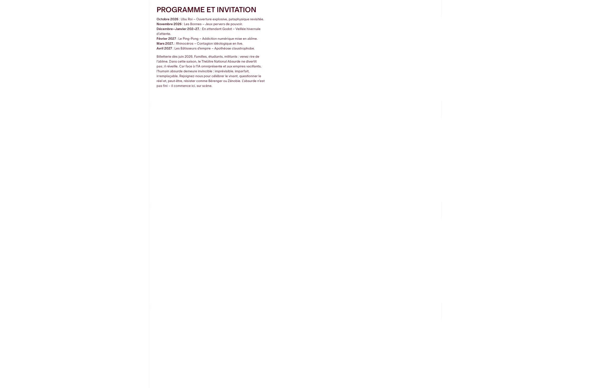
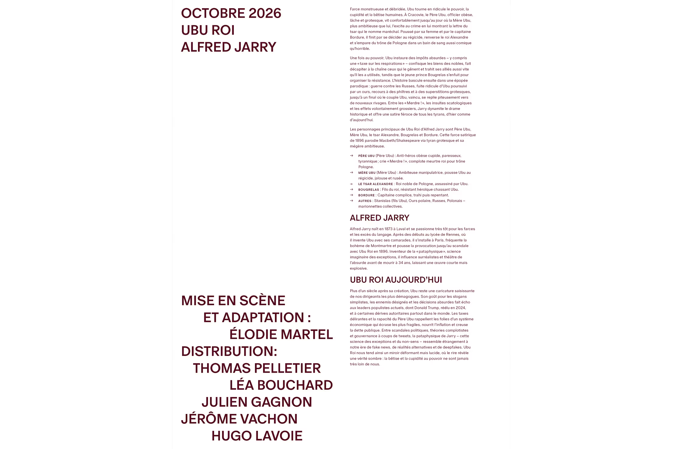
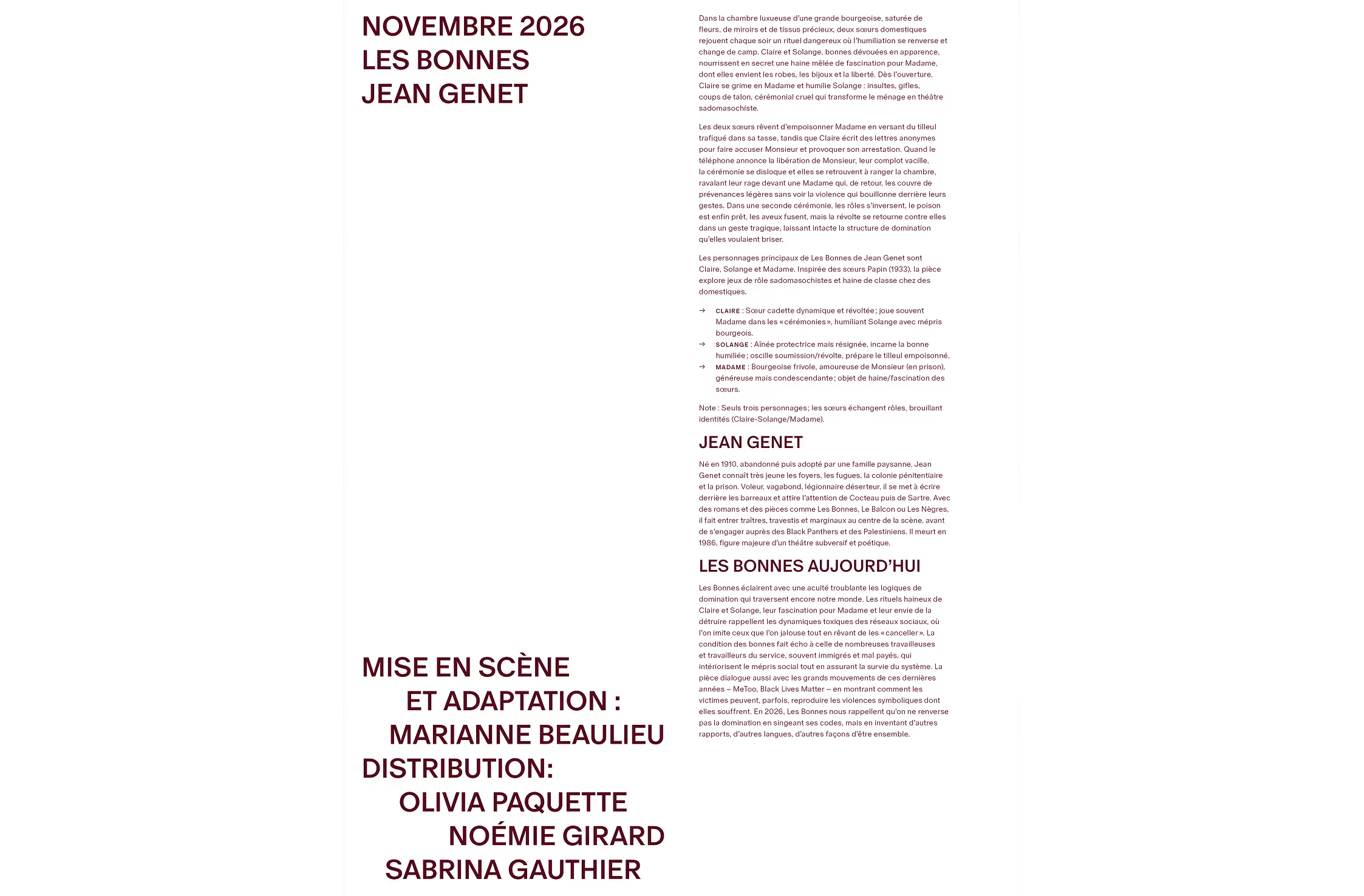
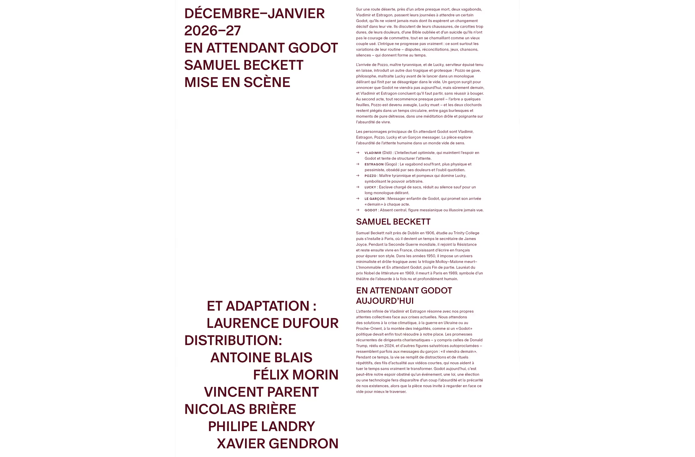
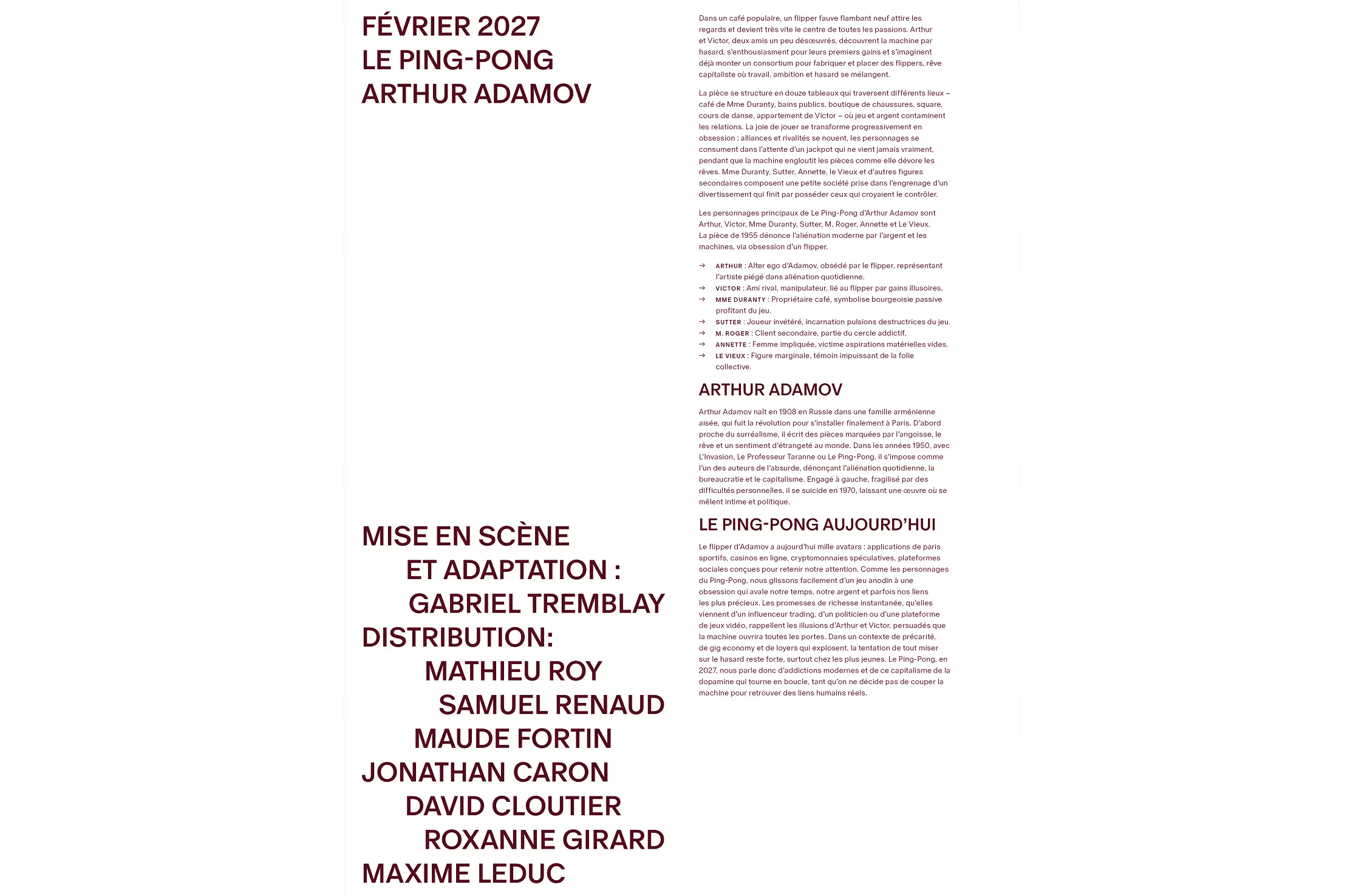
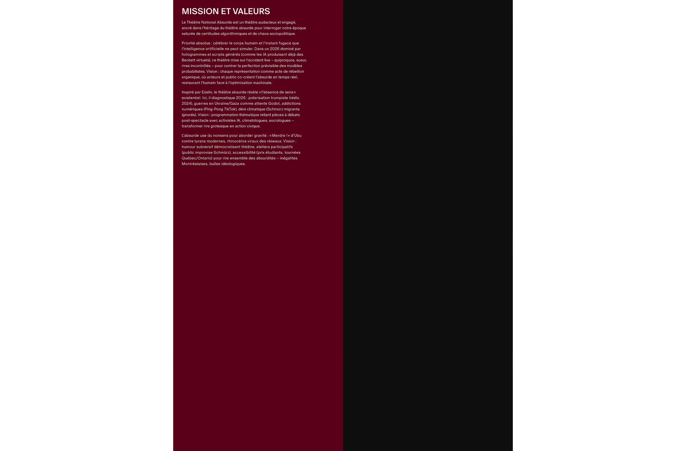
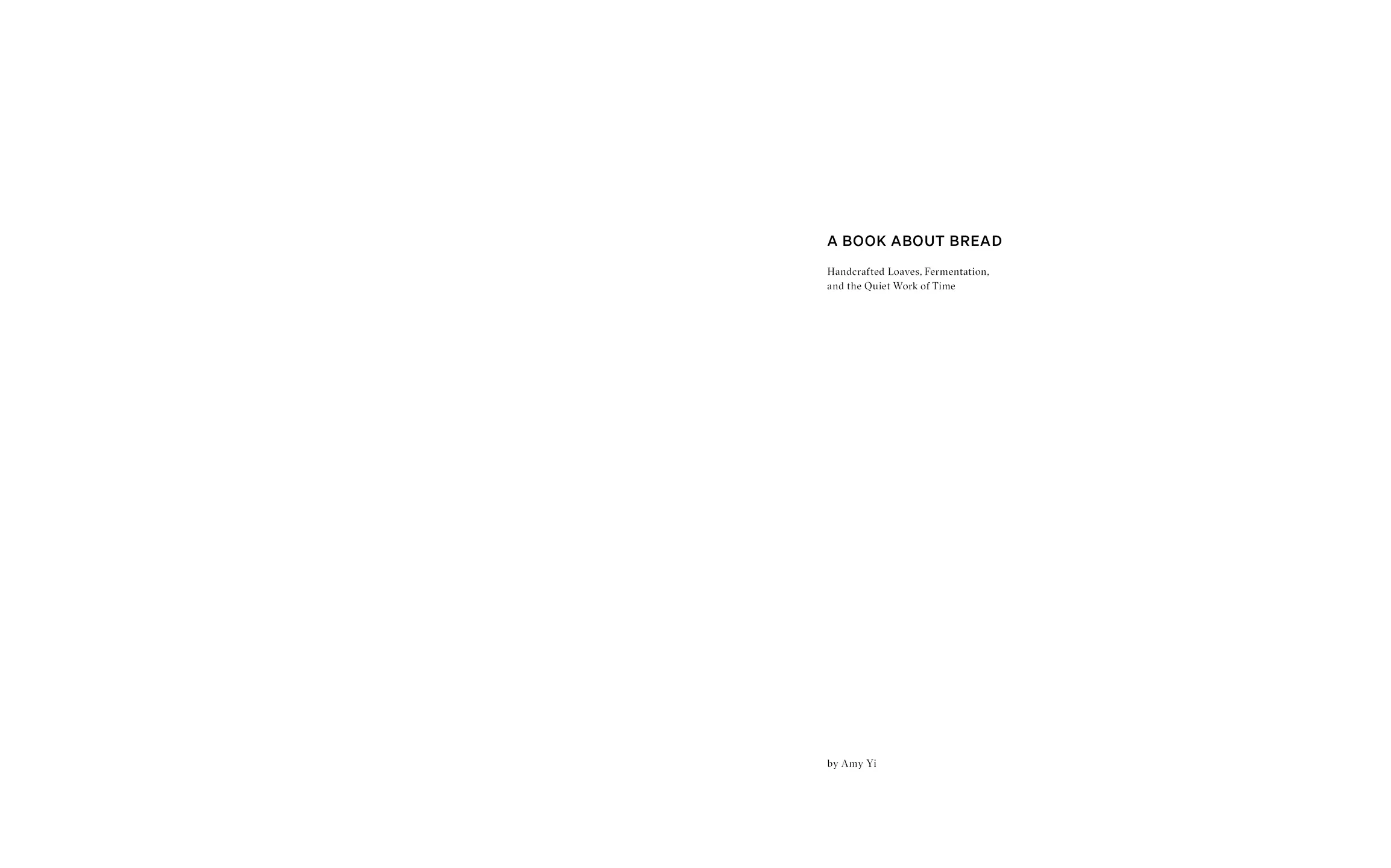
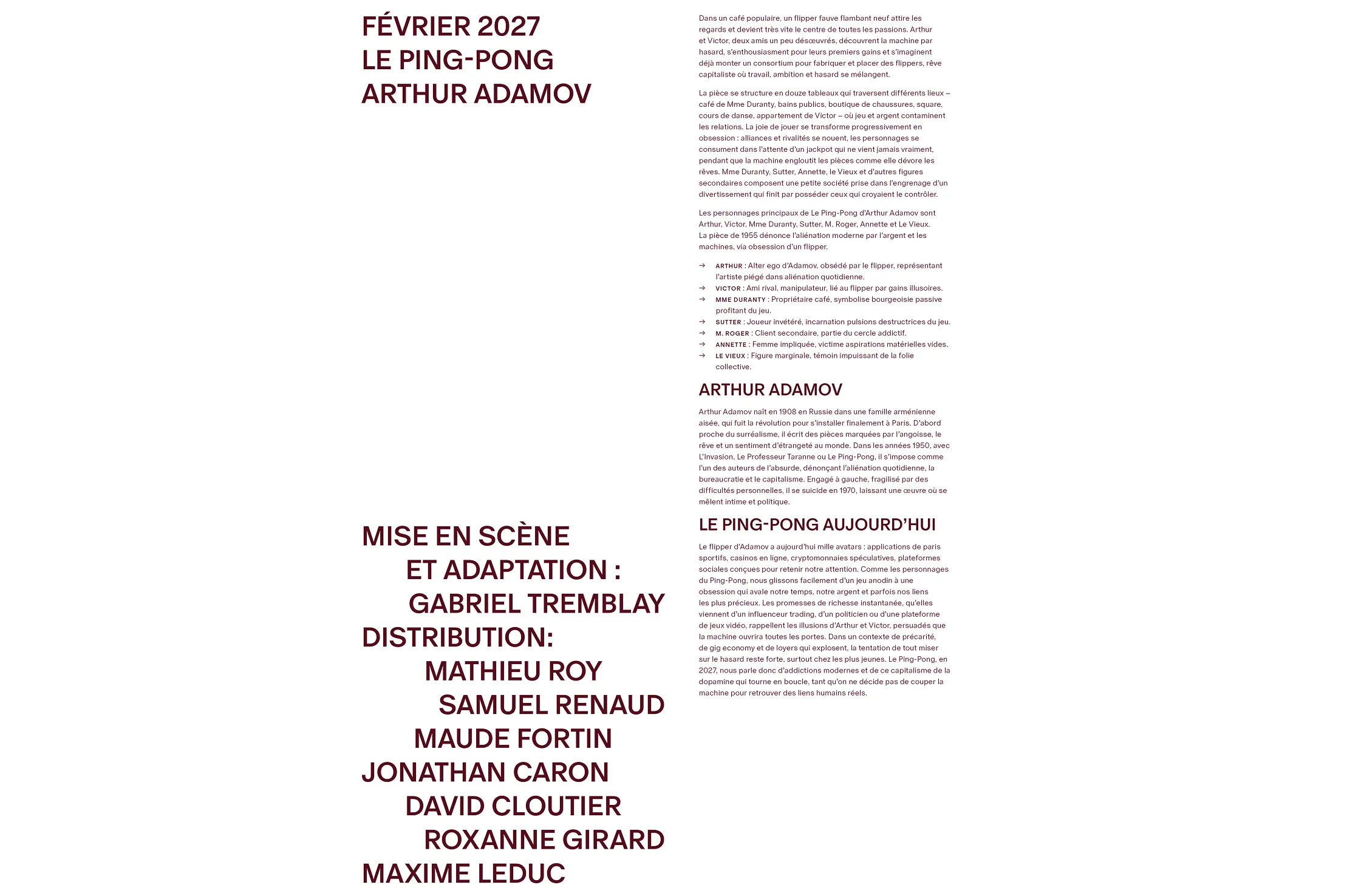
Program information is placed within a smaller inserted booklet positioned at the center of the brochure. This structure separates the expressive visuals from the program text, guiding readers to move between visual interpretation and practical information. The booklet uses a different paper stock with a soft gray tone, which introduces tactile contrast and subtle material depth.

Theatre of the Absurd

Publication Design

Theatre of the Absurd describes plays that portray human existence as uncertain and often illogical, frequently using interrupted dialogue, repetition, and unconventional narrative structures.

The project was to design a theatre program for Theatre of the Absurd. The program needed to function both as a promotional piece for upcoming productions and as a record documenting the season’s plays, cast members, and creative teams.

scroll this way →
Photography by Tommy-Paul Keo
A close-up photograph highlighting the barley grains used as the basis for the packaging pattern. The elongated forms and layered arrangement inspired the repeated stitched motif applied throughout the identity system, translating the organic texture of the grain into a simplified visual language.
A close-up view of the stitched surface pattern applied across the reusable grain bags. Repeated linear motifs are embroidered directly onto the neutral fabric, creating a subtle textured detail that adds rhythm, tactility, and visual consistency throughout the packaging system.

Photography by Tommy-Paul Keo
An open reusable fabric grain bag filled with grains, shown alongside a second closed bag in the background. The soft textile materials, visible contents, and minimal color palette highlight the tactile and natural qualities of the packaging system.

Photography by Tommy-Paul Keo

The design approach highlights the logic of absurdist theatre. Instead of presenting information in a strictly linear way, the brochure invites readers to encounter visual and emotional elements first, with informational content revealed more deliberately afterward. This reverses the typical hierarchy of theatre programs, where text usually leads the experience.

Mark-making became the primary method for expressing the abstract dynamics of each play. Rather than illustrating scenes or characters directly, gestural compositions were developed to suggest character relationships, themes, and underlying tensions.

While the imagery encourages interpretation, the brochure still follows a consistent layout structure so readers can clearly navigate the program once they move from visual exploration to the informational content.
Subheader

The final program is a 52-page tabloid-format brochure. The larger scale allows the gestural compositions to be experienced at full size, highlighting texture and movement while giving the artworks an impactful visual presence.
The format can also be folded in half, making the publication easier to handle during a performance. Each play is showcased through a distinct abstract composition that emphasizes emotional tensions and charcater dynamics while maintaining open to interpretation.

Subheader

Program information is placed within a smaller inserted booklet positioned at the center of the brochure. This structure separates the expressive visuals from the program text, guiding readers to move between visual interpretation and practical information. The booklet uses a different paper stock with a soft gray tone, which introduces tactile contrast and subtle material depth.